本文翻译自作者Slava Shestopalov,原网站:https://medium.muz.li
「Optical Effects in User Interfaces: An Illustrated Guide
How to make optically balanced icons, correct shapes alignment, and perfect corner rounding.」
本篇共计15780 字,预计阅读25分钟。
部分学术用语会在文章底部标注
俗话说,眼见为虚。但是如果你了解人类视觉的特性,你就可以构建出更平易近人的设计。不仅是字体设计师要利用视觉技巧来创建可读性且平衡性强的字体,对于界面(UI)设计师也有帮助。
Our eyes are weird organs that often tell lies to us. But if you know the peculiarities of human vision, you can construct more approachable and clean designs. Not only do type designers utilize optical tricks for creating readable and well-balanced fonts, but it’s also helpful for interface designers, who build user-computer interaction.
在20世纪20年代,格式塔视觉理论出现(the Gestalt theory of visual① )。它对我们的眼睛如何处理不同的图像以及我们的大脑的理解图像方法进行了解释。你可能已经听说过其中提到的相似或者是闭合原则,本文涉及格式塔理论的一些要点,不同于科学研究,强调的是实践方面的应用。在文章底部,有相关推荐资料list~
In the 1920s the Gestalt theory of visual perception was developed. It explains how our eyes process different images and how our brain interprets them. You might have already heard about such things as the principle of proximity or the common fate rule. This article refers to some points of the Gestalt theory and highlights practical aspects rather than scientific research. There is a list of recommended materials on the topic at the bottom.
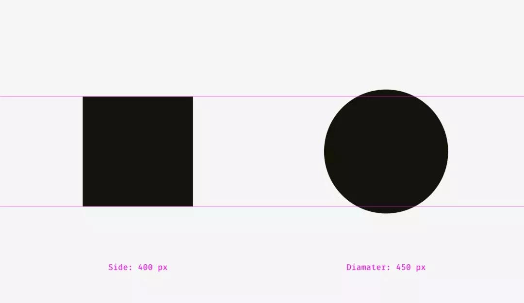
1.实测与视觉大小
各400像素的正方形和圆形谁更大呢?从几何学上讲,它们的宽,高是相等的。但看下面的图片,我们在视觉上立刻感觉方形比圆形面积更大。
1. Measured and optical size
What is bigger: a 400-pixel square or a 400-pixel circle? Geometrically speaking, their width and height are equal. But look at the picture below. Our eyes immediately detect that the square outweighs the circle.

上图的参考线版本。↓

再来看另一张正方形和圆形的图片,对于你来说,他们的视重②(visual weight )是相等的吗?
Let’s take a look at one more picture with a square and a circle. In terms of visual weight are they equal to you?

至少很难立刻说出来,哪个在视觉上更重。不足为奇,因为我增加了圆的直径。↓
At least it’s hard to tell immediately, which one outweighs the other. Not surprising because I increased the diameter of the circle.
我重叠了第一、二个示例的形状。在左侧,400像素的正方形比400像素的圆形面积更大。这就是我们看到它在视觉上更大的原因。在右侧,圆和正方形是平衡的。基本上,它们具有相似的面积,而它们的宽度和高度不同。
I overlapped the shapes from the first and the second examples. On the left, the 400-pixel square has bigger area than the 400-pixel circle. That’s why we see it visually larger. On the right, the circle and the square are balanced. Basically, they have similar area while their width and height are different.

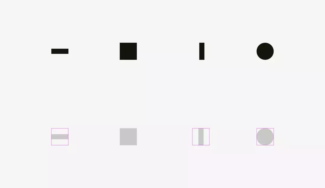
在相同效果下,我们也可以论证菱形和三角形的视重。为了达到在视觉上与正方形平衡,它们应该更宽更高,以使它们的面积相似。对于简单形状,基于面积的方法最适用。↓
We can witness the same effect with diamonds or triangles. To be balanced visually with squares, they should be wider and higher, so that their areas are similar. Area-based approach works perfect with the simplest shapes.↓

在界面中怎么使用这个功能呢?比如,创建一组图标时,使它们视觉均衡是重点。图标不能突出太多或看起来太小。如果我们直接将图标绘制入方形区域,则类似方形的图标看起来会更大。↓
How can one use this feature in interfaces? For instance, when you are creating a set of icons, it’s important to make them all well-balanced, so that no icon stands out too much or looks too tiny. If we directly inscribe icons into square areas, the more square-like icons will look larger.

我建议,将视觉上较小的图标扩大到正常图标区域之外,并将在视觉上较重的图标和图标区域之间留出一些空间,来填补不同形状图标的视重。
I recommend compensating the weight of differently shaped icons by allowing visually smaller icons to hang beyond the icon area and by leaving some space between visually heavier icons and the icon area.
现实 icon在视觉上平衡的例子。
And now some real icons balanced optically.

图标区域总是比图标主体大的原因,现在很明确了。——只是为了允许非方形图标与方形的视重平衡。
Now it’s clear why an icon area is always larger than an icon body — just to allow non-square icons fit it and look not smaller than square icons.

最简单的检查视觉平衡的方式,就是把项目模糊。如果你的图标有相似面积的斑点,则他们的视重相同。
The easiest test to check visual balance is blurring the items. If your icons turn into more or less similar blobs, they have the same optical weight.

但我们使用现有的图形的时候,例如,被用作分享或点赞类按键的社交网络的logo。Facebook和Instagram的图标是方形的,而Twitter和Pinterest分别由鸟形轮廓、环线形的“P”代表。这就是Twitter和Pinterest图标区域有点大的原因,以使它们达到在视觉上与Facebook和Instagram图标保持平衡。
But sometimes we work with already existing graphics, for instance, social network logos used as sharing and liking buttons. Facebook and Instagram icons are square, whereas Twitter is represented by a bird silhouette and Pinterest by an encircled “P”. That’s why Twitter and Pinterest icons are a bit larger, so that they look balanced with Facebook and Instagram icons.

视觉平衡问题的另一个例子,是与圆形按钮放在一起的文本框。如果按钮直径等于文本框高度,则按钮看起来小。当你放大一点点时,那么整个结构才会变得更加平衡。
Another example of an optical balance issue is a textbox placed together with a round button. If the button diameter equals the textbox height, the button will seem smaller to our eyes. When you enlarge it a little bit, the whole construction will become better balanced.
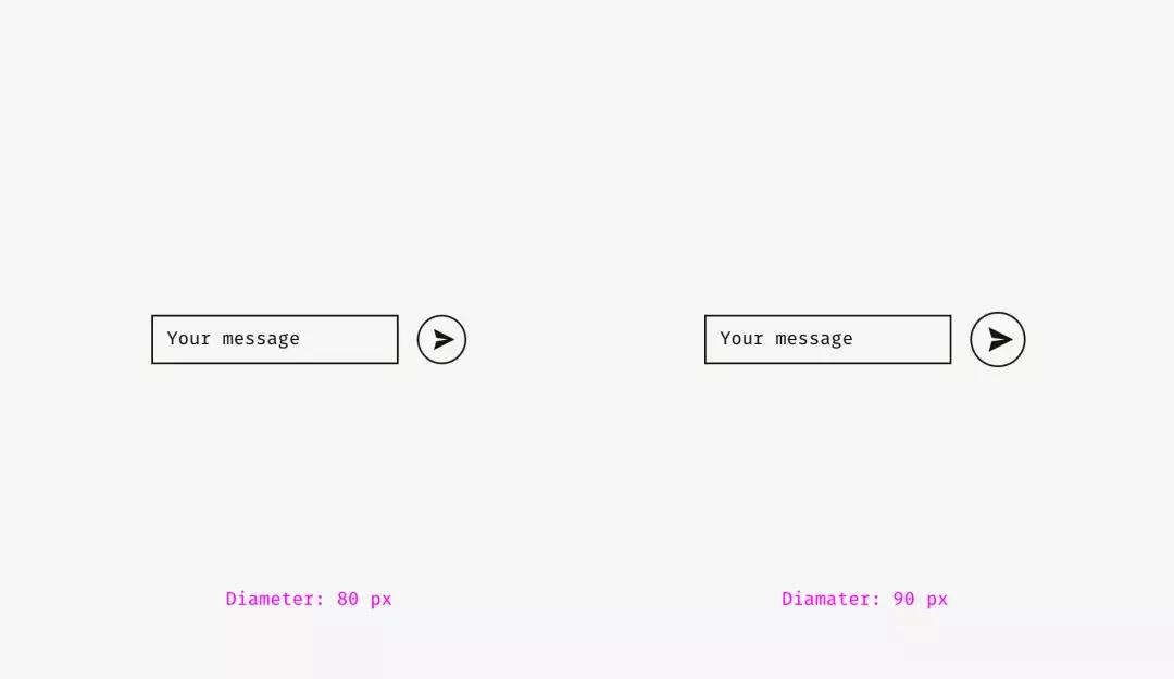
但是,如果更改按钮的样式,则不需要放大。在下面的图片中,按钮和文本框高80像素,但由于黑色填充,右侧的按钮看起来并不“失重”。
But if you change the style of the button, enlargement won’t be needed. On the picture below, the button and the textbox are 80 pixels high, but the button on the right doesn’t look “lost” owing to the strong black fill.

重点:
·视重是人眼感知物体的大小和重要性的方法,并且它不一定等于其像素大小或面积。
·圆形,菱形,三角形和其他非方形形状需要更高更宽,以便与方形形状视觉平衡。
·对于一组图标来说至关重要的是:图标区域应该留有一些空间用于视觉平衡。这是贯穿始终的原则。
Things to remember
- ·Optical weight is how human eyes perceive the size and significance of an object, and it doesn’t necessarily equal its pixel size or area.
- ·Circles, diamonds, triangles, and other non-square shapes need to be higher and wider to be optically balanced with squarish shapes.
- ·Areas for icons should have some space reserved for optical balancing. It’s crucial for sets of icons, which should look consistently.
2.不同形状的对齐方式
视觉对齐是视觉平衡(上一个主题)的延续话题。判断一下,下图的条形长度相似吗?
2. Alignment of different shapes
Optical alignment is a logical continuation of the optical balance topic. Take a look at the stripes below. Do they look as if they are of the same length?

在像素级上,答案明显是肯定的。但是,第一眼看来,下面的条形比上面的短一些。
Pixelwise, the answer is a firm “yes”. However, at first sight, the lower stripe looks shorter than the upper one.

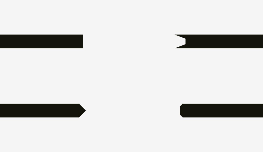
再来看一张。这次的不同在哪里?
One more picture of the two stripes. Has anything changed?

对下部条纹进行视觉补充:让下方条形尖端超过上方条形长度20像素来填补视觉空隙,这样,就能够使得两个条形在视觉上形状大小相似。
I applied optical compensation for the lower stripe. Allowing the spikes to go 20 pixels beyond the length of the upper stripe is the way to compensate a gap between the spikes and make both shapes optically equal.

现在来看一些更复杂的形状案例。
And now some more sophisticated examples of differently shaped stripes.
因此,如果你做的海报中有条形和文字,或者你想在产品卡上放置明显的“折扣”条形样元素,就要注意视觉平衡。尖端的边缘部分应该超出其他形状,尤其是在它是矩形条形的情况下。
So, if you are creating a poster with folded stripes and text on them or you are putting a bright “discount” stripe on a product card of an online store, mind making them optically balanced. Sharp edges should go a bit beyond the rest of the shape, especially if it’s a rectangle.

如果是对齐纯文本和有背景的段落呢?这取决于背景的视觉密度。如果它颜色很淡,你可以将突出显示的段落与其余文本对齐。
And what about aligning plain text and paragraphs that have a background? It depends on the visual density of the background. If it’s light, you can align the highlighted paragraph with the rest of text.
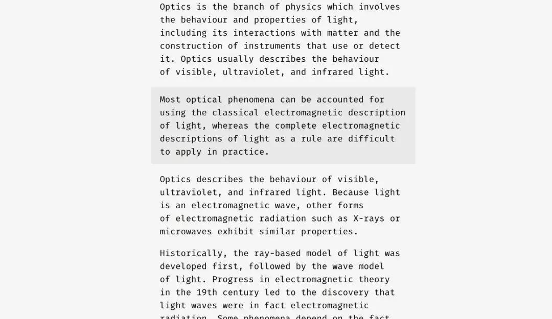
由于背景很浅,因此通常不会中断文本流。
Since the background is light, it doesn’t interrupt the usual text flow.
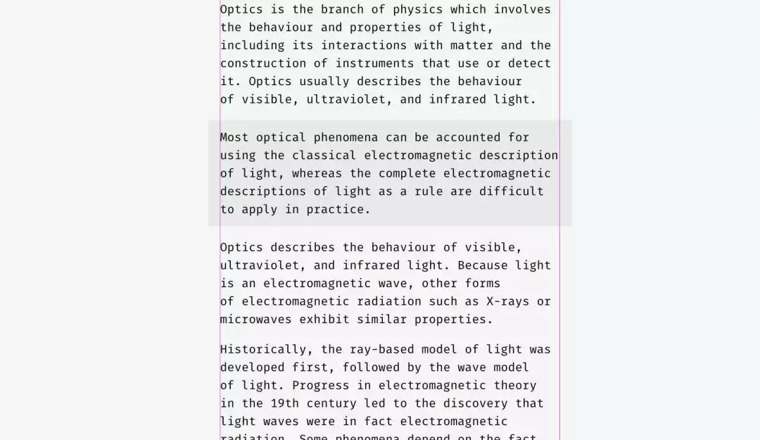
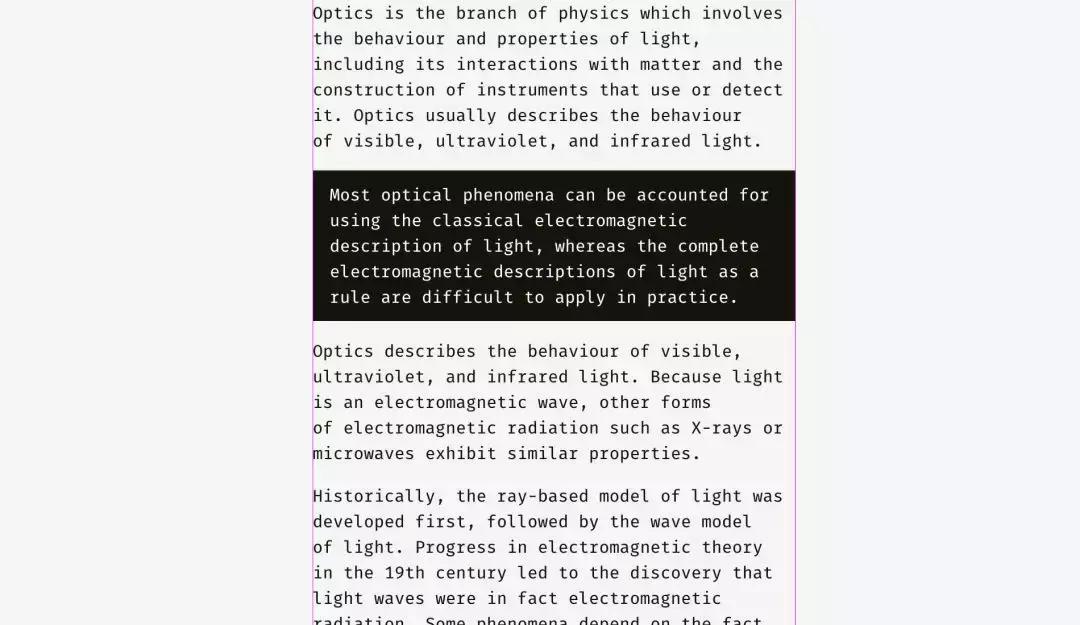
背景密度的加减,可以使用不同的方法。在下图,黑色背景与文本的其余部分对齐,而其中的白色文本缩进。
A different approach can be utilized for a dense background. On the picture, the black background is aligned with the rest of text while the white text inside of it is placed with indents.

与浅色背景的情况不同,黑色背景有相当大的视重,如果目标是无缝插入一个段落,最好将其与下图所示的方式对齐。
Unlike the case with the light background, the black one has substantial optical weight, and if the goal is to insert a paragraph seamlessly, it’s better to align it the way shown below.
相同的原理适用于按钮和输入字段。当然,这不是固定的,只是基于人类视觉感知的推荐。
The same principle will work with buttons and input fields. Of course, it’s not a dogma, just a recommendation based on human visual perception.

左侧,输入字段的浅色背景可以超出输入标签和用户输入。“发送”按钮的右边缘未与输入背景的右边缘完全对齐,因为按钮较暗并且从视觉角度看起来较重。
在右侧,输入具有实线边框,我将它们与标签对齐,而用户的输入在框内有缩进。“发送”按钮具有三角形边。按钮向右移动一点,看起来与上面的矩形输入字段平衡。
The light background of input fields on the left can go beyond input labels and user’s input. The right edge of “Send” button is not fully aligned with the right edge of input backgrounds since the button is darker and looks heavier from visual perspective.
On the right, inputs have solid borders, and I aligned them with the labels while user’s input has indents inside of the boxes. “Send” button has a triangular side. The button is moved a bit rightwards to look balanced with the rectangular input fields above.

这里我们要讨论到对齐的另一个方面 ——文本和图标按钮的对齐方式。看看下面的按钮。文字看起来是居中的吗?
And here we are approaching to one more aspect of alignment — the alignment of text and icon buttons. Look at the buttons below. The text looks centered, doesn’t it?

在右键上我将单词向左移动了一点,因为右边是三角形。此外,箭头状按钮的宽度为40像素,看起来在视觉上等于矩形按钮。
The trick is that on the right button I moved the word a bit to the left, since the right edge is triangular. Moreover, the arrow-like button is 40 pixels wider to look optically equal to the rectangular one.

文本按钮不仅具有水平对齐方式,而且还具有单词和背景的垂直对齐方式。我想讲的第一种方法,用于各种操作系统、站点和应用程序的接口。它是基于字体大写字母高度的对齐方式(所谓的高度)。它等于“H”或“I”的高度。
Not only do text buttons have horizontal alignment, but also they have vertical alignment of a word and a background. The first approach I’d like to tell about is used in the interfaces of various operating systems, sites, and applications. It’s the alignment based on the height of an uppercase letter of a font (so-called cap height). It equals the height of either “H” or “I”.

基本上,大写字母上方和下方的空格与按钮的边缘相等。这是有道理的,因为命令名称通常用标题大小写,英文字母有更多的上升部分,上部伸出部分(l,t,d,b,k,h),比下降部分,下部悬挂部分(y,j,g, p)。
Basically, the space above and below an uppercase letter and the edge of a button is equal. It makes sense because command names usually are written in title case and English letters have more ascenders, upper sticking out parts (l, t, d, b, k, h), than descenders, lower hanging parts (y, j, g, p).

另一种方法是使用字体的小写字母(所谓的x高度)的高度来对齐名称和背景。在sans和sans serif界面字体中,它等于字母“x”的高度 - 这并不奇怪。
Another approach is to align a name and a background using the height of a lowercase letter of a font (so-called x-height). In sans and sans serif interface fonts, it equals the height of — not surprisingly—the letter “x”.
这种方法也很有意义,因为文本的主要视觉重心,集中在放置小写字母的区域。
This approach also makes sense because the main optical weight of a text is concentrated in the area where lowercase letters are placed.

这些方法之间有什么区别吗?有。并没那么大。
Is there any difference between these approaches? Yep, there is a difference. And it’s not that big.

下图有更多示例。在左栏,按键的表示的上限高度方法,对于“Cancel”和“OK”两个按键肯定更好 - 在设计中被广泛应: 因为“Cancel”没有下伸部,“OK”则都是大写。
在右栏,中显示的x高度方法仅适用于“同步”按钮,其名称同时具有上部和下部伸出元素; “取消”和“确定”字样似乎过高。
More examples for comparison below. The cap-height approach represented by the left column is definitely better for “Cancel” and “OK” — so widely used buttons — because “Cancel” has no descenders and “OK” is all capitals. The x-height approach shown in the right column is better only for “Sync” button, the name of which has both an upper and a lower sticking out elements; “Cancel” and “OK” words seem to be placed too high.

图标类按钮的情况与文本类按钮略有不同。让我们在圆形按钮背景上放置一个流行的“发送”图标。哪种变体看起来更加平衡?
The situation with icon buttons is slightly different from text buttons. Let’s put a popular “Send” icon on a round button background. Which variant looks more visually balanced?

希望你注意到的是左边。这是因为不同的对齐方法。如果图标是矩形,则首选左侧图标处理方法。在某种程度上,这是正确的,因为当你向开发人员发送SVG或PNG文件时,它是一个上面有纸飞机画的矩形的纸张。右侧变体显示图标的位置,其所有锐利边缘应当与圆形按钮背景的距离相等。
Hope you’ve noticed that something is wrong with the left one. It happens because of different alignment methods. The first option treats the icon if it was a rectangle. To a certain extent that’s right because when you send an SVG or PNG file to a developer it’s a rectangular sheet with a paper plane art on it. The right variant shows the icon placed the way all its sharp edges have equal distance to the circular button background.

如果您为开发人员准备文件,则需要保留一些区域,以便他们可以将图标在背景上以视觉方式居中。
If you prepare a file for a developer, you need to reserve some area, so that they can center the icon on the background optically right.

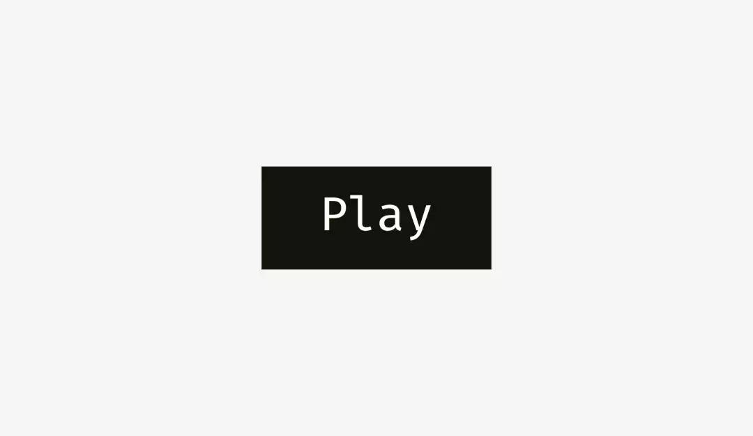
与“*放播**”按钮相同的,如果直接对齐这些形状 - 圆角矩形和三角形 - 它们看起来很奇怪。
The same story with “Play” buttons. If you directly align these shapes — a rounded rectangle and a triangle — they’ll look odd.

如果您想要更好地定位三角形,做圆形辅助线,并将此圆圈与按钮背景对齐。
If you want to position the triangle optically better, encircle it and align this circle with the button background.

重点:
·具有锋利边缘的形状应该更大或更长,以与相邻的矩形物体看起来平衡。
·在按钮背景上定位按钮名称的有效方法:大写字母高度对齐。
·做圆形辅助线,并将圆与背景对齐,是在按钮上正确定位三角形图标的有效方法之一。
Things to remember
- ·Shapes with sharp edges should be larger or longer to look balanced with the neighboring rectangular objects.
- ·Cap-height alignment is an effective method of positioning button names on button backgrounds.
- ·One of the effective ways to correctly position a triangular icon on a button is to encircle it and align the circle with the background.
3.视觉圆角
什么比圆形更圆?我曾经认为没有,但正如我在本文开头所说的那样,我们的眼睛很奇怪,有时会感觉不到我们所期望的东西。下图中的哪个圆看起来最圆滑?
3. Optical corner rounding
What can be more circular than a circle? I used to think that nothing, but as I said at the beginning of this article, our eyes are weird and sometimes perceive things not as we expect. So, which circle on the picture below looks the most smoothly circular?

我之前询问的人是在3号和4号之间进行选择。数字1和2绝对太瘦,5太丰满了。如果我们重叠第三个和第四个变体 :一个几何圆和一个修改过的圆 - 我们会发现后者比第一个更重,因此,我们的眼睛更平滑。
People who I asked before were choosing between numbers 3 and 4. Numbers 1 and 2 are definitely too skinny, 5 is too plump. If we overlap the third and the fourth variants — a geometric circle and a modified circle — we’ll find out that the latter is a trifle heavier than the first one and, consequently, more smooth to our eyes.

为了表明我的意思,我从三种著名的几何字体 Futura,Circe和Geometria来打出字母“o” 。鉴于这些高品质字体是基于人类视觉感知而构建的,并且使用了复杂的视觉构造系统,我认为它们的圆形形状看起来比几何形状更圆。这些字母是否更适合你的眼睛?
To show what I mean I took letters “o” from three famous geometric fonts — Futura, Circe, and Geometria. Given that high-quality fonts are built based on human visual perception and use a sophisticated system of optical construction, I suppose their circular shapes look more circular than geometric ones. Aren’t these letters pleasant to your eyes?

用几何圆圈重叠一下它们。即使是最几何的Futura的“o”也有四个突出的部分。此外,Circe和Geometria的字母比圆形更宽,但即使它们具有相同的高度和宽度,我们也可以看到这四个“肚子”好像它们是饥饿和过度的。
Let’s overlap them with geometric circles. Even the most geometric Futura’s “o” has four sticking out parts. Circe’s and Geometria’s letters are, in addition, wider than circles, but even if they had equal height and width, we could see these four “bellies” as if they were hungry and overate.

因此,从视觉上讲,修改后的圆圈(右侧)看起来比几何圆形(左侧)更“圆形”。
So, optically speaking, a modified circle (on the right) can look even more “circular” than a geometric one (on the left).

我们怎样才能利用这种现象?当然是在圆角上!如果你在流行的图形编辑器中使用嵌入圆角功能,结果在视觉上可能不会很好。
How can we use this phenomenon? For corner rounding, of course! If you utilize the embedded rounding feature in popular graphics editors, the result will be not optically good.

人眼立即察觉到直线突然变成曲线的变化。而这种圆角看起来并不自然。
Human eyes immediately detect the point where a straight line suddenly turns into a curve. And this rounding doesn’t look natural.

在考虑到视觉感受的情况下,我改进了这个问题。
I fixed this issue taking into account our visual perception.

这种圆角在几何圆之外有一个额外的区域,使得曲线看起来不那么突出。
This kind of rounding has an extra area beyond the geometric circle making the point where a line meets a curve unnoticeable.

试着感受这些圆角方法之间的区别。
Just try to feel the difference between these rounding methods.

现在我们可以将此方法应用于圆角按钮。
Now we can apply this approach to rounded buttons.

你可能已经注意到右边的按钮有更光滑的圆角,让你的眼睛更舒服。
与app图标相同的道理。人们不会简单地使用标准的圆角来获得完美的结果。但在我们深入研究这个主题之前,让我们来看看两个不同的圆形形状。
You might have noticed that the buttons on the right have more smooth corner rounding and it is more pleasant to your eyes.
The same story with app icons. One doesn’t simply use standard corner rounding to reach a perfect result. But before we dive into this topic let’s take a look at two differently rounded shapes.

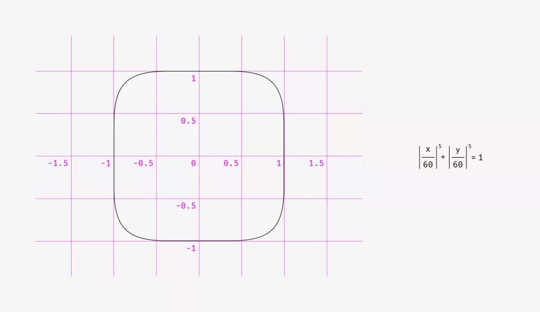
第一个是我在Sketch中创建的圆角矩形,。第二种形状是超椭圆,也称为Lamé曲线。它是由法国数学家加布里埃尔·拉姆(GabrielLamé)发现的,根据公式的不同,可以从四角星到形状看起来像圆角正方形。
The first one is a rounded rectangle, which I created in Sketch. The second shape is a superellipse, also known as Lamé curve. It was discovered by a French mathematician Gabriel Lamé and depending on the formula can vary from something like a four-pointed star to the shape looking practically as a rounded square.

Marc Edwards提出了Lamé曲线的公式,使得其具有圆滑的完美的视觉形状。从iOS 7开始,图标都基于这个准则。
Marc Edwards proposed the formula of Lamé curve that resulted a smooth and optically perfect shape. Icons starting from iOS 7 are based on it.
后来这个形状通过添加黄金比例和网格来修改、引导设计师设计新图标,但又是另一个故事了。
Later this shape was modified by adding golden ratio proportions and a grid for guiding the designers of new icons but that’s a different story.

使用像超级椭圆这样的形状的最大好处是,它们的光滑外观。另一方面,这些非标准形状难以插入真实界面中。应该将多个SVG组合在一起,在代码中包含特殊的公式或脚本,或者使用像Apple那样的PNG掩码作为其应用程序图标。
至于设计过程本身,有一个圆角的简单修复。你需要将可恢复的圆角效果转换为轮廓,进入形状编辑模式并手动移动更接近的曲线手柄。
The main benefit of using shapes like superellipse is their smooth appearance. On the other hand, these non-standard shapes are difficult to insert into a real interface. One should either combine multiple SVGs, include special formulas or scripts into the code or use PNG masks like Apple does for its app icons.
As for design process itself, there is a simple fix for rounded corners. You need to convert revertible rounding effects into an outline, enter the shape editing mode and manually move curve handles closer to each other.

对于绘制道路或地铁方案,锐角倒角的差异要更明显,这非常重要。
The difference is even more vivid with acute angle rounding, which is important for drawing road or metro schemes.

重点:
·几何圆角看起来很比较生硬,因为你可以很容易地看到直线突然变成曲线的点。
·在视觉上正确的的圆角,需要特殊的公式,或手动调整形状。
贴士:
有时,一个不理想的几何方形看起来更加方形。你可能会想,“多么荒谬的废话?”那么,你 如何看待下图的方形?哪种形状看起来更方形?
Things to remember
- ·Geometrically rounded corners look artificial because you can easily see the points where a straight line suddenly turns into a curve.
- ·Optically correct corner rounding needs special formulas or manual adjustment of a shape.
Bonus
Sometimes a not ideally geometrical square looks more squarish. You might think, “What a ridiculous nonsense?” So, what do you think about the squares below? Which shape looks more squarish?

如果你选择了左边的形状,你就能体会到无差别的视觉感受了。
If you’ve chosen the left shape, you’ve managed to hear the voice of your unbiased visual perception.

①格式塔是作为心理学术语的格式塔具有两种含义:一指事物的一般属性,即形式;一指事物的个别实体,即分离的整体,形式仅为其属性之一。也就是说,“假使有一种经验的现象,它的每一成分都牵连到其他成分;而且每一成分之所以有其特性,即因为它和其他部分具有关系,这种现象便称为格式塔。五项原则:Proximity (接近)Similarity (相似)Closure (闭合)Continuity (连续)Simplicity (简单)参考:格式塔心理学5项法则的学习与思考 腾讯CDC 2010.7.23
②视重(visual weight )
视重,Visual Weight,是设计中的一个概念,即一个物体通过视觉产生的重量。即便是在一个二维平面,某些元素也可以看起来比其他物体要重。这个概念很强大,善于利用能让我们的设计平衡,和谐,富有层次感。
END
本文转载自研习社天津分社