1 说明:
=====
1.1 pychartdir库:ChartDirector 是一款商业的图表库的python版本。
1.2 ChartDirector有多种语言的版本,使用它做的图表非常的精细漂亮,提供免费版本,但会出现logo信息。
1.3 安装方法,不是
pip install pychartdir #不是这样安装,安装比较奇特
1.4 源代码来自官方demo,进行修改和注解。
2 安装:
=====
2.1 官网*载下**:
https://www.advsofteng.com/download.html
2.2 本机是deepin-linux操作系统。*载下**了:
chartdir_python_linux_64.tar.gz
2.3 解压,将里面的lib包下的文件复制到,一个新文件夹下:chartdirector。
2.4 找到自己的python的安装路径:site-packages,将文件夹chartdirector复制在文件夹site-packages下。比如本机路径如下:
/usr/local/lib/python3.8/site-packages
2.5 新建一个文件:chartdirector.pth,将:chartdirector,复制进入,保存即可。
2.6 测试:打开python IDE,输入from pychartdir import *,如果导入成功则说明安装成功,可正常使用pychartdir。没报错,代表安装成功。
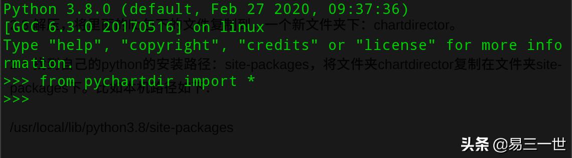
3 柱状图
======
3.1 效果图:
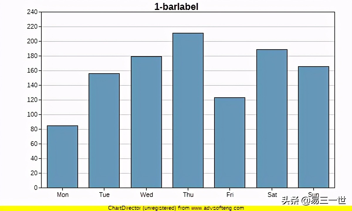
免费版有黄色的logo
3.2 代码:有讲解。
from pychartdir import *

data = [85, 156, 179, 211, 123, 189, 166]
labels = ["Mon", "Tue", "Wed", "Thu", "Fri", "Sat", "Sun"]

#实例化图标和大小设置
c = XYChart(600, 360)
# light grey (0xcccccc)
# 绘图区大小设置和定义,默认白色
c.setPlotArea(70, 20, 500, 300)
#设置背景颜色为浅灰色
#c.setPlotArea(70, 20, 500, 300,0xcccccc)

# 柱的颜色:blue (0x6699bb)
layer = c.addBarLayer(data, 0x6699bb)
#设置柱子的圆角
#layer.setRoundedCorners()
c.xAxis().setLabels(labels)

#默认y坐标轴的刻度
#定义y坐标轴刻度间隔40(0-50-100-150)
#c.yAxis().setTickDensity(40)

# dark grey (0x555555)

#标题名挂在y坐标轴边上,左边
#c.yAxis().setTitle("1-barlabel", "arialbd.ttf", 14, 0x555555)
#标题名挂在x坐标轴下,因为有logo,看不出来
#c.xAxis().setTitle("1-barlabel", "arialbd.ttf", 14, 0x555555)
#正常的标题名位置
#c.addTitle("1-barlabel", "arialbd.ttf", 14, 0x555555)
#默认字体,字体大小,颜色
c.addTitle("1-barlabel")

#生成图表,在根目录下
c.makeChart("barlabel.png")
4 高级柱状图
=========
4.1 效果图:
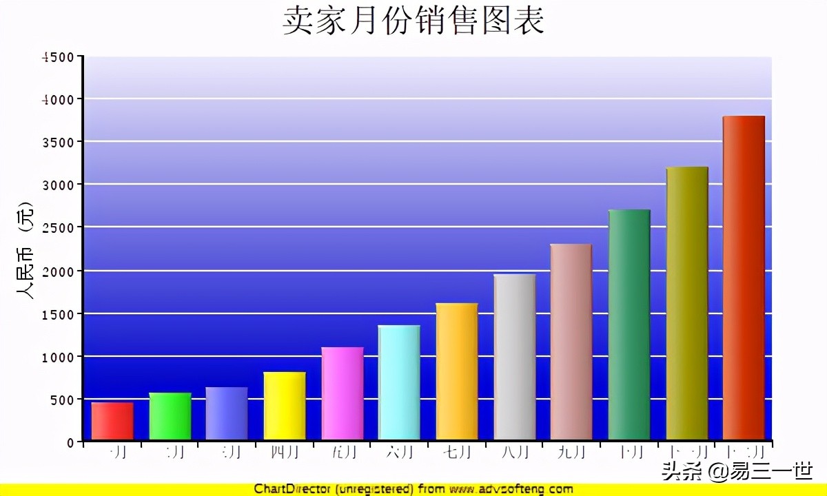
4.2 代码:
from pychartdir import *

data = [450, 560, 630, 800, 1100, 1350, 1600, 1950, 2300, 2700, 3200, 3800]

labels = ["一月", "二月", "三月", "四月", "五月", "六月", "七月", "八月", "九月",
    "十月", "十一月", "十二月"]

c = XYChart(600, 360)

#注意默认不支持中文,需要自己提前*载下**好中文字体:simsun.ttf
c.addTitle("卖家月份销售图表", "simsun.ttf", 18)

# Set the plotarea at (60, 40) and of size 500 x 280 pixels. Use a vertical gradient
# color from light blue (eeeeff) to deep blue (0000cc) as background. Set border and
# grid lines to white (ffffff).
c.setPlotArea(60, 40, 500, 280, c.linearGradientColor(60, 40, 60, 280, 0xeeeeff,
    0x0000cc), -1, 0xffffff, 0xffffff)

# Add a multi-color bar chart layer using the supplied data. Use soft lighting effect
# with light direction from left.
c.addBarLayer3(data).setBorderColor(Transparent, softLighting(Left))

c.xAxis().setLabels(labels)
c.xAxis().setTickOffset(0.5)
c.yAxis().setTitle("人民币 (元)", "simsun.ttf", 10)
c.xAxis().setLabelStyle("simsun.ttf", 8)
c.yAxis().setLabelStyle("simsun.ttf", 8)

c.xAxis().setWidth(2)
c.yAxis().setWidth(2)

c.makeChart("2.png")
5 圆锥图
=======
5.1 效果图
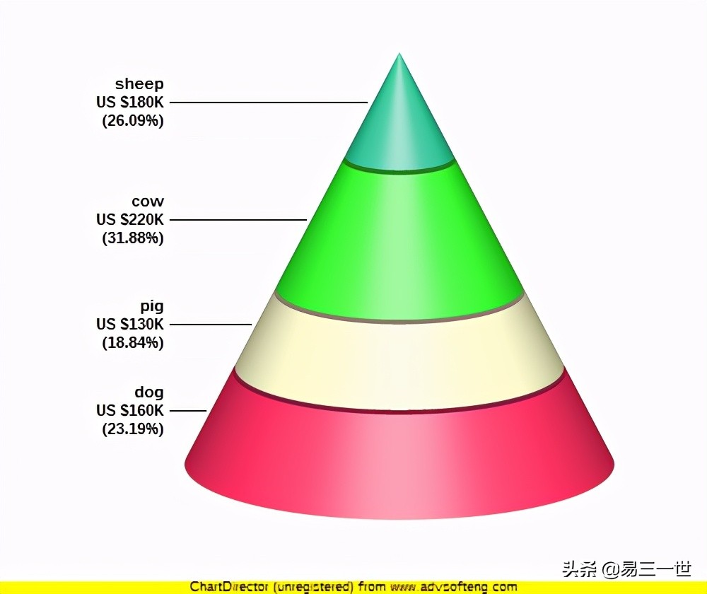
5.2 代码:
from pychartdir import *

data = [160, 130, 220, 180]
labels = ["dog", "pig", "cow", "sheep"]
colors = [0xFF3366, 0xFFFFCC, 0x33FF33,0x33CC99]

c = PyramidChart(500, 420)
c.setConeSize(282, 182, 152, 302)
# Set the elevation to 15 degrees
c.setViewAngle(15)

c.setData(data, labels)
# Set the layer colors to the given colors
c.setColors2(DataColor, colors)

# Leave 1% gaps between layers
c.setLayerGap(0.01)

# Add labels at the left side of the pyramid layers using Arial Bold font. The labels will have 3
# lines showing the layer name, value and percentage.
c.setLeftLabel("{label}\nUS ${value}K\n({percent}%)", "arialbd.ttf")

# Output the chart
c.makeChart("cone.png")
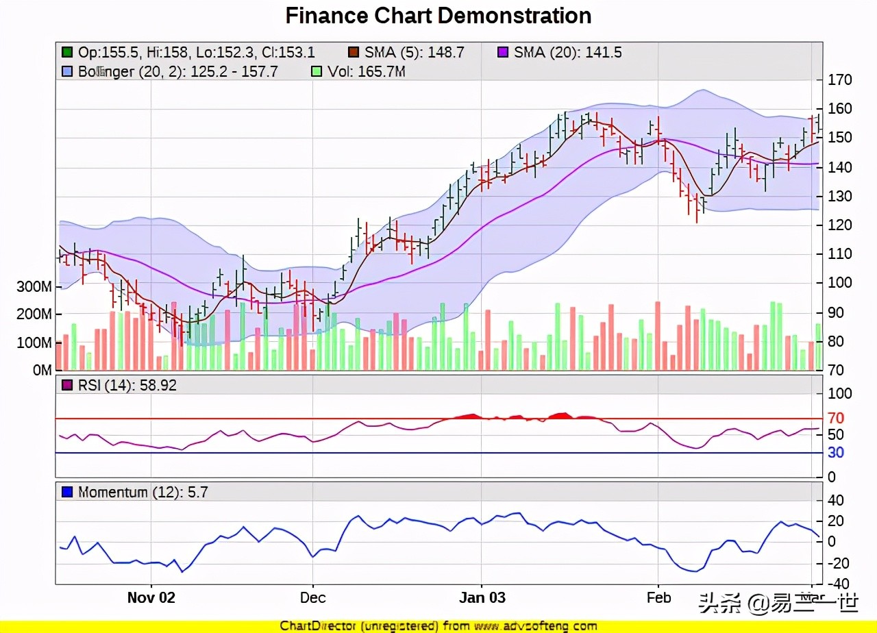
6 附注几张好的图:
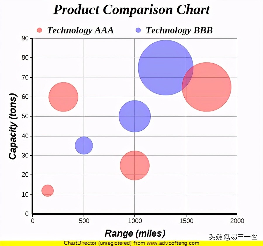

复杂图-1
复杂图-2
简单介绍到这里,喜欢的可以继续研究。