整理翻译:设计与设计师(ID:Design-Designer)作者: Mark Wilson略作删减,版权归原作者所有,转载请注明出处。
正文总计:7348 字 7图
预计阅读时间:19分钟
Apple is bringing back crazy colors after years of minimalism.
Here’s why
为什么经历了多年的极简主义风格之后,苹果重新推出了疯狂的配色?
“When you think about this company, it started in color and was always known for color,” says Laurie Pressman, VP of the Pantone Color Institute.
“当你想到这家公司时,首先想到的是色彩,它一直以色彩而闻名。”彩通色彩研究所(Pantone color Institute)Laurie Pressman如是说。
[图片来源: Apple]
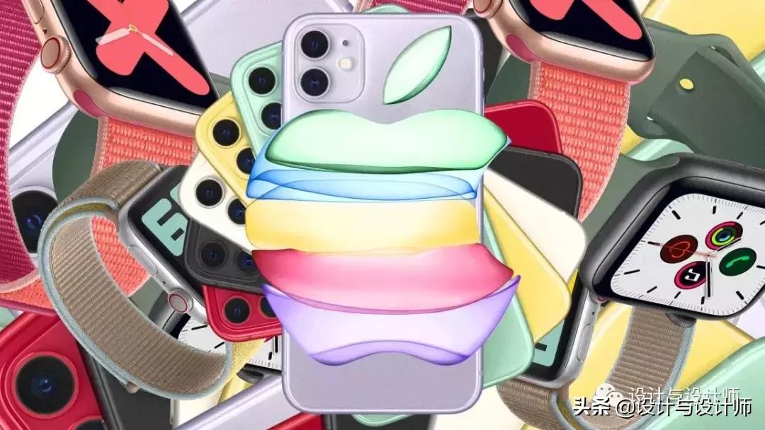
Time moves fast. It’s been almost 20 years now since Apple turned away from building colorful computers, and embraced the minimalist white, black, and gray look. Through the mid-aughts, we still had occasional pops of color from the iPod mini line and the short-lived iPhone 5c, but the Apple of the 2000s and 2010s has largely been defined by glass and machined aluminum. Premium? Yes. Timeless? Certainly. Expressive? No.
时间过得很快。苹果公司已经有将近20年没有生产彩色外观的电脑了,而是采用了极简主义的白色、黑色和灰色的外观。在今年8月中旬,iPod mini系列和寿命较短的iPhone 5c的颜色我们仍然偶尔能够看到,但2000年代到2010年代的苹果(Apple)的产品基本上是由玻璃和铝加工而成的。高溢价?是的。永恒?当然。有表现力?不。
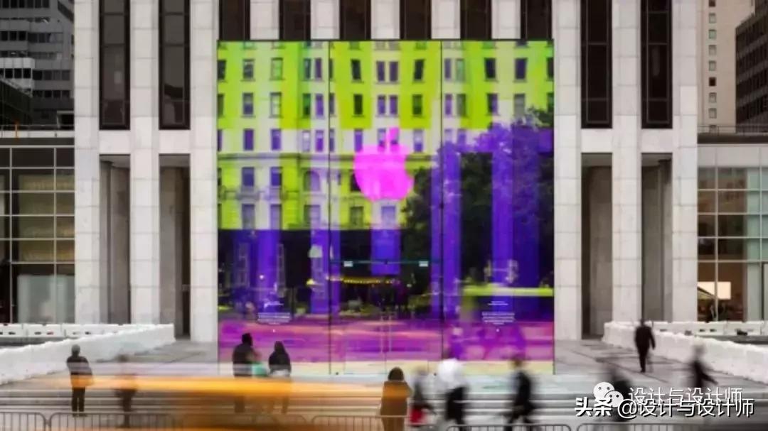
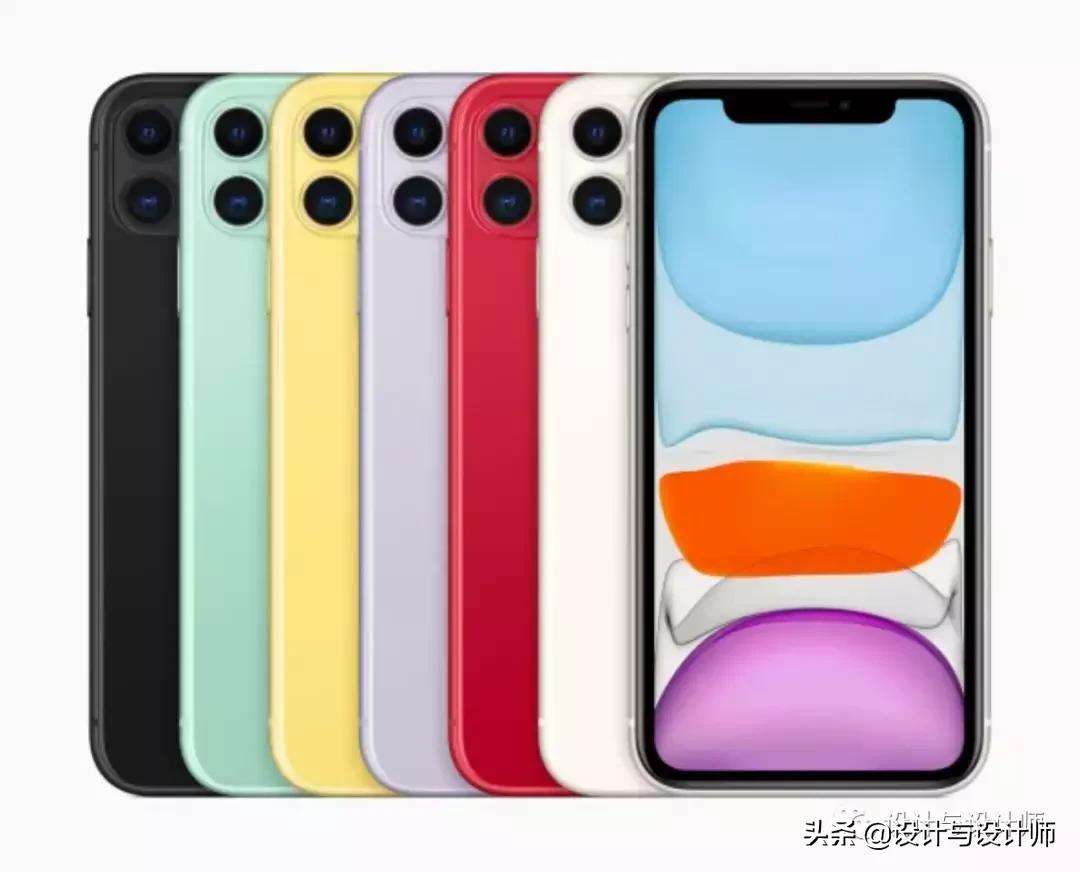
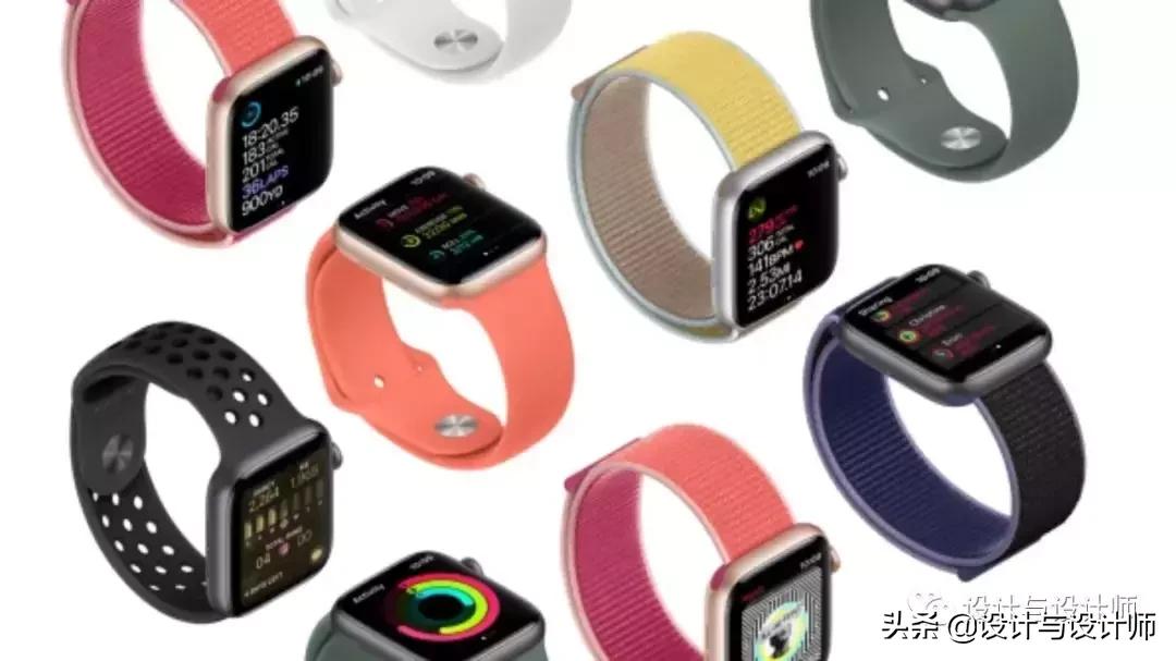
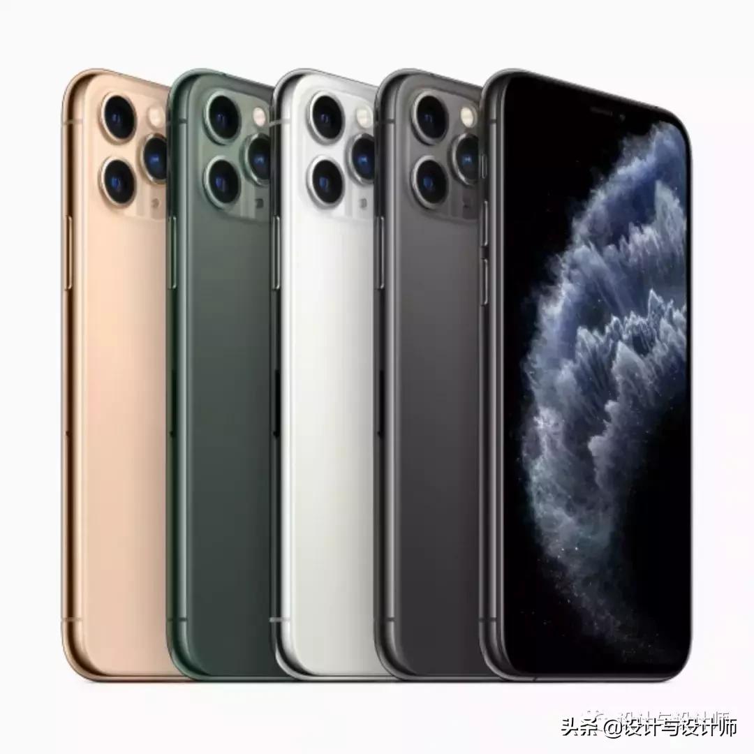
Suddenly, Apple is presenting consumers with a slew of color options again—and in its flagship products. The new iPhone 11, announced this week at the company’s annual launch event, is available in a whopping six colors, from a bold red to a trio of pastels including a light lavender, yellow, and teal. Even the super-premium new iPhone 11 Pro introduces an intriguing green alongside a more typical warm gold and two grays. And this news comes in the wake of Apple’s newly announced New York store, which will no longer be a transparent cube of glass but an iridescent, rainbow-hued one. When I asked Laurie Pressman, VP of the Pantone Color Institute, about the change in design direction, she seemed to feel like it was about dang time Apple moved on from the mausoleum and adopted color again.
突然之间,苹果公司又向消费者提供了一系列的颜色选择——在其旗舰产品中也是如此。本周在苹果年度发布会上发布的新款iPhone 11有六种颜色可供选择,从大胆的红色到淡紫色、黄色和蓝绿色三种颜色。新款iPhone 11 Pro更是推出了一款引人入胜的绿色,配以更典型的暖金色和两种灰色。这一消息是在苹果公司(Apple)刚刚宣布在纽约开设新店之后发布的。新店将不再是一块透明的玻璃立方体,而是一块彩虹色的玻璃。我向彩通色彩研究所(Pantone Color Institute)副总裁Laurie Pressman咨询关于设计方向的变化,她似乎觉得苹果公司离开困区重新采用色彩的时代已经到来了。
[图片来源: Apple]
“When you think about this company, it started in color and was always known for color,” says Pressman of Apple.
“当你想到这家公司的时候,你会发现它是从色彩开始的,而且一直以色彩闻名。”关于苹果公司,Pressman如是说。
So why is Apple embracing its past now? Because as Pressman points out, Apple is thinking about its iPhones as accessories, not technologies. And color is currently on trend—perhaps no surprise for a time when many of us need something to feel better about the world.
那么,苹果公司为什么要拥抱它的过去呢?因为正如Pressman所指出的,苹果将iphone视为配件,而非技术。如今,色彩正成为一种流行趋势,这并不奇怪——或许在我们需要一些东西来让自己对这个世界感觉更好的时候。
[图片来源: Apple]
At Pantone, Pressman has worked for multiple consumer electronics companies like LG and Huawei, though not Apple. While she was working with Huawei, picking colors for phones that would be sold in China, one insight in particular stuck with her. “Huawei told us, people keep their phones for a year, then trade them in,” she says, “because people [in China] were treating their phones as an accessory.” Today, phones are a critical piece of personal expression. “I found it fascinating, because I don’t think that had been the case in the U.S., that people were trading in their phones to get a new accessory for the next year. Maybe we were treating them as technology.” Indeed, Apple’s sluggish iPhone sales seem evidence of consumer apathy. For some consumers, a piece of technology that hasn’t changed radically in years just isn’t worth upgrading.
在彩通公司Pressman曾为LG和华为等多家消费电子公司做过色彩工作,但从没有为苹果公司工作过。她曾经与华为合作,为即将在中国销售的手机挑选颜色,其中一种见解尤其让她印象深刻。她说:“华为告诉我们,人们把手机使用一年,就可能把它换掉,因为人们(在中国)把手机当作配件。”如今,手机是一种个人身份非常重要的表现方式。“我觉得这很有趣,因为我不认为在美国是这样的,在美国,人们用手机来换取明年的新配件。也许我们把它们当成了技术来对待。事实上,苹果iPhone销售疲软似乎证明了消费者的冷漠。对一些消费者来说,一项多年来没有发生根本性变化的技术根本不值得升级。
[图片来源: Apple]
But Pressman points to all sorts of precedents that make now a good time for a consumer electronics company to adopt color, beyond fashion appeal. Social media, she says, is driving millennials and generation Z to be more normalized to color across the board. “Think how much time people spend on social media. What am I doing to get people’s attention? Color,” says Pressman. “If you’re just using grays and beiges, you’re just going to meld into the background and get lost.” On these platforms, life is becoming larger than life. Restaurants, for instance, are being designed with neon signs and patterned backdrops to be Instagrammable.
但Pressman还指出,各种各样的先例都为消费电子产品公司提供了采用颜色的好时机。她说,她说,社交媒体推动千禧一代和Z世代更全面地接受色彩。“想想人们在社交媒体上花了多少时间。我该怎么做才能引起人们的注意呢?“色彩,”Pressman说。“如果你只是使用灰色和米色,只会被背景淹没,迷失方向。”在这些平台上,生活正在变得覆盖生活的方方面面。例如,餐馆正在设计霓虹灯标志和图案背景,以便让人们更容易记住它。
While Pressman and I talk, she looks at the iPhone 11 Pro colors for the first time. What immediately catches her eye is the green metallic, what she describes as a teal on her monitor. “This makes me want a new phone,” she says, pointing out that a similar color was in a recent Pantone color forecast. Repeatedly, she calls the color “handsome.” As for the rest of the line, its metallic finishes imply sophistication, she says. “I think there’s something automatic. We see metallic as more premium or expensive,” she says. “It always engages the eye.” Which makes sense, since the iPhone 11 Pro is the premium iPhone line.
在我和Pressman交谈时,她第一次看到了iPhone 11 Pro的颜色。立即吸引她眼球的是暗夜绿色,她在显示器上描述为蓝绿色。“这让我想要一部新手机,”她说,并指出Pantone最近的颜色预测中也出现了类似的颜色。她反复称赞这种颜色“帅气”。她说,至于该系列的其他部分,金属饰面意味着精致。“我认为这是自动的。我们认为金属更高档或更昂贵,”她表示。它一定会吸引人们的眼球。这是很有道理的,因为iPhone 11 Pro是iPhone高端系列。
[图片来源: Apple]
The more nuanced story, however, is in the less expensive iPhone 11 line. Pressman explains that white, black, and red are “basic shades,” and pretty safe as far as colors go. “Red is your most accepted bright,” says Pressman. “People easily pick a red phone and it can go with anything—it’s not objectionable like maybe a bright orange could be.” The other iPhone colors she describes as “sherberty pastels.”
不过,更微妙的故事发生在价格较低的iPhone 11系列上。普雷斯曼解释说,白色、黑色和红色是“基本色调”,就颜色而言相当安全。普雷斯曼说:“红色是你最能接受的明亮颜色。”“人们很容易就拿起一部红色的手机,它可以和任何东西搭配——它并不像鲜艳的橙色那样令人反感。她形容iPhone的另一种颜色是“sherberty pastels”。
These pastels are part of another trend—that color is losing its associations with gender, she argues. And you can see that particularly in the sherberts that would have been relegated to Easter eggs and spring dresses in decades passed. “Maybe it started with millennial pink then made its way across other pastel shades,” says Pressman. But across all aspects of design, she says, these pastels are in, from home decor to product packaging. And as she points out, when you have consumers picking out a pastel couch, you know that color family has gone mainstream because people feel secure enough displaying that color in their home for a long time to come.
她认为,这些粉彩色是另一种趋势的一部分,即颜色正在逐步没有性别界限。你可以看到这一点,尤其是在夏尔巴人身上,在过去的几十年里,夏尔巴人一直被归入复活节彩蛋和春装的范畴当中。Pressman说:“也许它始于千禧一代的粉色,然后在其他柔和色调中流行开来。”但是,从家居装饰到产品包装,这些粉彩在设计的各个方面都很流行。正如Pressman所指出的,当消费者选择一款柔和色彩的沙发时,你就知道这些色彩家族已经成为主流,因为在未来很长一段时间里,人们都觉得在家里展示这种颜色是足够安全的。
Finally, the pastels offer us something else, Pressman argues. In a time of political upheaval, and a world where our gadgets are seen more like drugs than salves, “they’re the antithesis of technology,” says Pressman. “These colors are calming. They’re optimistic. They’re gentle.”
最后,普雷斯曼认为,粉彩色还为我们提供了其他东西。在一个政治动荡的时代,在一个电子产品更像是*品毒**而不是药物的世界里,“它们是科技的对立面,”普雷斯曼说。“这些颜色让人平静。它们乐观,温柔。”
She laughs for a moment at the certain irony at play, that technology, which is “making us crazy,” could also be calming us down. “But I applaud Apple for this,” she concludes with a chuckle.
她笑了一会儿,因为其中的讽刺意味:“让我们疯狂”的技术,也可能让我们平静下来。“但我也因此为苹果喝彩,”她笑着说。
About the Author
关于作者
Mark Wilson is a senior writer at Fast Company who has written about design, technology, and culture for almost 15 years. His work has appeared at Gizmodo, Kotaku, PopMech, PopSci, Esquire, American Photo and Lucky Peach More
Mark Wilson是Fast Company的资深作家,他写了近15年的设计、技术和文化方面的文章。他的作品曾发表在Gizmodo、Kotaku、PopMech、PopSci、Esquire、American Photo和Lucky Peach 上面
免责申明:公众号宗旨是收集好的资料分享,非盈利性质。部分内容来源于网络或网友自主投稿编辑整 理,版权归原作者所有,其内容为作者个人观点,并不代表本公众号赞同其观点和对其真实性负责。如您(单位或个人)认为本公众号某部分内容有侵权嫌疑,请通知我们,我们将第一时间予以更改或删除。