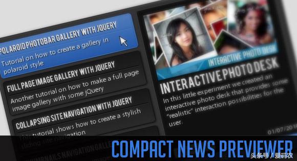
今天我们将创建一个新闻预览器,让你以一种紧凑的方式展示你的最新文章或新闻。新闻预览者将会显示一些左边的文章列表和文章的预览,并且在右边有一个更长的描述。一旦点击左边的新闻,预览就会出现。
让我们从标记开始。
标记
我们将有一个主容器“cn_wrapper”,它将包含一个与类“cn_preview”和一个带有类“cn_list”的右元素。预览div将包含内容元素。每一个都包含一个预览图像,一个标题和描述,以及一些跨度和一个链接到真实的文章。
在左边的列表中,我们将会有一个简短的描述条目。我们还将添加一个导航,用于在容器末尾的页面中进行操作:
<div class="cn_wrapper">
<div id="cn_preview" class="cn_preview">
<div class="cn_content" style="top:5px;">
<img src="images/polaroidphotobar.jpg" alt=""/>
<h1>Polaroid Photobar Gallery with jQuery</h1>
<span class="cn_date">28/09/2010</span>
<span class="cn_category">Tutorials</span>
<p>In this tutorial we are going to create an...</p>
<a href="http://tympanus.net/codrops/2010/09/28/polaroid-photobar-gallery/" target="_blank" class="cn_more">Read more</a>
</div>
<div class="cn_content">
<img src="images/fullpageimagegallery.jpg" alt=""/>
<h1>Full Page Image Gallery with jQuery</h1>
<span class="cn_date">08/09/2010</span>
<span class="cn_category">Tutorials</span>
<p>In this tutorial we are going to create a stunning...				</p>
<a href="http://tympanus.net/codrops/2010/09/08/full-page-image-gallery/" target="_blank" class="cn_more">Read more</a>
</div>
...	</div>
<div id="cn_list" class="cn_list">
<div class="cn_page" style="display:block;">
<div class="cn_item selected">
<h2>Polaroid Photobar Gallery with jQuery</h2>
<p>Tutorial on how to create a gallery in polaroid style</p>
</div>
<div class="cn_item">
<h2>Full Page Image Gallery with jQuery</h2>
<p>Another tutorial on how to make a full gallery</p>
</div>
...		</div>
<div class="cn_page">
...		</div>
<div class="cn_page">
...		</div>
<div class="cn_nav">
<a id="cn_prev" class="cn_prev disabled"></a>
<a id="cn_next" class="cn_next"></a>
</div>
</div></div>
预览容器中的第一个内容项将已经具有被滑动的样式,即前5个像素的位置。所有其他预览都是“隐藏”的,因为它们的顶部是310像素。
项目列表将被划分为每个页面最多包含5个项目的页面。
让我们来看看它的风格。
CSS
我们将使用许多CSS3属性来创建一些简洁的效果。我们将使用阴影、圆边和梯度的RGB和十六进制值。
让我们从主容器开始。我们将它设置为相对的,这样我们就可以在它里面使用一些绝对的定位:
.cn_wrapper{ margin:90px auto 0px auto; width:500px; height:300px; position:relative; color:#fff; overflow:hidden; padding:5px; text-shadow:1px 1px 1px #000; border:1px solid #111; background-color:#333; -moz-box-shadow:1px 1px 4px #222; -webkit-box-shadow:1px 1px 4px #222; box-shadow:1px 1px 4px #222; -moz-border-radius:5px; -webkit-border-radius:5px; border-radius:5px;}
我们的观众内部标题将具有以下风格:
.cn_wrapper h1{ font-size:20px; text-transform:uppercase;}.cn_wrapper h2{ font-size:12px; border-bottom:1px solid #000; padding-bottom:4px; text-transform:uppercase;}
h2在预览列表中使用,我们给它一个底部边框,在它下面创建一个漂亮的雕刻线条。这将会起作用,因为我们会给p,它是一个顶部的边界,颜色较浅。
预览和列表的位置都是绝对的,所以我们将首先定义通用样式,然后我们覆盖左边的预览:
.cn_preview, .cn_list{ width:250px; height:300px; position:absolute; top:2px; left:6px;}.cn_preview{ left:255px;}
在预览中,我们将拥有几个内容元素,这些内容元素的样式如下所示:
.cn_content{	border:1px solid #444;	top:310px;/*5*/
left:5px;	width:219px;	padding:10px;	position:absolute;	background-color:#101010;	height:275px;	-moz-border-radius:5px;	-webkit-border-radius:5px;	border-radius:5px;}
这些元素将在JavaScript中激活。最初,我们想要隐藏它们,所以我们设置了一个大于整个包装器本身的顶部。这就是为什么我们将包装器的溢出设置为隐藏的原因,这样我们就不会看到任何超出包装器边界的东西。
现在,我们将对内容div中的元素进行样式化。
在我们的例子中,图像的最大宽度是215像素。请注意,如果您有不同大小的图像,您将不得不适应它下面的所有元素。在这种情况下,图像的高度为119像素。这就是我们要建立的所有元素的高度。
.cn_content img{ width:215px; -moz-box-shadow:1px 1px 4px #000; -webkit-box-shadow:1px 1px 4px #000; box-shadow:1px 1px 4px #000;}
日期和类别将完全定位在内容div的底部:
.cn_date{ position:absolute; bottom:30px; right:8px; font-size:11px;}.cn_category{ position:absolute; bottom:30px; left:8px; font-size:11px; padding:1px 3px; background:#ccc; border:1px solid #ddd; color:#000; text-shadow:-1px 0px 1px #fff; -moz-border-radius: 3px; -webkit-border-radius: 3px; border-radius: 3px;}
作为一个p元件的描述将具有固定的高度,并且如果它较长,将被切断:
.cn_content p{ height:57px; margin-top:2px; overflow:hidden;}
将与原始物品链接的按钮将会以一定的坡度、一个盒子阴影和左右底部的圆形边界将其与内容相结合:
a.cn_more{	position:absolute;	padding: 4px 0px;	left:0px;	bottom:0px;	width:236px;	color:#fff;	text-align:center;	font-size:12px;	letter-spacing:1px;	text-shadow:1px 1px 1px #011c44;	text-transform:uppercase;	text-decoration: none;	border:1px solid #4c7ecb;	outline:none;	cursor:pointer;	background-color: #1951A5;	background-image:
-moz-linear-gradient(
top,			rgba(255,255,255,0.25),			rgba(255,255,255,0.05)
);	background-image:
-webkit-gradient(
linear,
left top,
left bottom,			color-stop(0, rgba(255,255,255,0.25)),			color-stop(1, rgba(255,255,255,0.05))
);	-moz-border-radius: 0px 0px 5px 5px;	-webkit-border-bottom-left-radius: 5px;	-webkit-border-bottom-right-radius: 5px;	-border-bottom-left-radius: 5px;	-border-bottom-right-radius: 5px;	-moz-box-shadow:1px 1px 3px #111;	-webkit-box-shadow:1px 1px 3px #111;	box-shadow:1px 1px 3px #111;}
在悬停时改变字体的颜色会产生一个漂亮的刻字效果:
a.cn_more:hover{ color: #011c44; text-shadow: 1px 1px 1px #ccdffc;}
现在我们将对列表中的项进行样式化。它们将会有一个渐变背景,它会在悬停上改变。我们还将对所选项应用悬浮效果。
.cn_item{	border:1px solid #090909;	cursor:pointer;	position:relative;	overflow:hidden;	height:49px;	color:#fff;	padding:5px;	margin:6px 5px 0px 0px;	text-shadow:1px 1px 1px #000;	background:#2b2b2b;	background:
-webkit-gradient(
linear,
left top,
left bottom,			from(#171717),			to(#2b2b2b)
);	background:
-moz-linear-gradient(
top,			#171717,			#2b2b2b
);	-moz-box-shadow:1px 1px 3px #111;	-webkit-box-shadow:1px 1px 3px #111;	box-shadow:1px 1px 3px #111;	-moz-border-radius:5px;	-webkit-border-radius:5px;	border-radius:5px;}.cn_item:hover, .selected{	border-color:#4c7ecb;	background-color: #1951A5;	background-image:
-moz-linear-gradient(
top,			rgba(255,255,255,0.25),			rgba(255,255,255,0.05)
);	background-image:
-webkit-gradient(
linear,
left top,
left bottom,			color-stop(0, rgba(255,255,255,0.25)),			color-stop(1, rgba(255,255,255,0.05))
);}
标题下面的雕刻线条也会改变颜色:
.cn_item:hover h2,.cn_list .selected h2,.cn_item:active h2{ border-color:#2C5FAC;}.cn_item:hover p,.cn_list .selected p,.cn_item:active p{ border-color:#527CBB;}
活动的伪类,即当我们点击一个项目时,会使用以下样式的文字效果:
.cn_item:active { color: #011c44; text-shadow: 1px 1px 1px #ccdffc;}
清单项目中的简短描述将有一个固定的高度和一个顶部边框,与h2的底部边框一起将创建一个雕刻的外观线条:
.cn_list p{ height:29px; padding-top:2px; overflow:hidden; border-top:1px solid #333;}
现在让我们来设计导航。我们将绝对设置在列表容器的底部:
.cn_nav{ width:55px; height:24px; position:absolute; bottom:0px; left:94px;}
下一项和之前的元素将有如下的共同风格:
a.cn_next, a.cn_prev{ float:left; height:23px; width:23px; background-color:#212121; background-repeat:no-repeat; background-position:center center; cursor:pointer; outline:none; border:1px solid #111; -moz-border-radius: 5px; -webkit-border-radius: 5px; border-radius: 5px; -moz-box-shadow: 1px 1px 3px #000; -webkit-box-shadow: 1px 1px 3px #000; box-shadow: 1px 1px 3px #000;}
现在,我们只设置了背景图像的各个风格:
a.cn_next{ background-image:url(../images/next.png);}a.cn_prev{ margin-right:5px; background-image:url(../images/prev.png);}
在悬停上我们只是改变背景颜色:
.cn_nav a:hover{ background-color:#101010;}
当我们点击一个导航条目时,我们会将它向下移动1个像素,这样它看起来就会被压缩。我们可以通过将保证金顶部设为1像素来进行:
.cn_nav a:active{ margin-top:1px; background-color:#000;}
不活跃的导航元素的不透明度为0.5:
.cn_nav a.disabled{ opacity:0.5;}
我们需要定义的最后一件事是名单上的那些页是不可见的。我们将让他们在JavaScript中可见:
.cn_page{ display:none;}
这是风格。现在,让我们用jQuery添加效果!
JavaScript
为了达到效果,我们将使用一些缓解措施,所以不要忘记加入jQuery放松插件。
在jQuery函数中,我们首先定义一些变量:
//caching//next and prev buttonsvar $cn_next = $('#cn_next');var $cn_prev = $('#cn_prev');//wrapper of the left itemsvar $cn_list = $('#cn_list');var $pages = $cn_list.find('.cn_page');//how many pagesvar cnt_pages = $pages.length;//the default page is the first onevar page = 1;//list of news (left items)var $items = $cn_list.find('.cn_item');//the current item being viewed (right side)var $cn_preview = $('#cn_preview');//index of the item being viewed.//the default is the first onevar current = 1;
对于每个条目,我们将其索引存储在所有文档中。我们绑定一个点击事件,它可以滑动当前的或点击的项目。根据当前项(如果它在新点击之前或之后出现),单击后的按钮将从上或下移动:
$items.each(function(i){	var $item = $(this);	$item.data('idx',i+1);	$item.bind('click',function(){		var $this 		= $(this);		$cn_list.find('.selected').removeClass('selected');		$this.addClass('selected');		var idx			= $(this).data('idx');		var $current 	= $cn_preview.find('.cn_content:nth-child('+current+')');		var $next		= $cn_preview.find('.cn_content:nth-child('+idx+')');		if(idx > current){			$current.stop()
.animate({						'top':'-300px'
},600,'easeOutBack',function(){
$(this).css({'top':'310px'});
});			$next.css({				'top':'310px'
}).stop()
.animate({				'top':'5px'
},600,'easeOutBack');
}		else if(idx < current){			$current.stop()
.animate({						'top':'310px'
},600,'easeOutBack',function(){
$(this).css({'top':'310px'});
});			$next.css({				'top':'-300px'
}).stop()
.animate({				'top':'5px'
},600,'easeOutBack');
}
current = idx;
});
});
现在我们将定义在导航中单击next时会发生什么情况。下一页如果存在,应该退色,如果没有下一页,按钮需要被禁用:
$cn_next.bind('click',function(e){	var $this = $(this);	$cn_prev.removeClass('disabled');
++page;	if(page == cnt_pages)		$this.addClass('disabled');	if(page > cnt_pages){
page = cnt_pages;		return;
}	$pages.hide();	$cn_list.find('.cn_page:nth-child('+page+')').fadeIn();
e.preventDefault();
});
前一页的内容相同:
$cn_prev.bind('click',function(e){	var $this = $(this);	$cn_next.removeClass('disabled');
--page;	if(page == 1)		$this.addClass('disabled');	if(page < 1){
page = 1;		return;
}	$pages.hide();	$cn_list.find('.cn_page:nth-child('+page+')').fadeIn();
e.preventDefault();
});
为了让整个事情看起来更漂亮,我们会将以下几行添加到HTML的标题中,以使标题更加美观:
<script src="js/cufon-yui.js" type="text/javascript"></script><script src="js/Bebas_400.font.js" type="text/javascript"></script><script type="text/javascript">
Cufon('.cn_wrapper h1,h2', {
textShadow: '-1px 1px black'
});</script>
就是这个!我们希望您喜欢本教程,并发现它很有用!