艺酷推选第397期
施王忠 MR.Shi
平面设计师
2012年毕业于杭州师范大学美术学院视觉传达系,毕业后进入地产广告机构,曾服务于多个知名地产企业与项目。2014年初合作创办宁波早安设计有限公司,并担任设计总监,开始从广告设计转向品牌设计,深入研究品牌形象、图形及字体,专注于品牌设计服务及中文字体的探索实践。自2015年初起,同时担任浙江万尊股份有限公司设计总监,维护市场品牌形象。
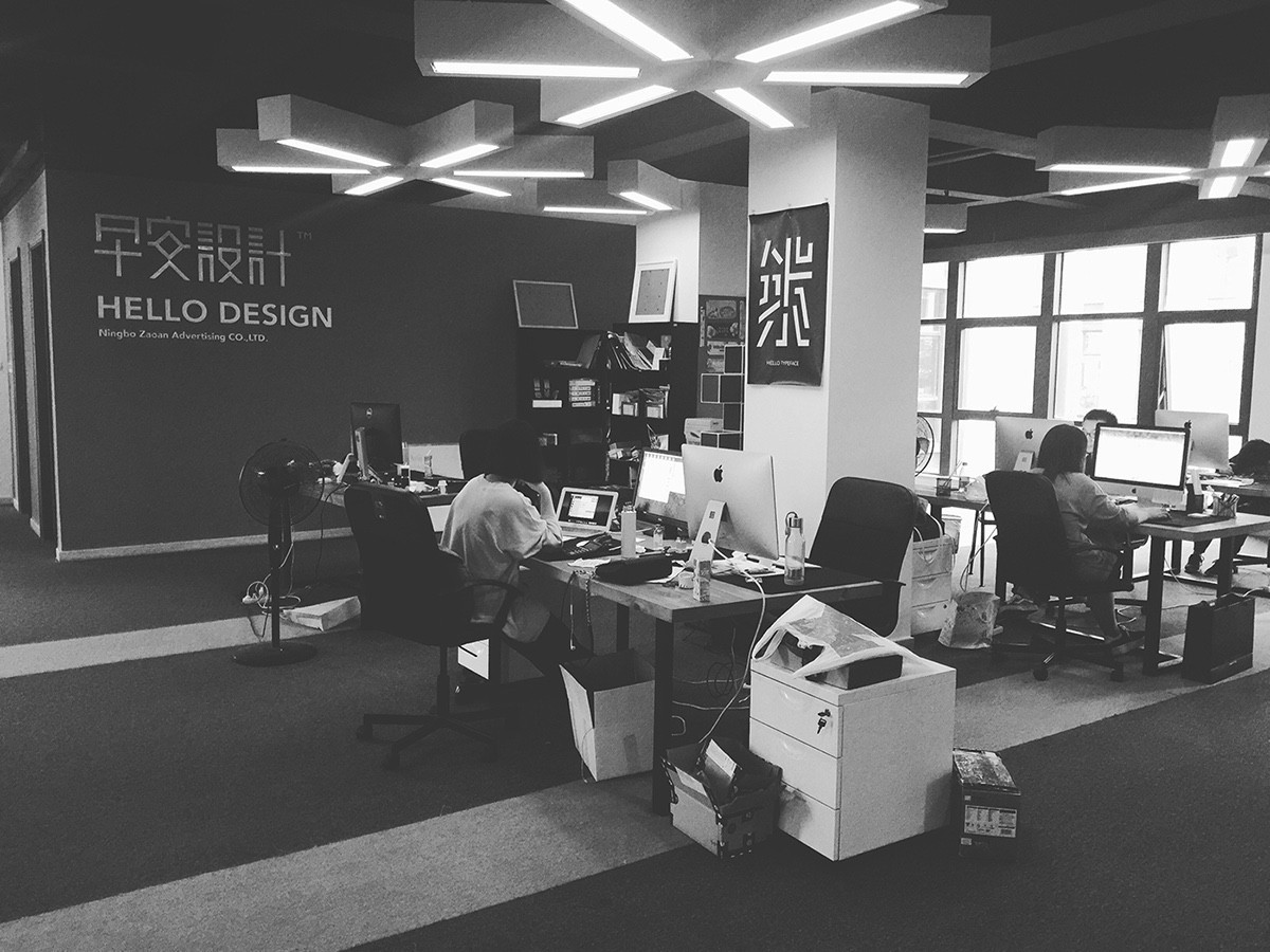
宁波早安设计成立至今,已为众多客户提供完整的品牌形象设计服务,作品多次收录于《Typeface Inspiration》(Hightone)、《Type Hybrid》(Viction:ary)、Behance平面设计策展库等专业书籍及媒体。早安设计致力于中文字体的研发与创新,开发的首款标题字体“早安字体”获得多个设计媒体的推荐,及台湾平面设计杂志《Inspire》关于《字体之于设计的亲密关系》的专题采访,在“Hiii Typography 2015”比赛中,获得铜奖与最受欢迎奖。
Location:宁波|Zhejiang China
Weibo:@ 小小设计施
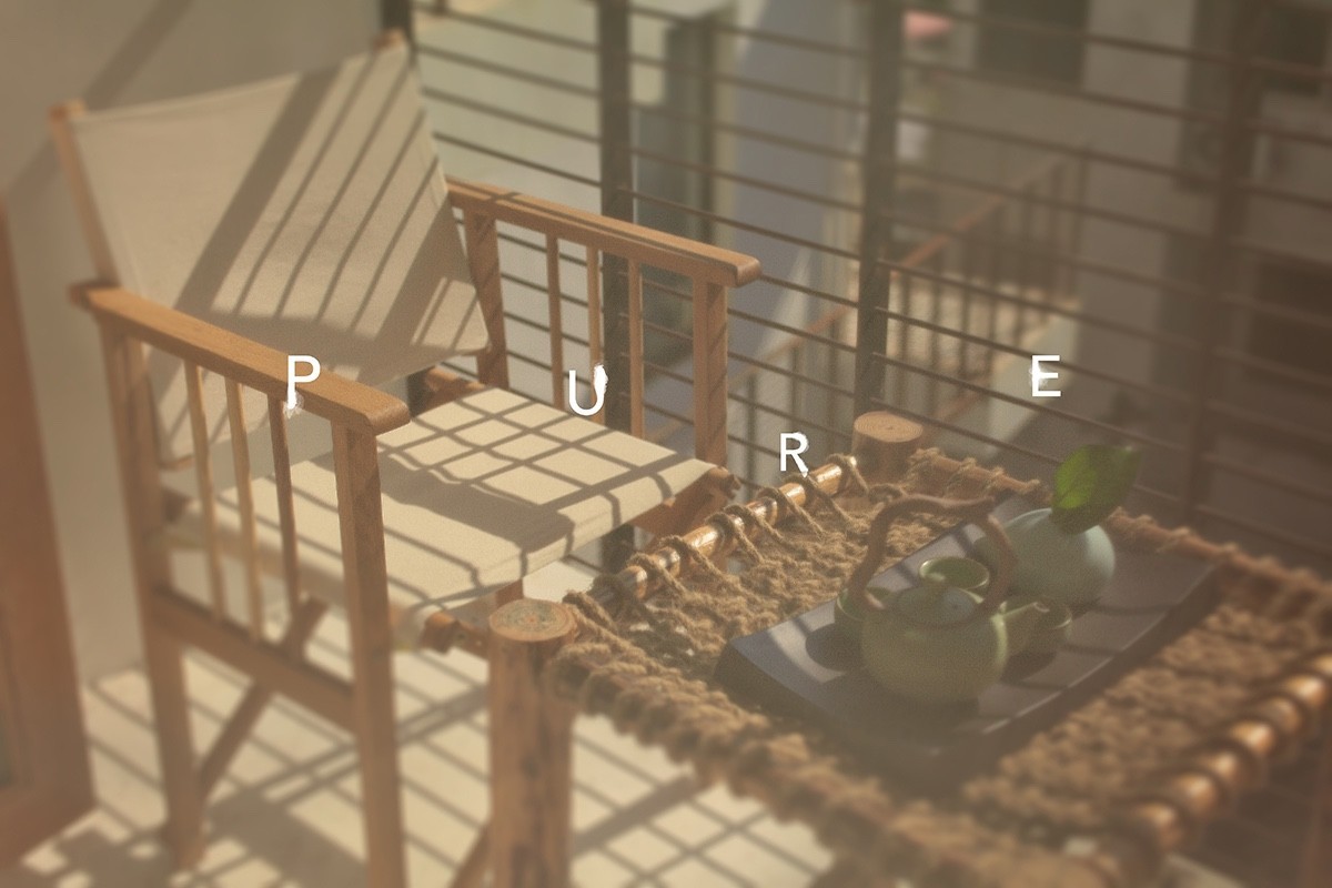
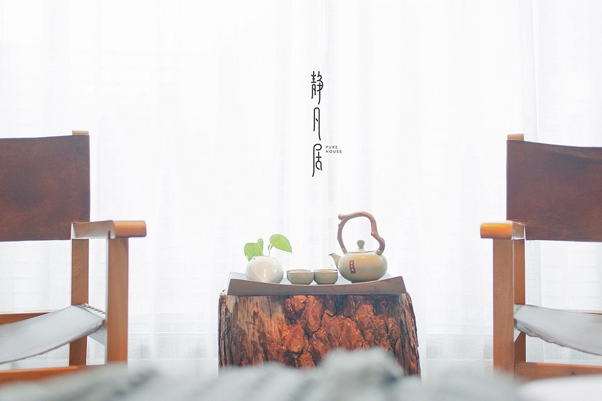
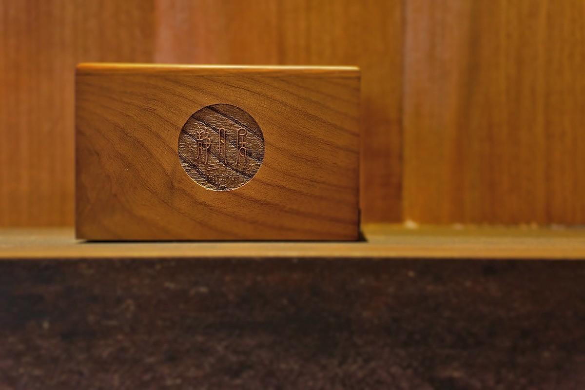
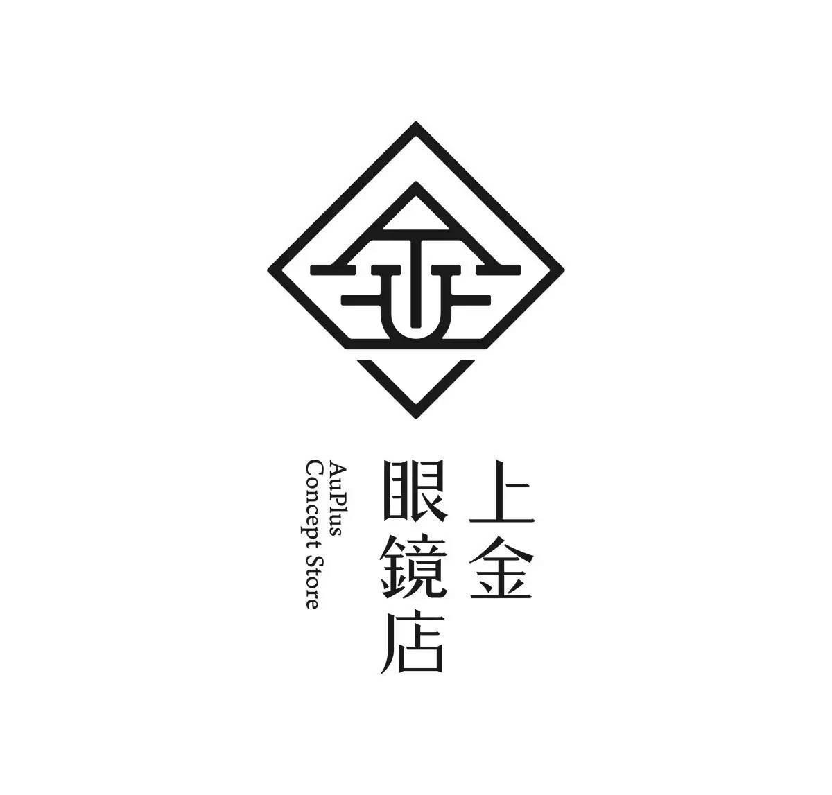
☞ 施王忠部分作品欣賞 ☜
品
牌
设
计
▼
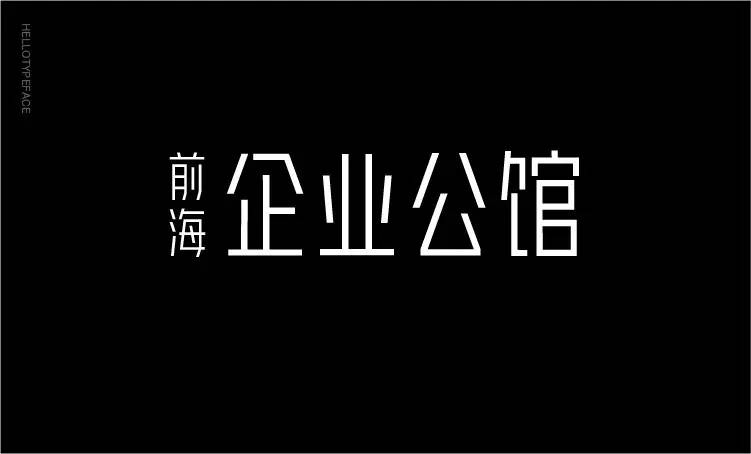
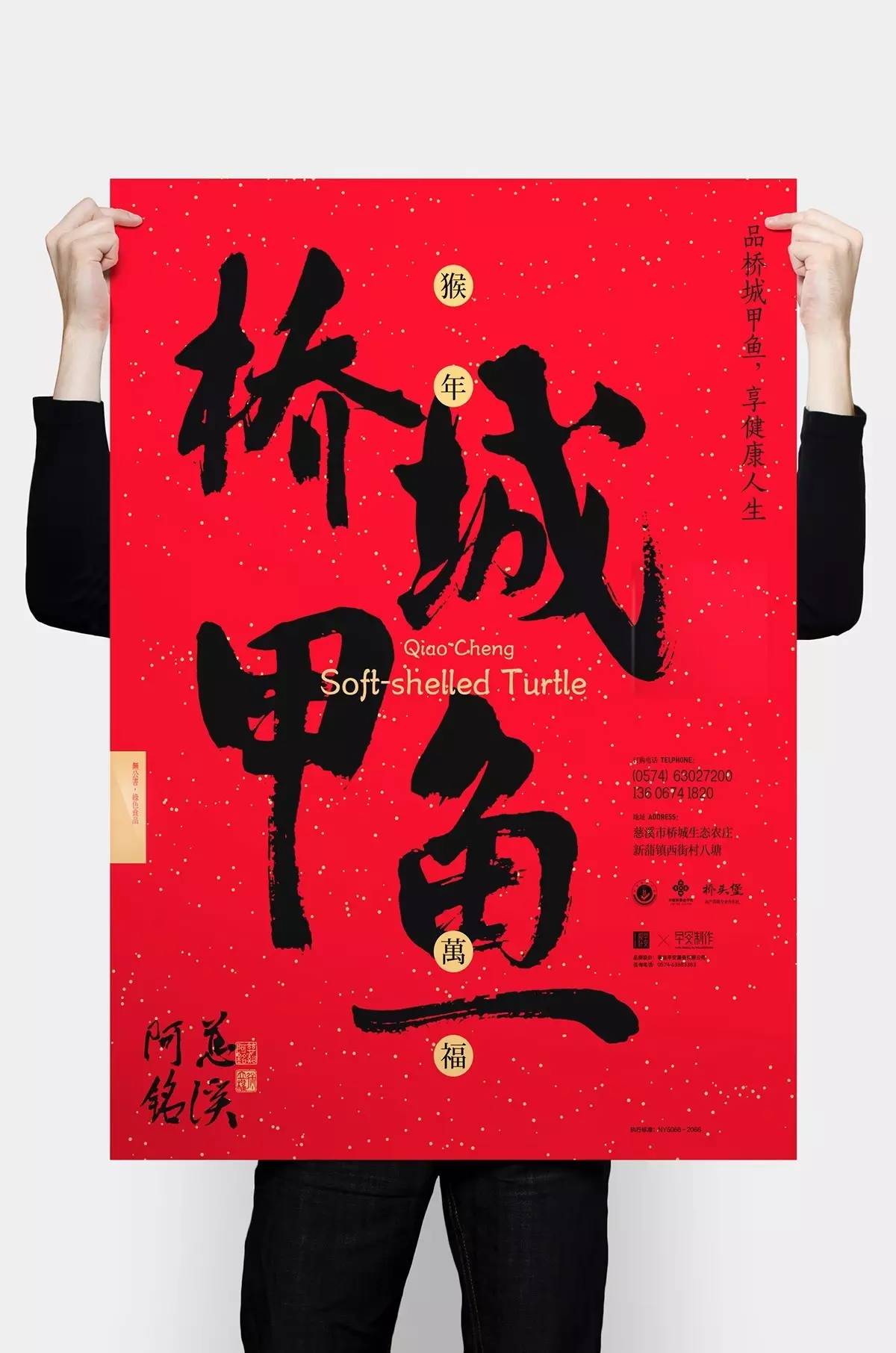
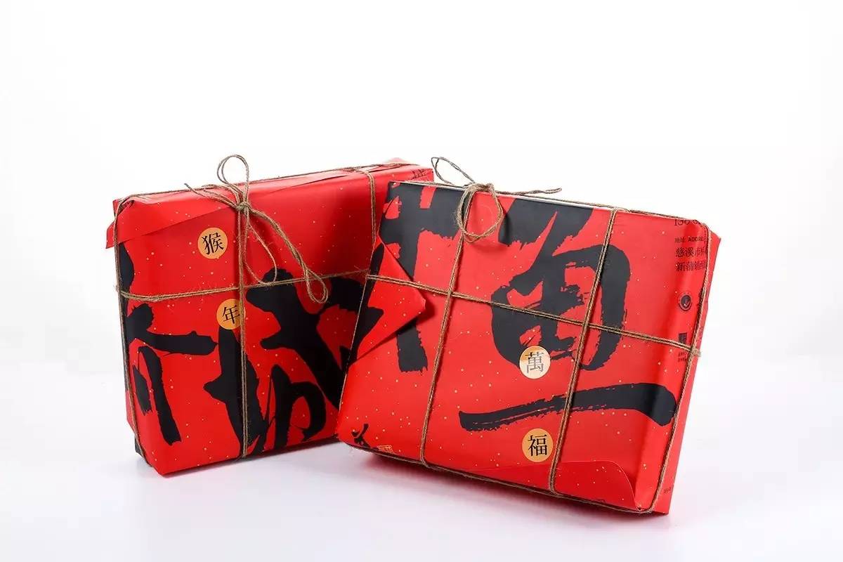
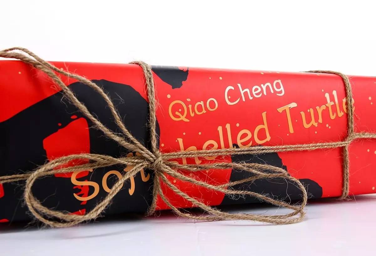
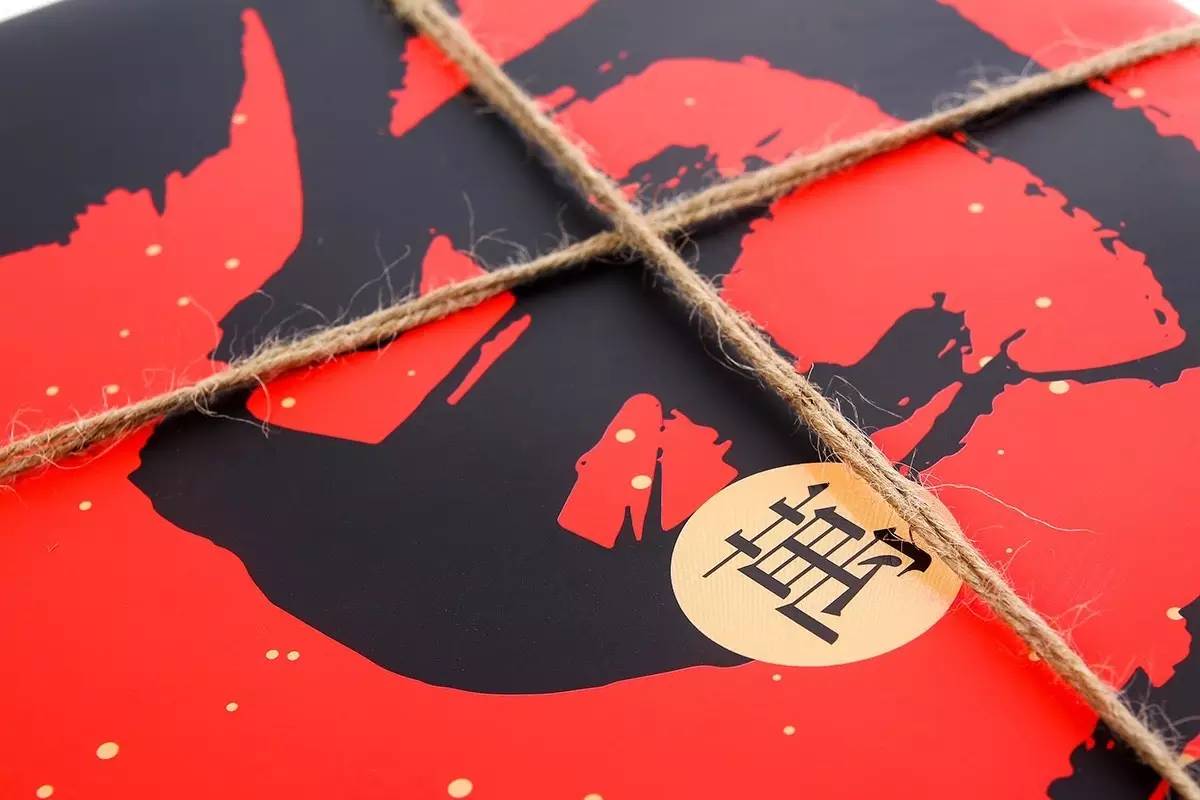
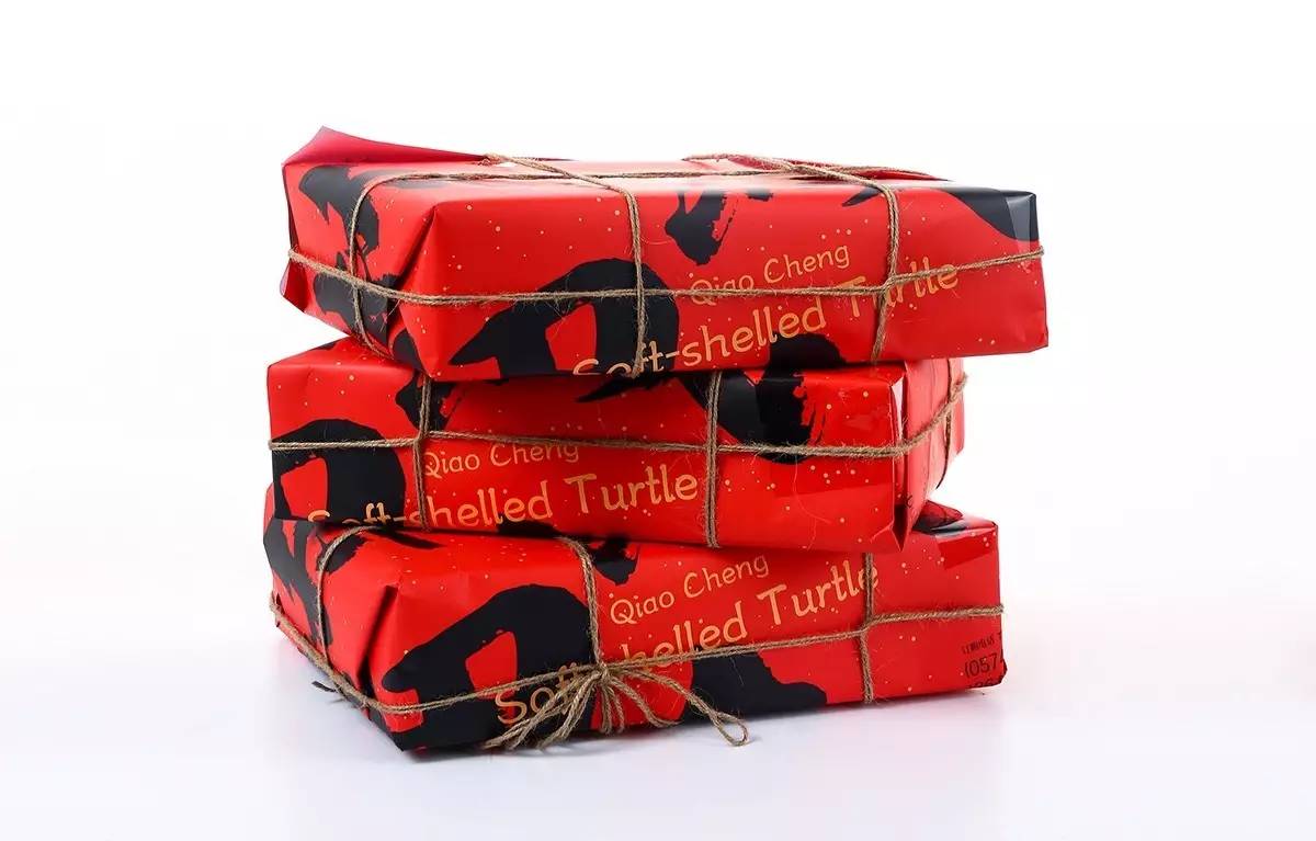
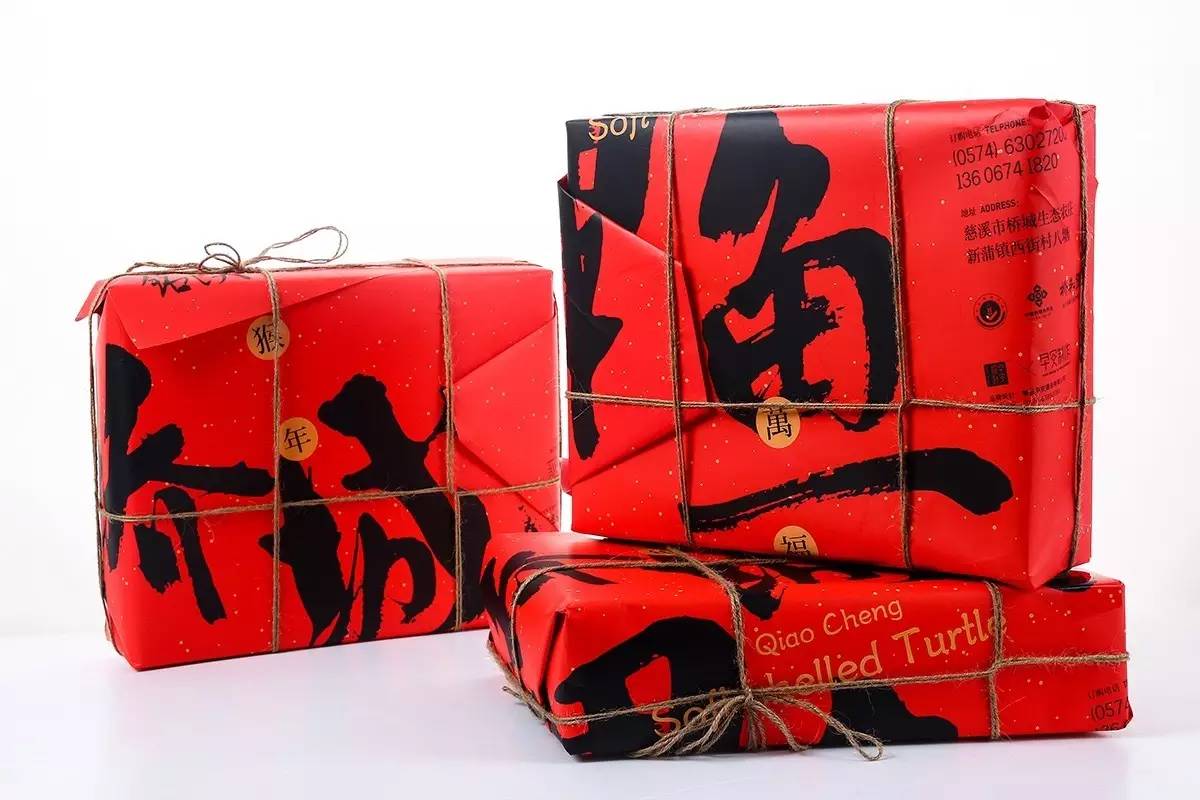
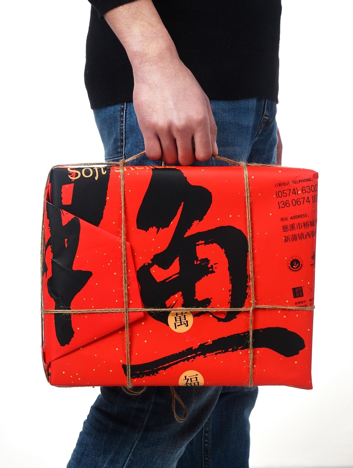
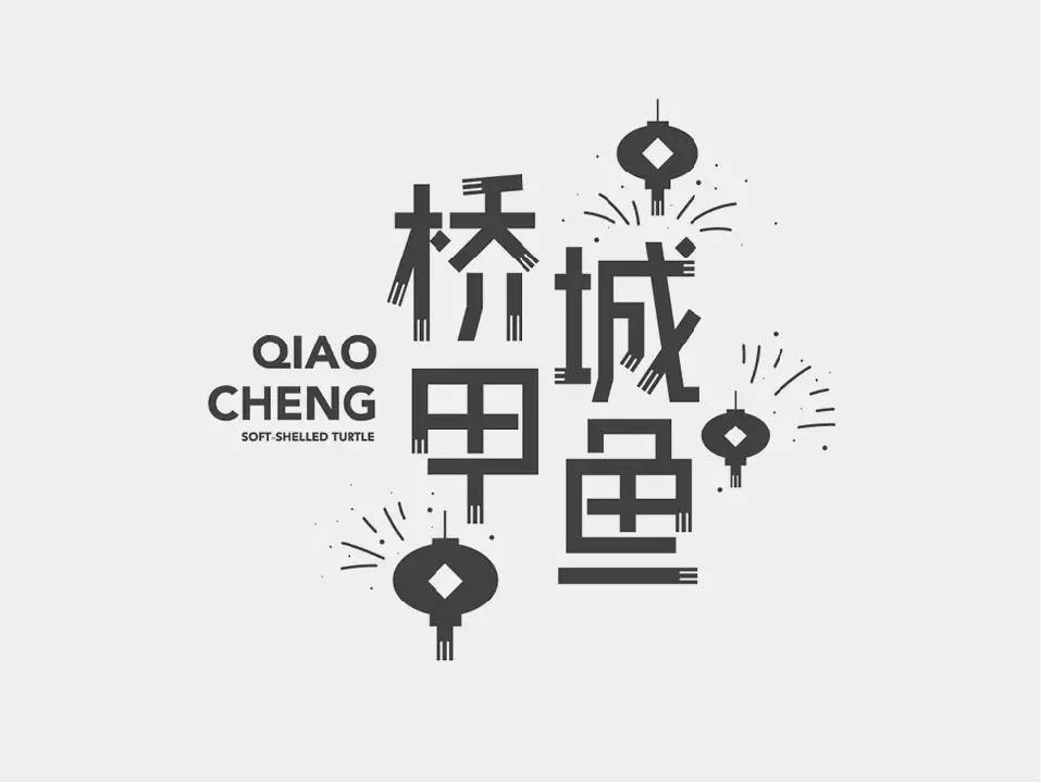
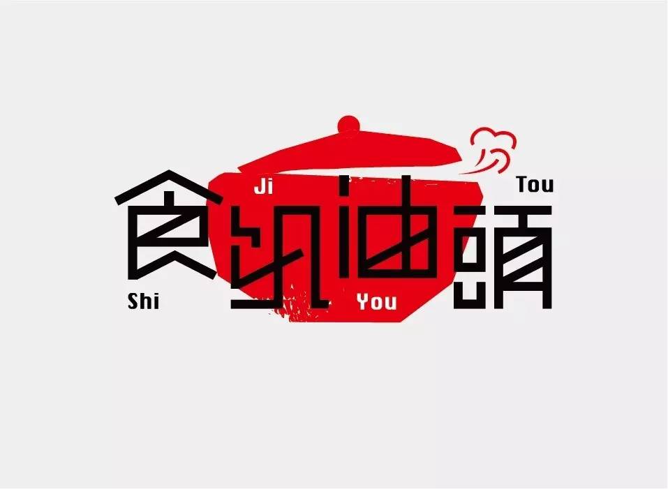
《桥城甲鱼》
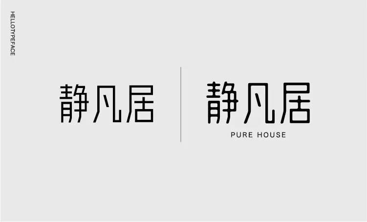
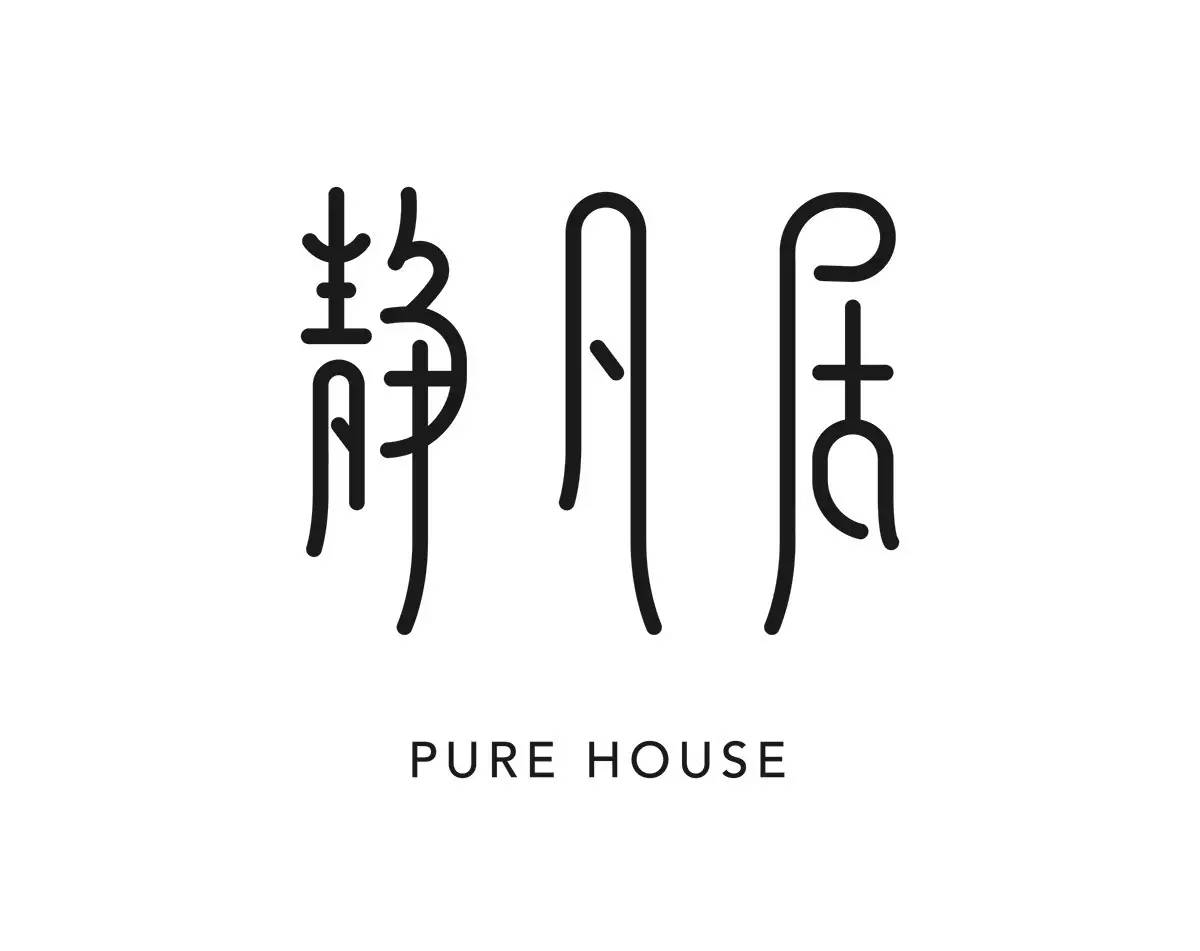
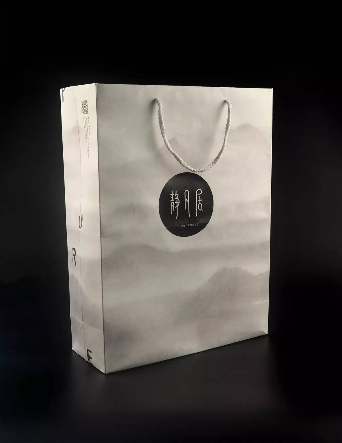
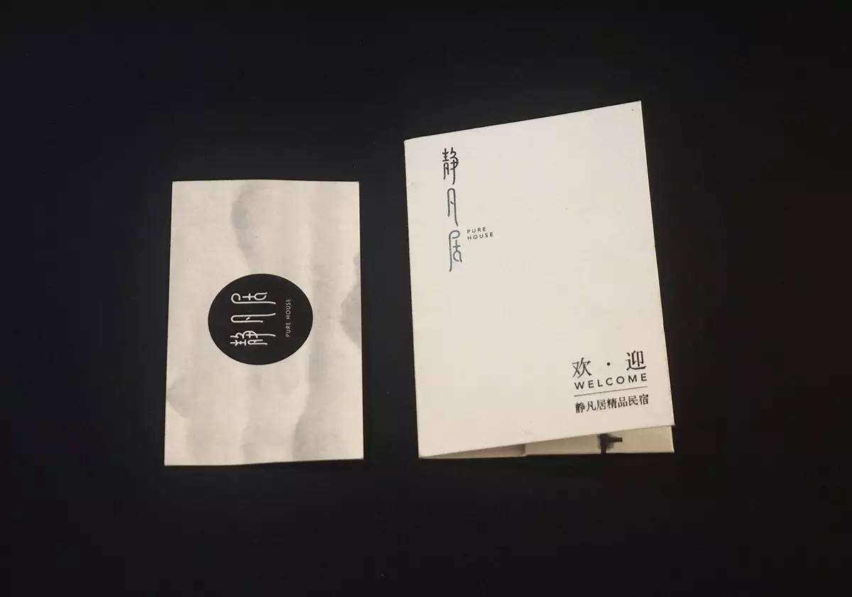
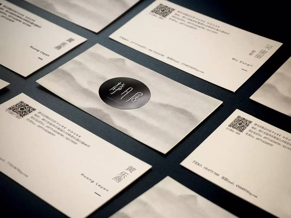
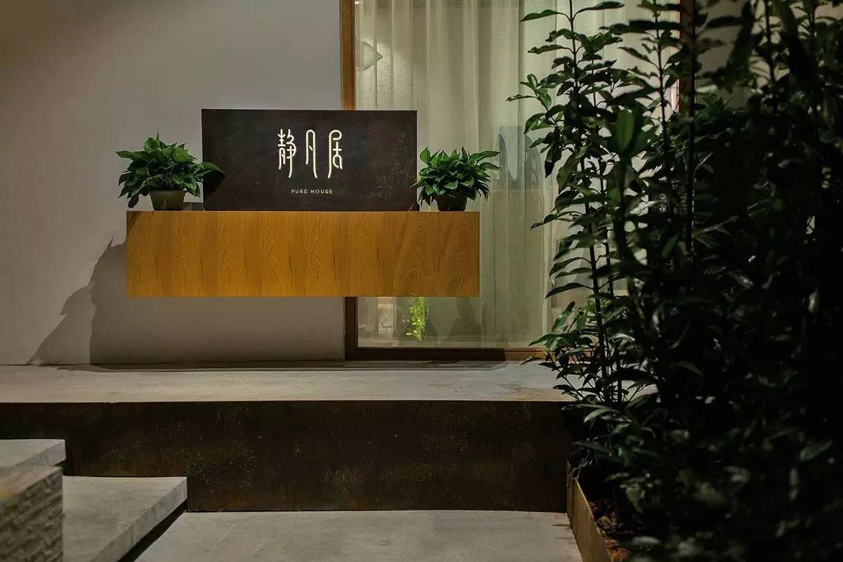
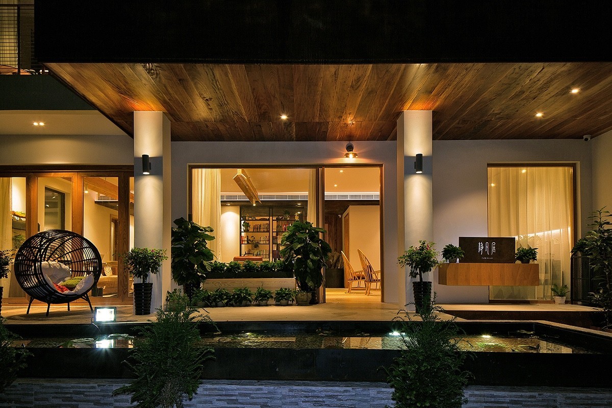
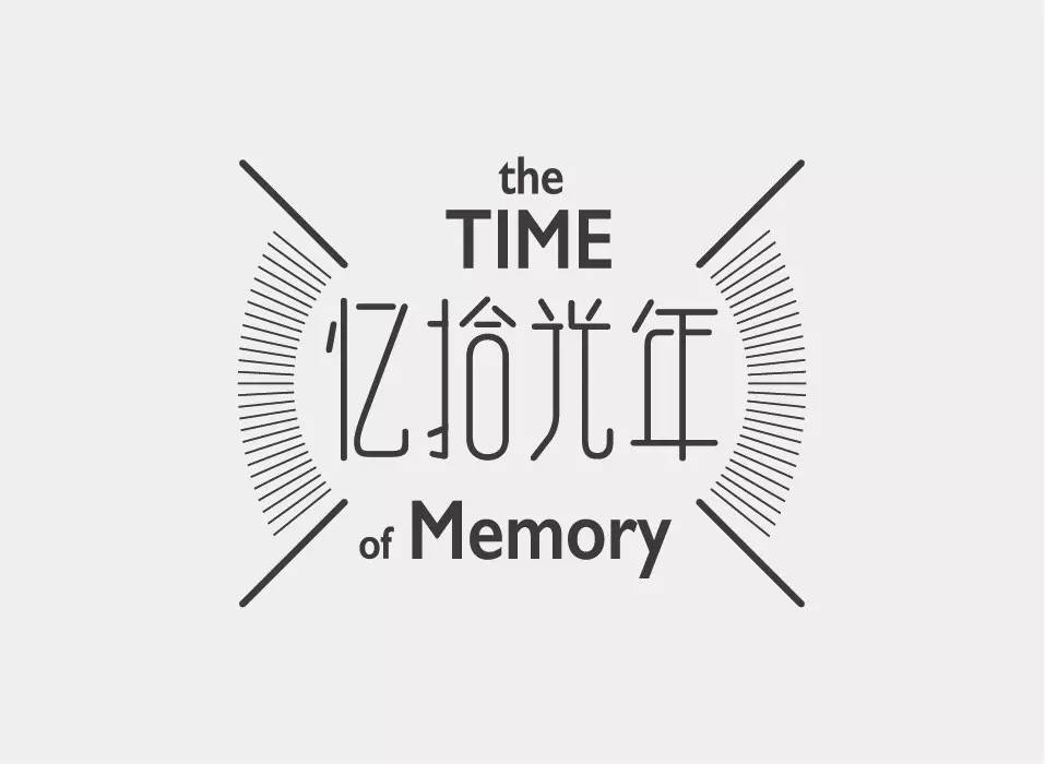
《静凡居》
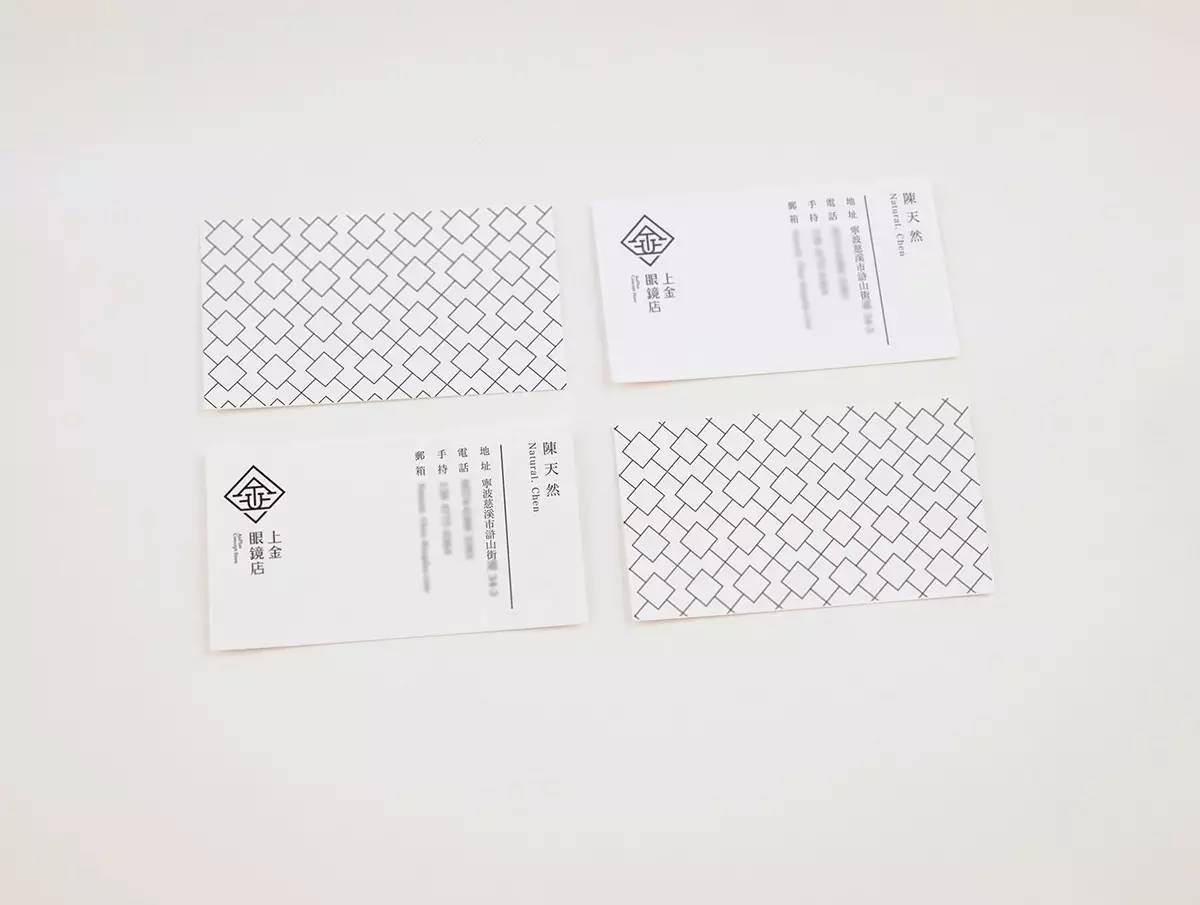
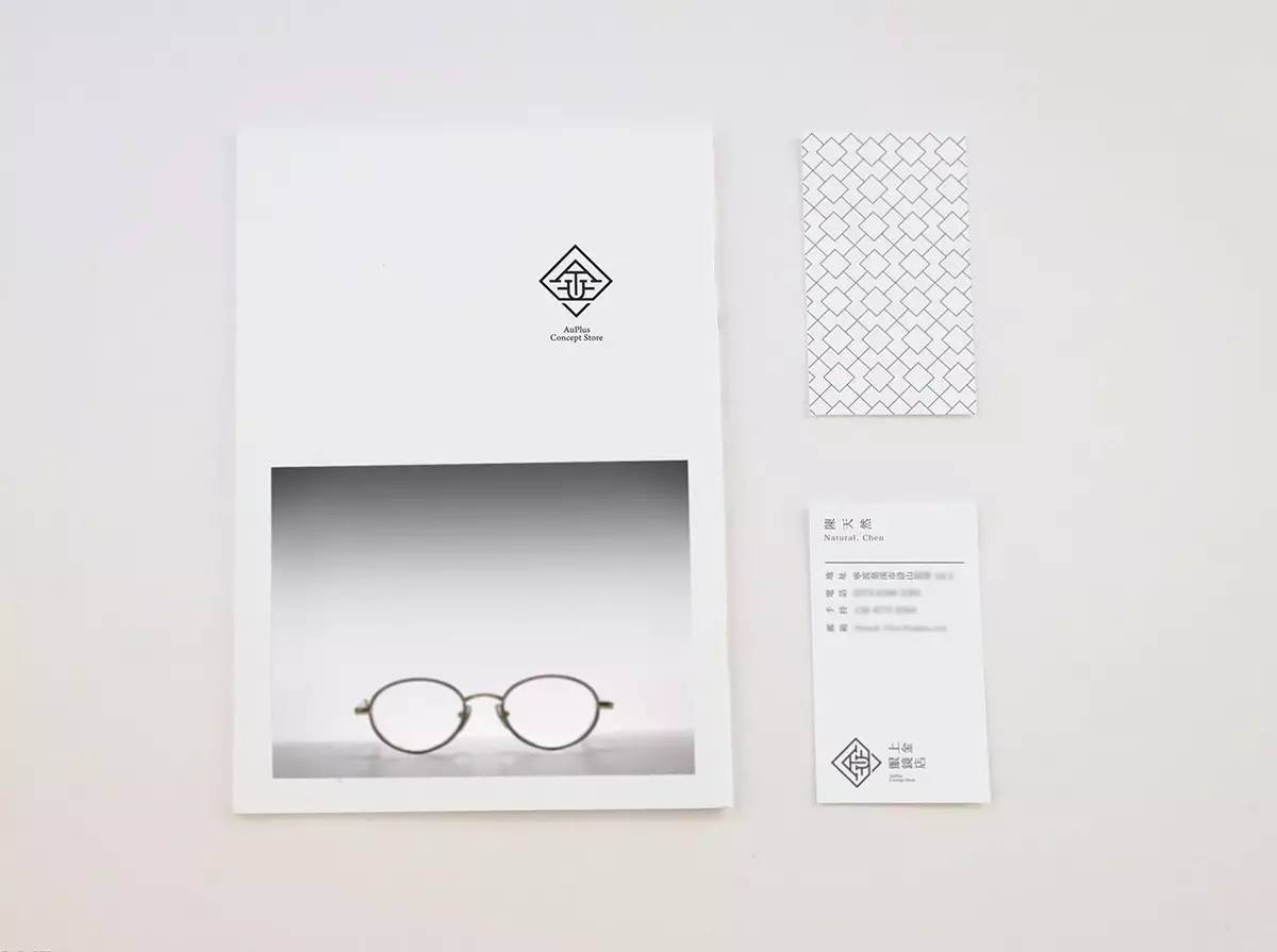
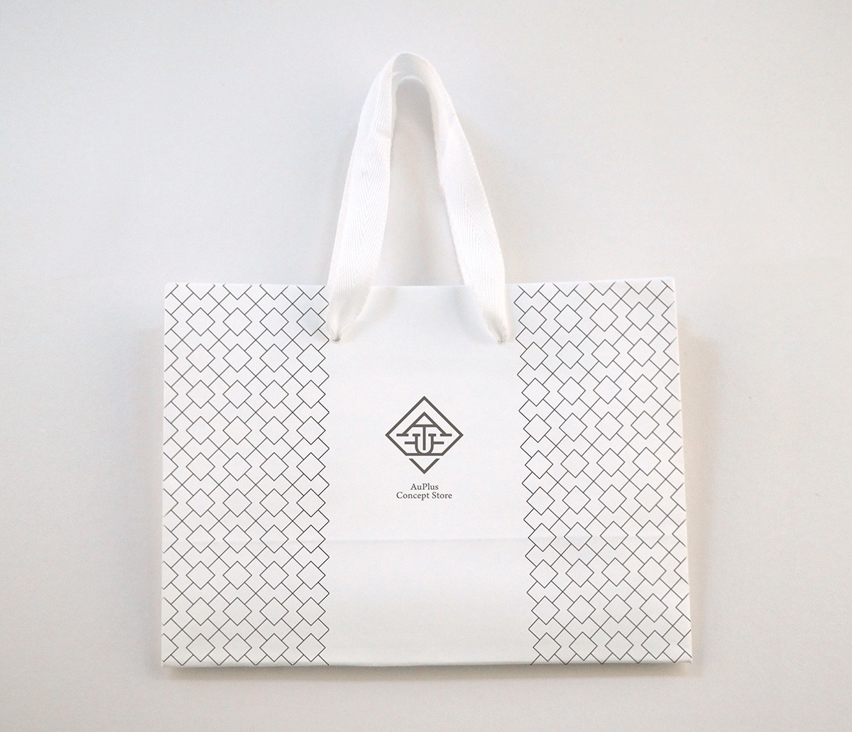
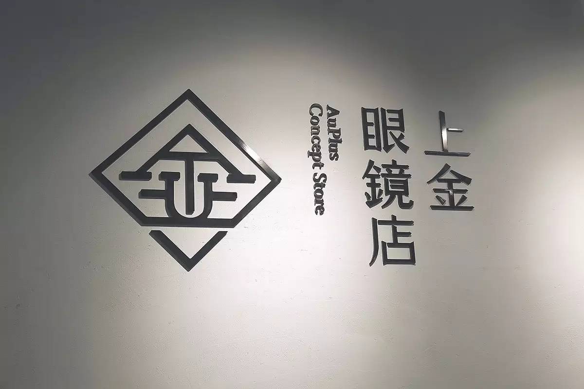
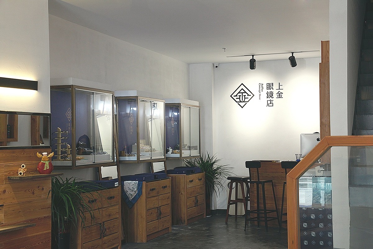
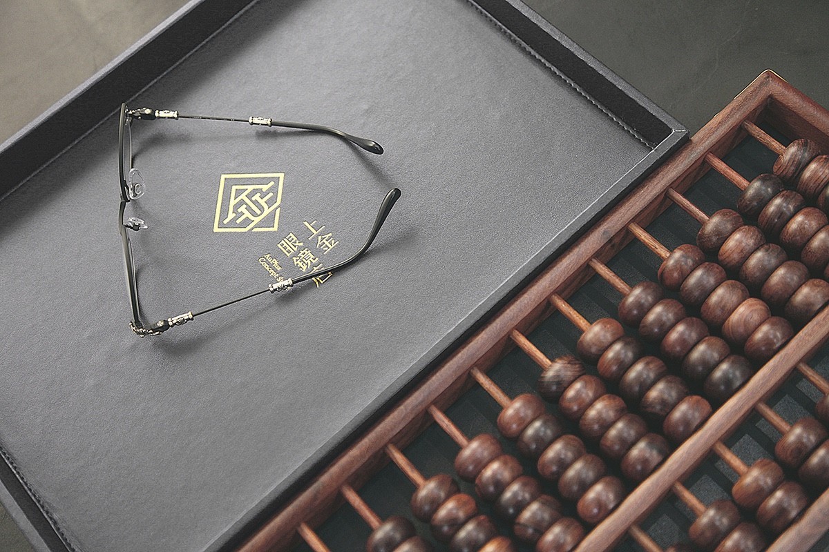
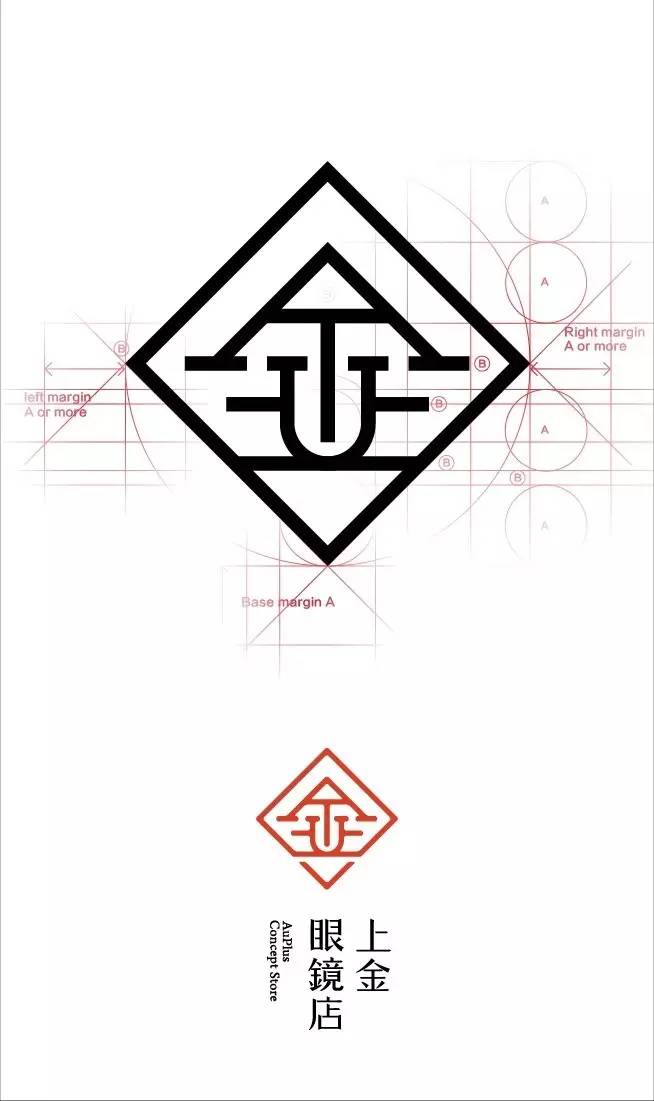
《上金眼镜店》
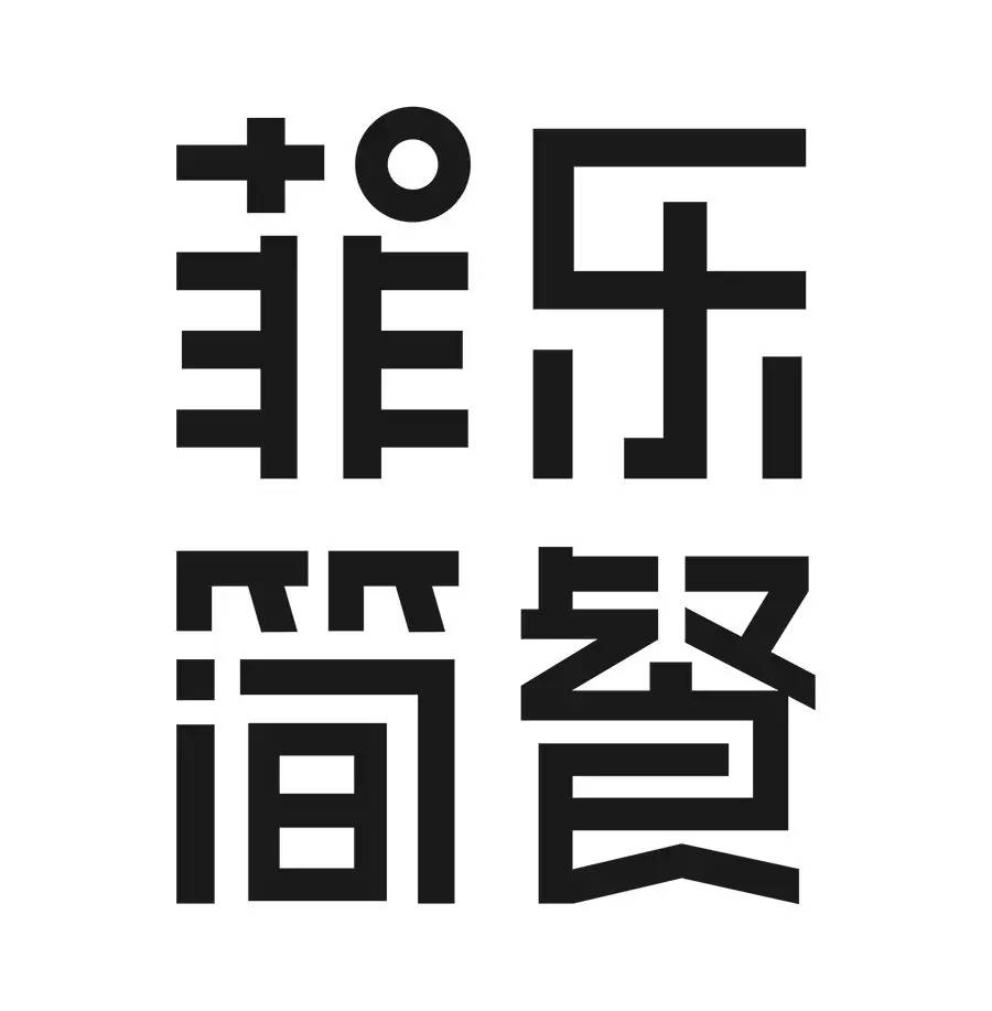
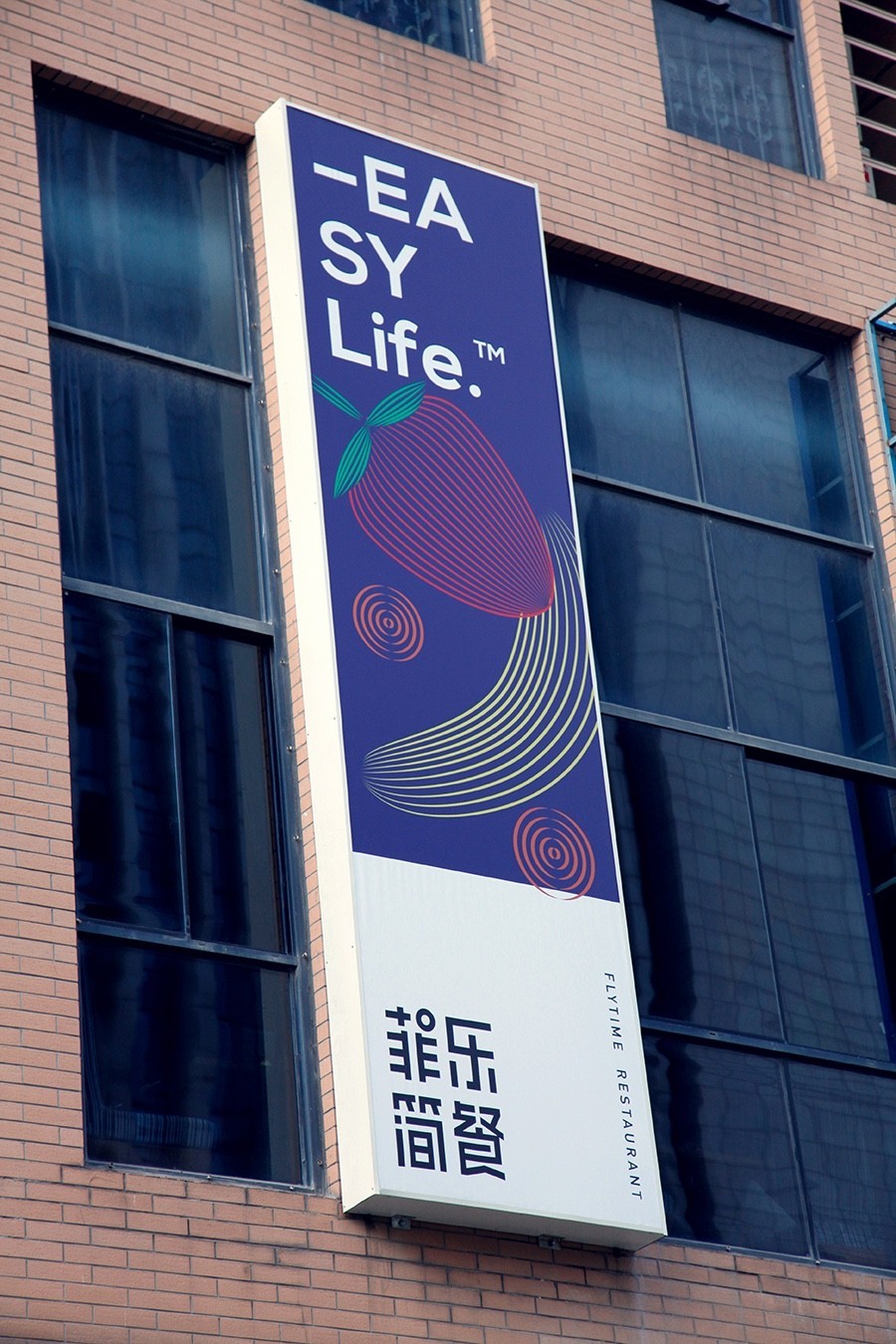
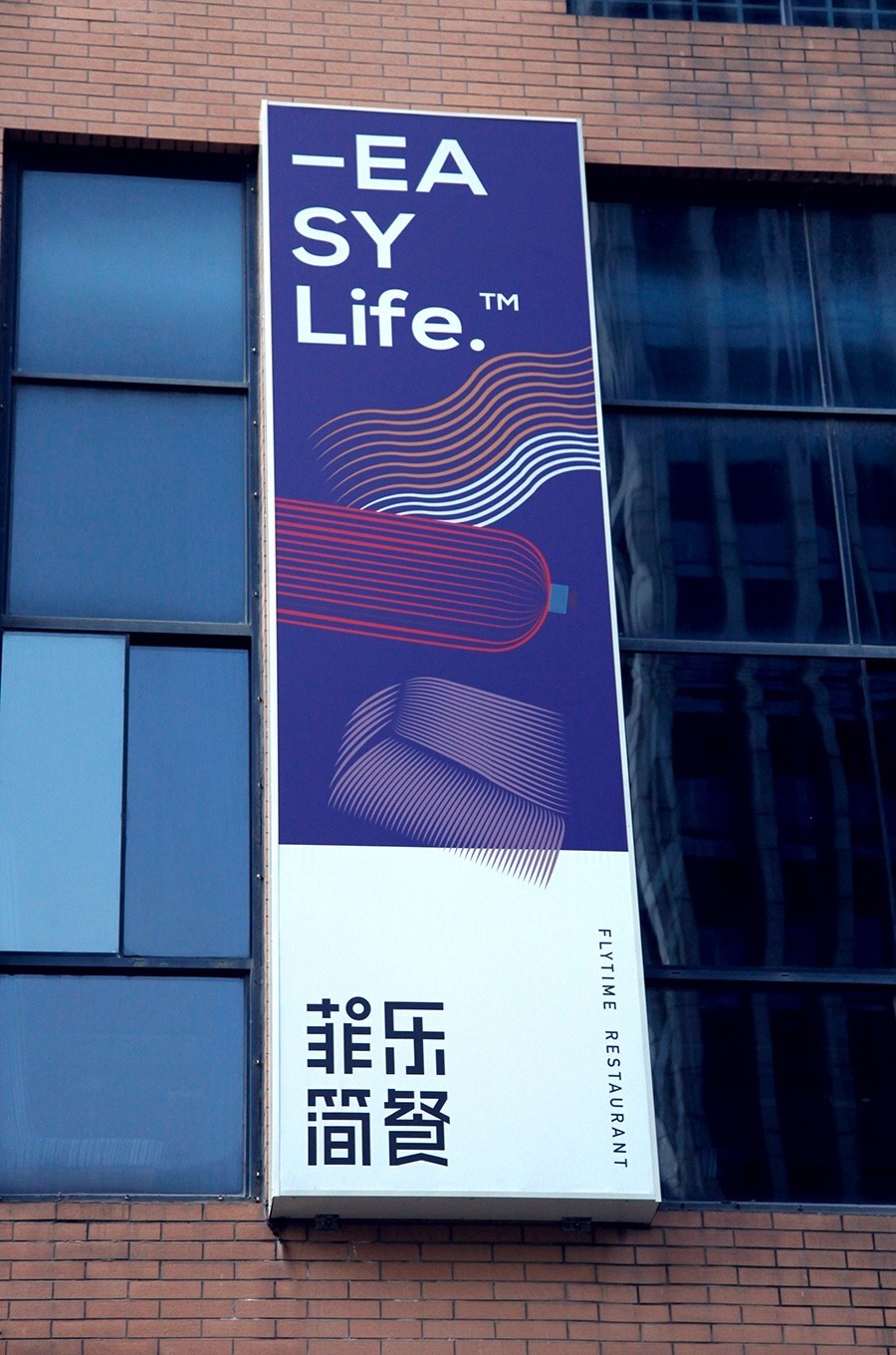
《菲乐简餐》


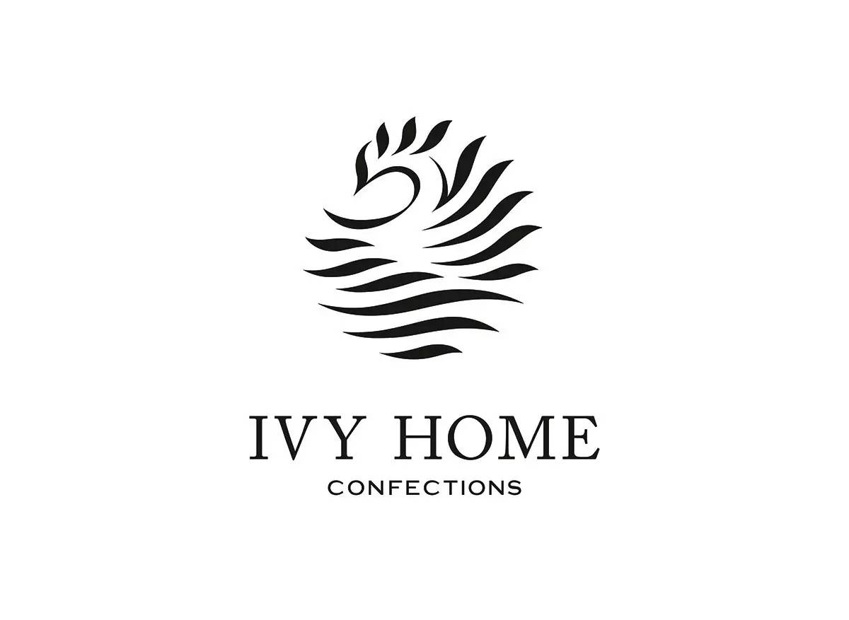
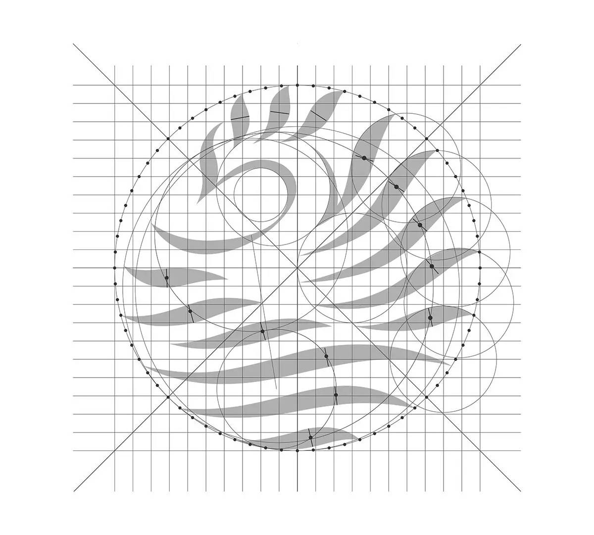
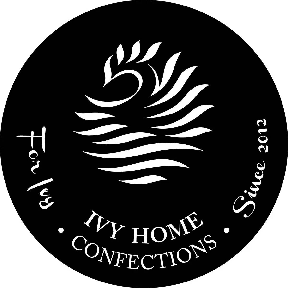
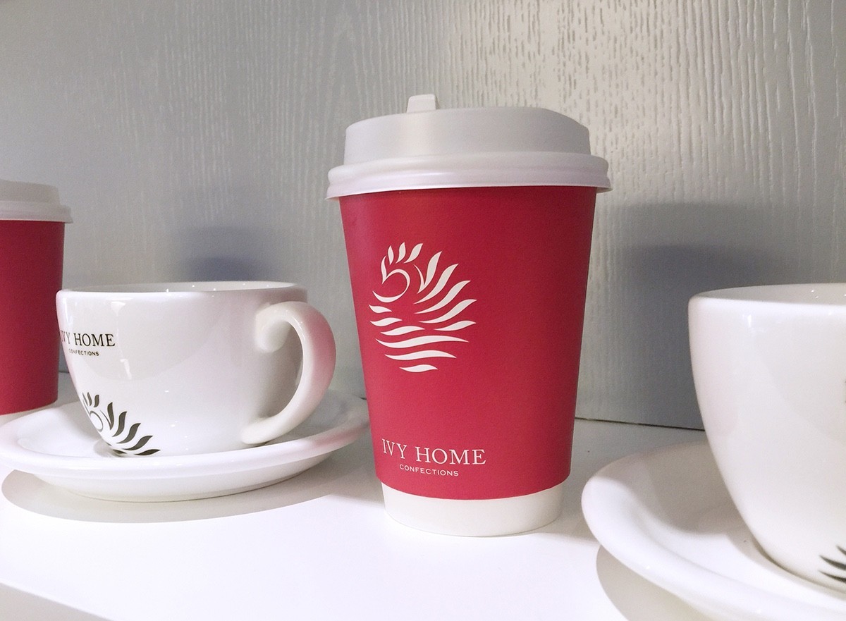
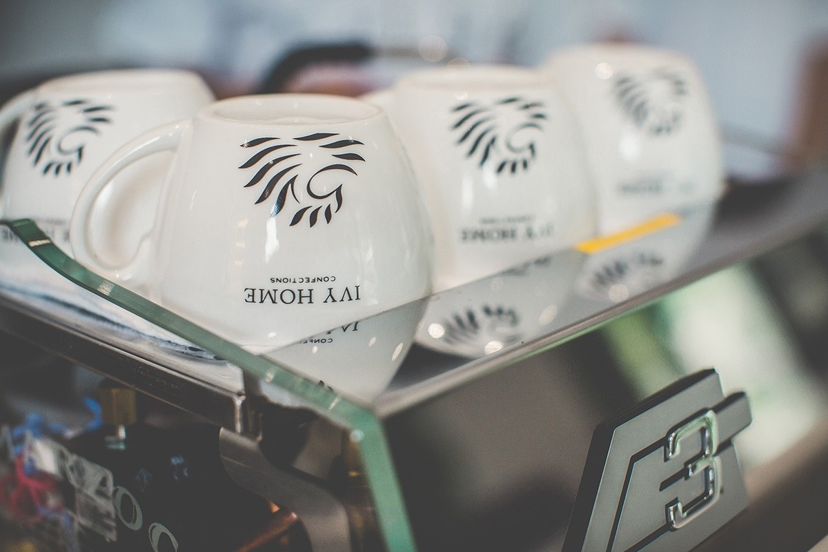
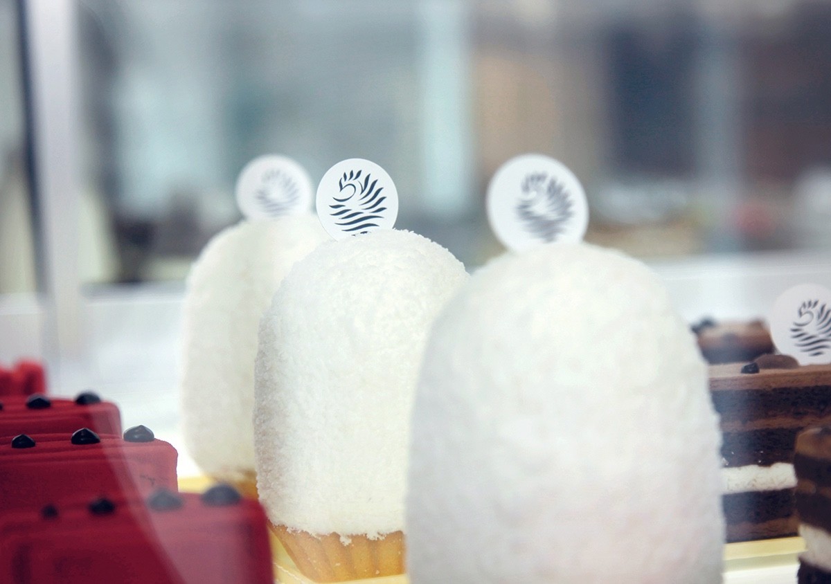
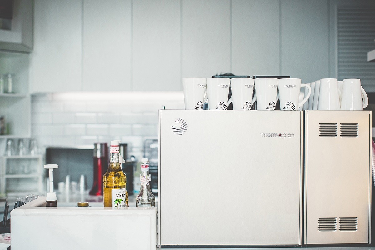
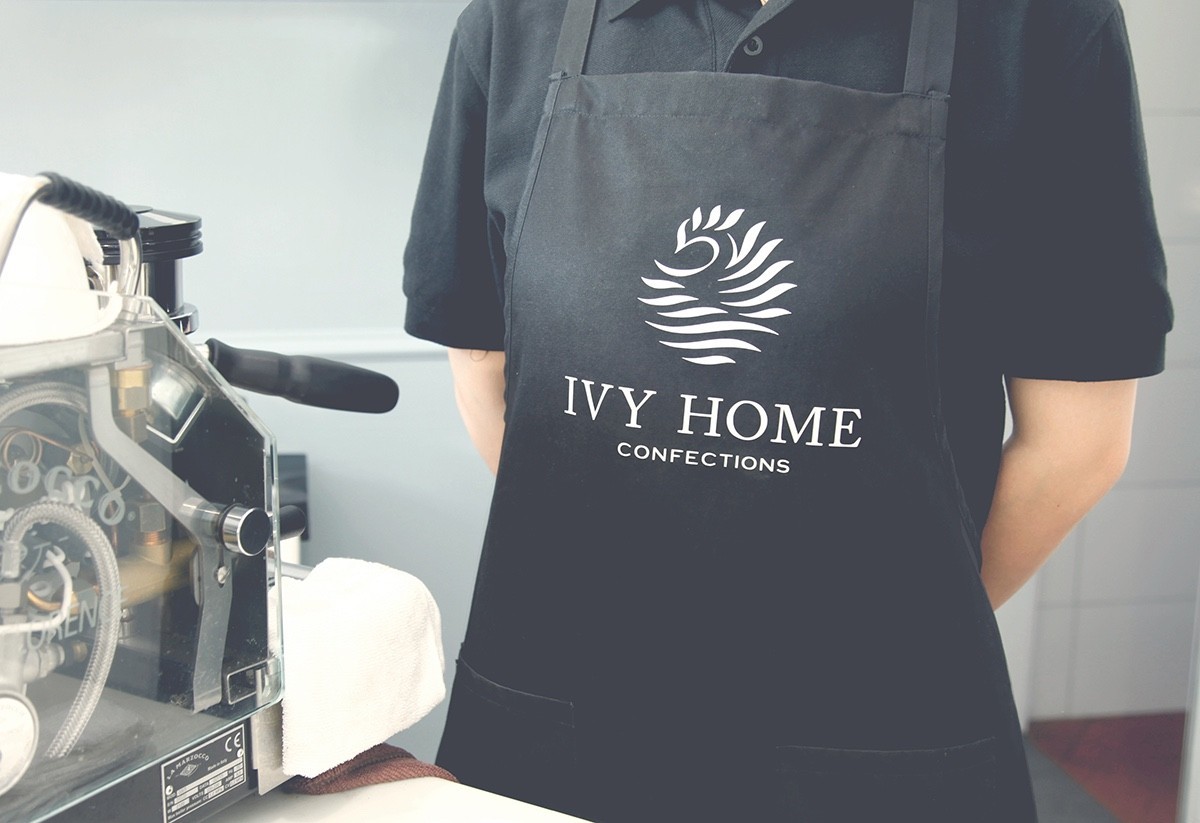
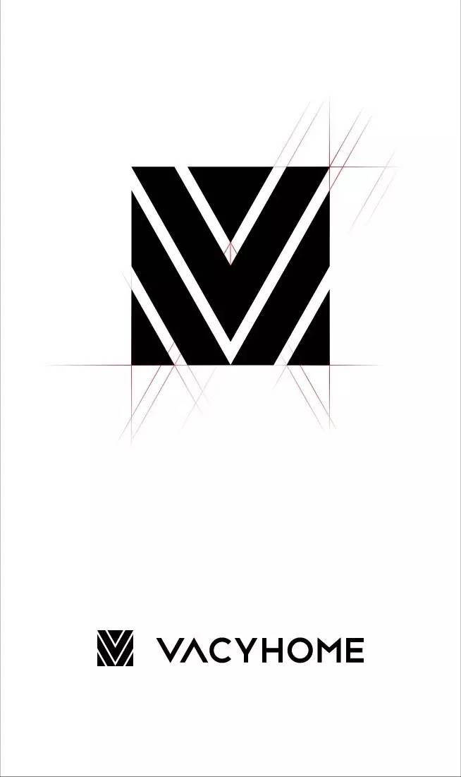
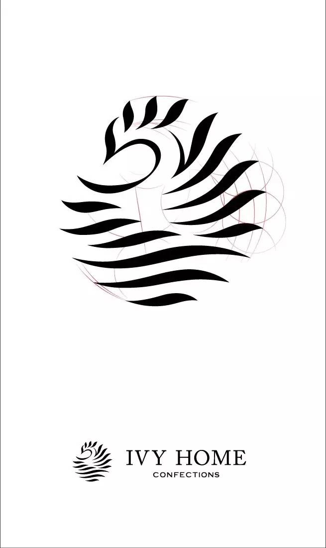
《IVYHOME》
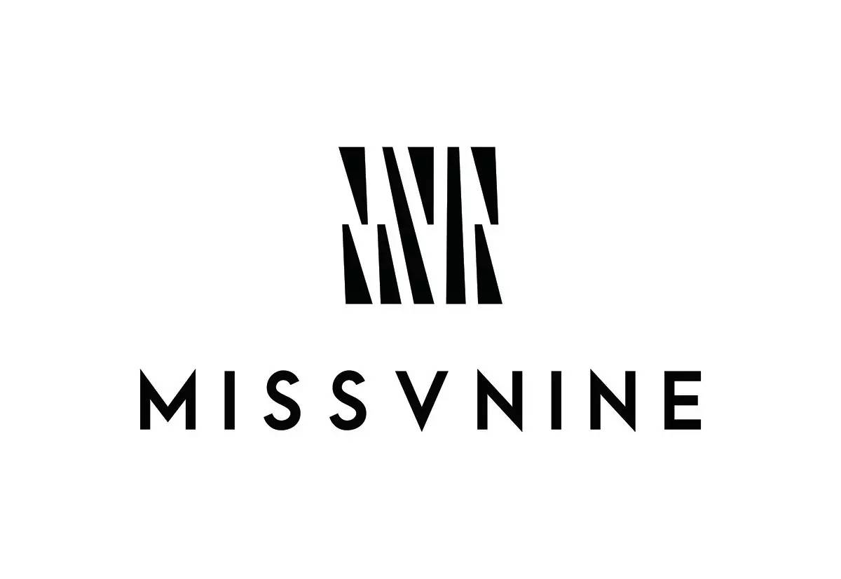
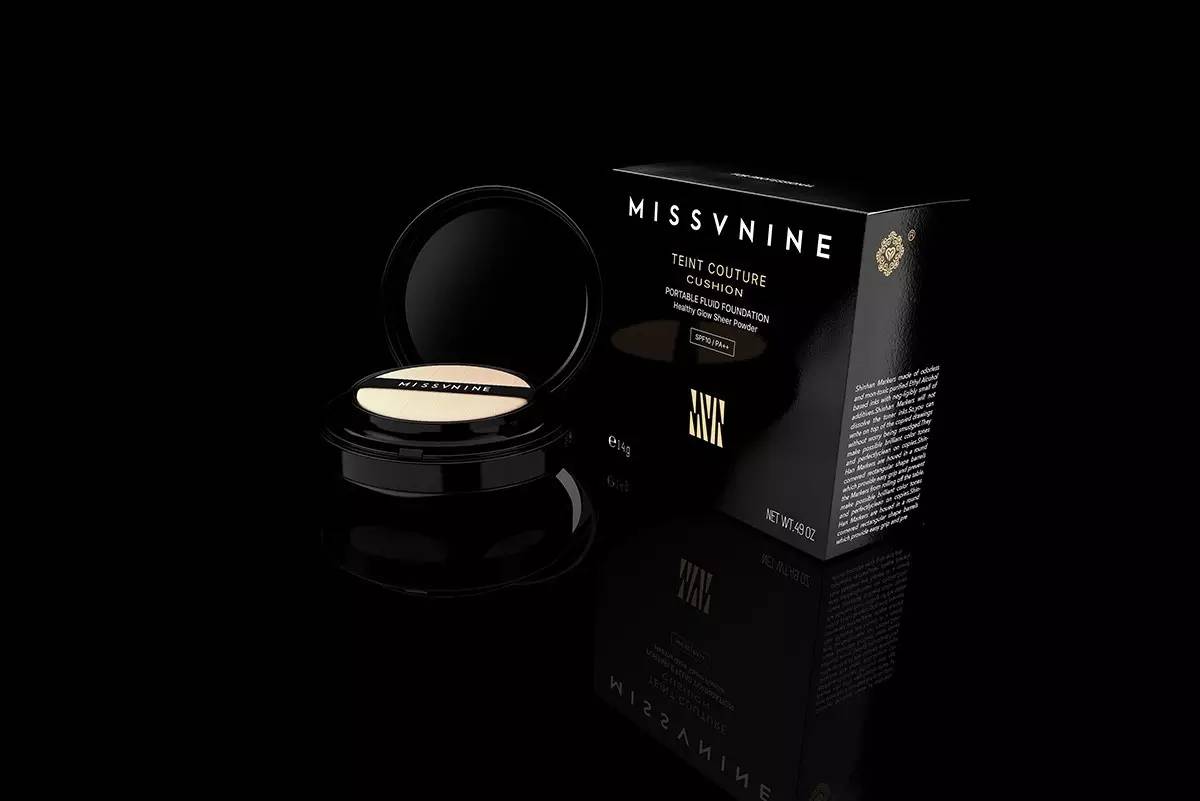
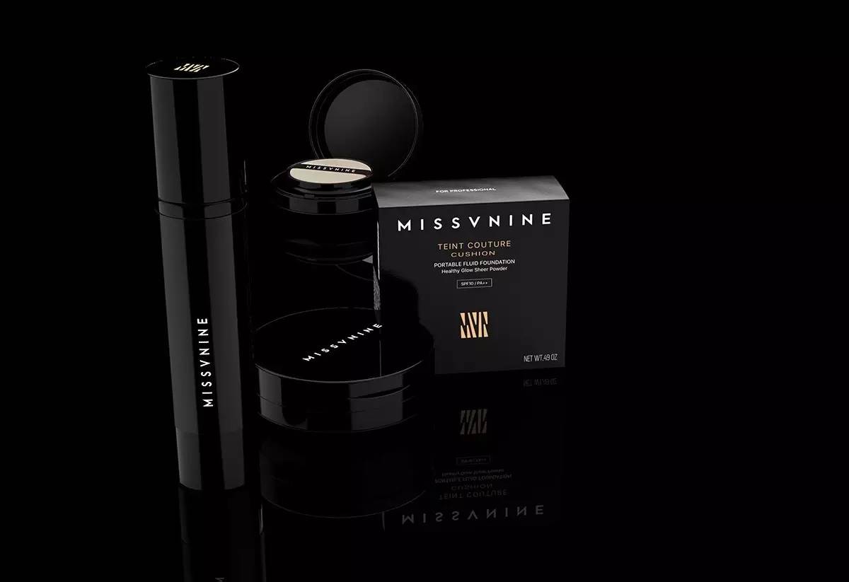
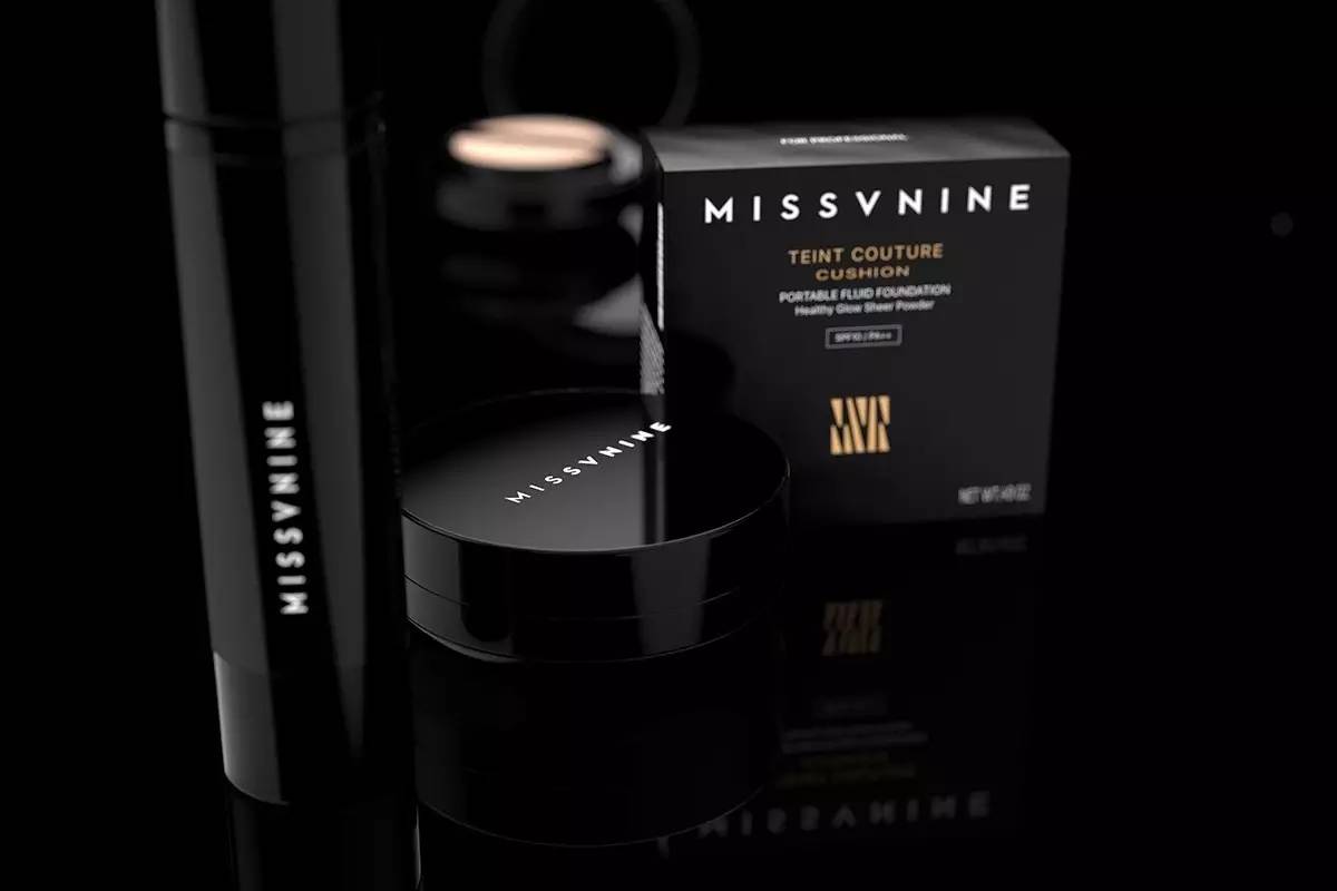
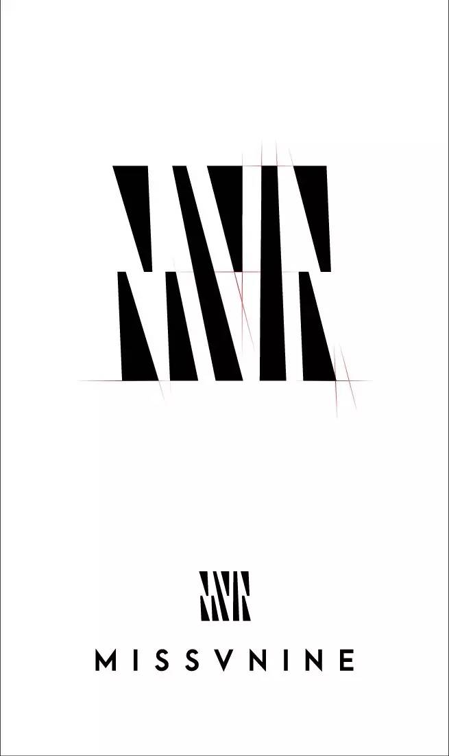
《MISSVNINE》
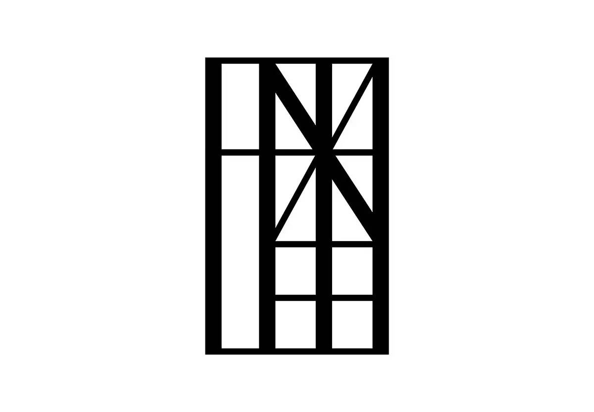
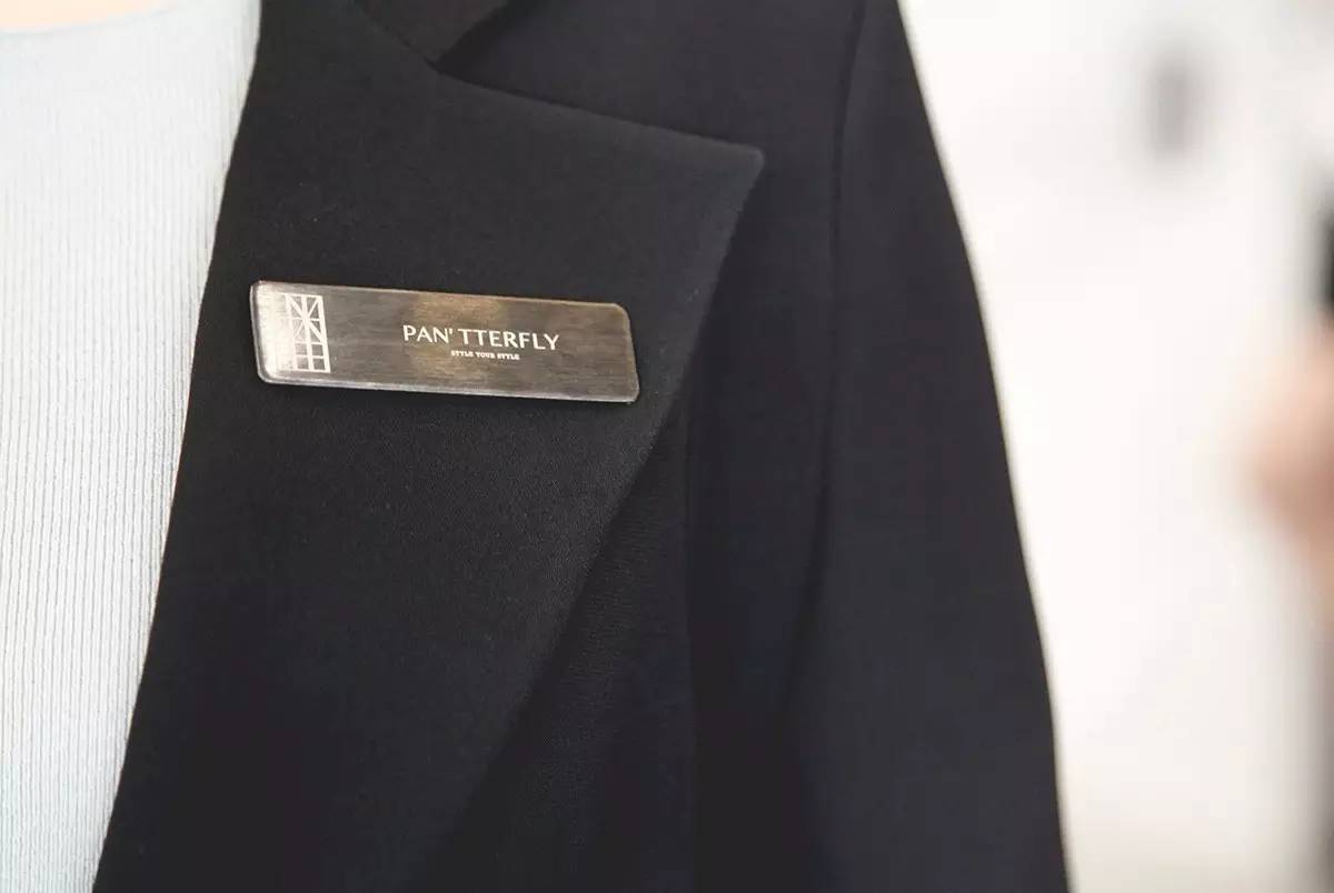
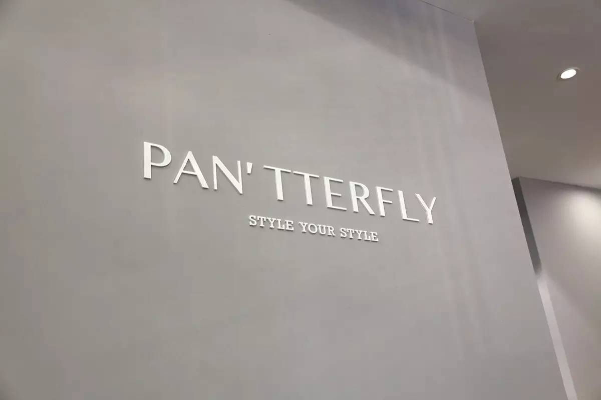
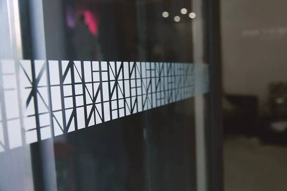
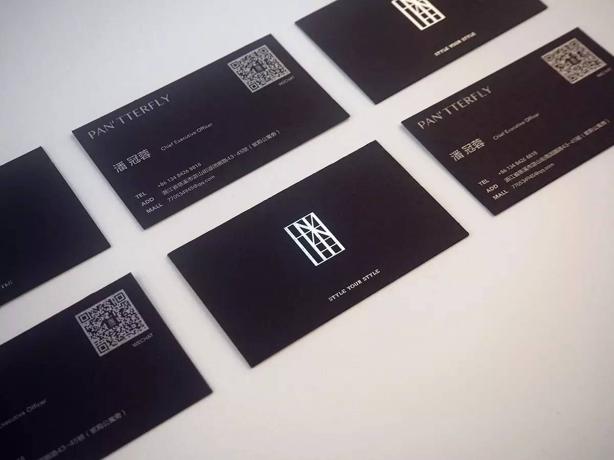
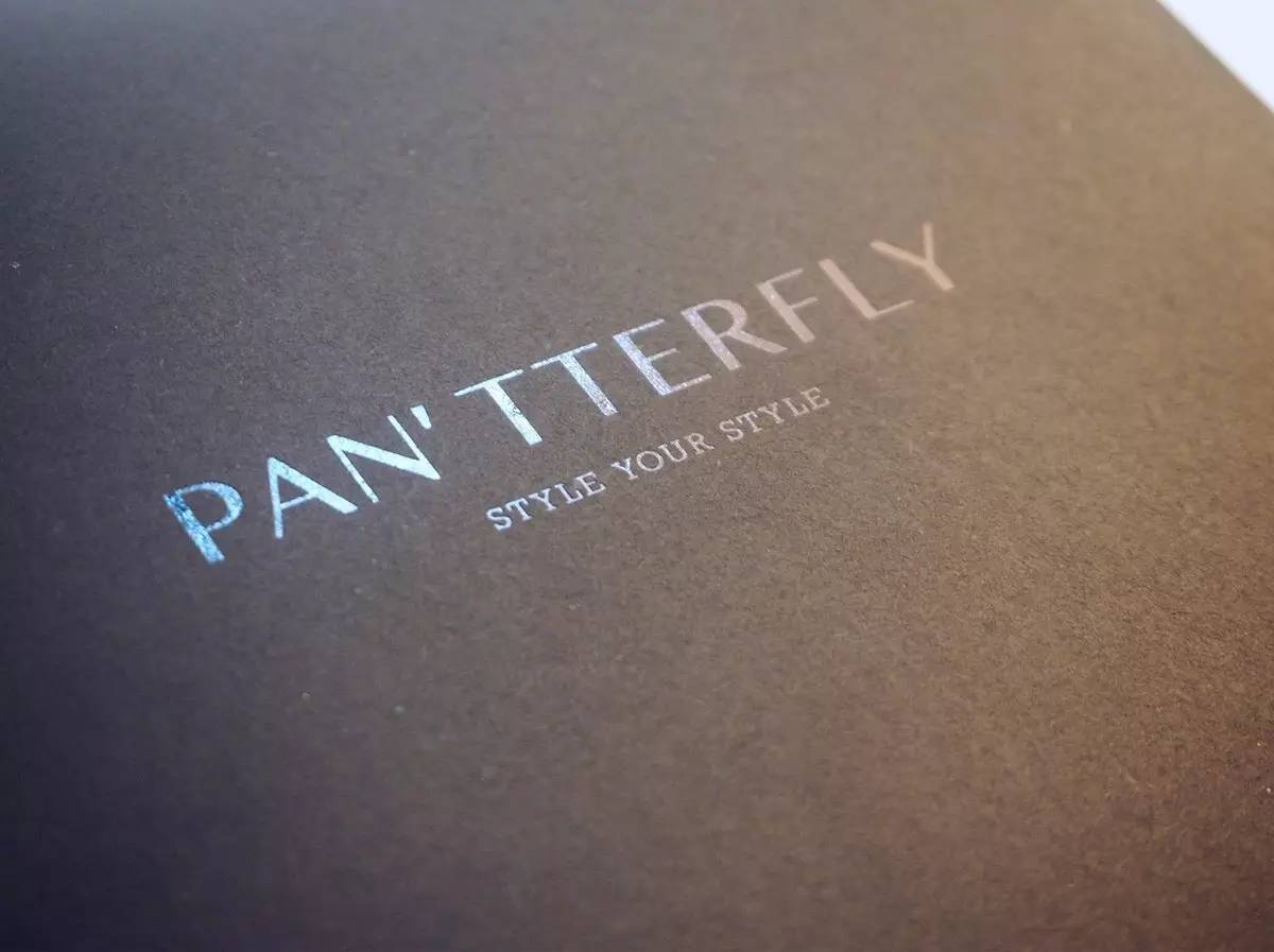
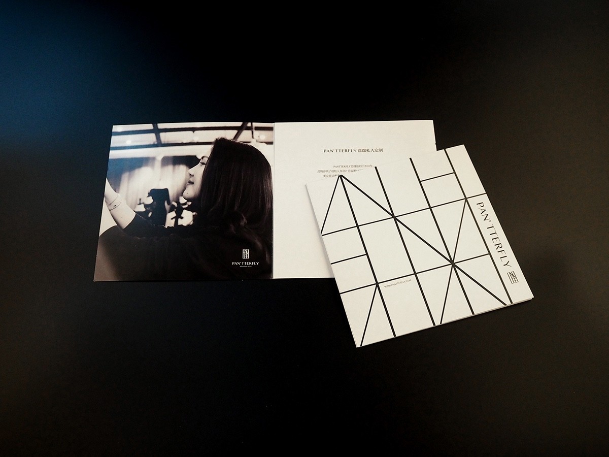
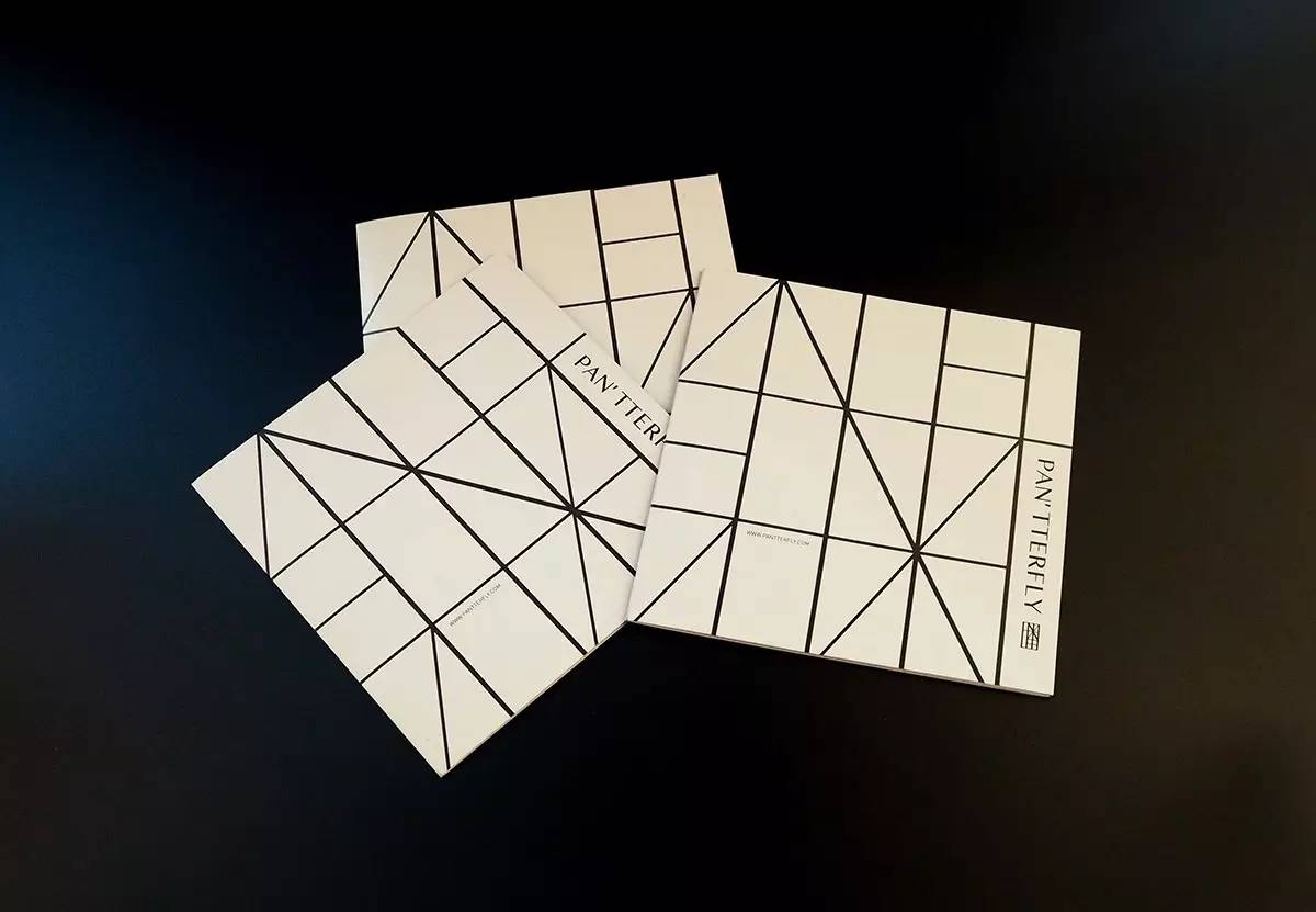
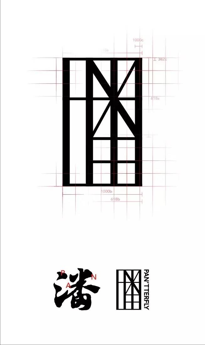
《pantterfly》
标
志
设计
▼
字
体

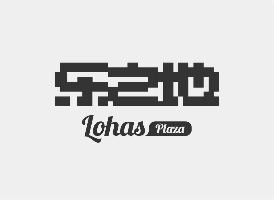
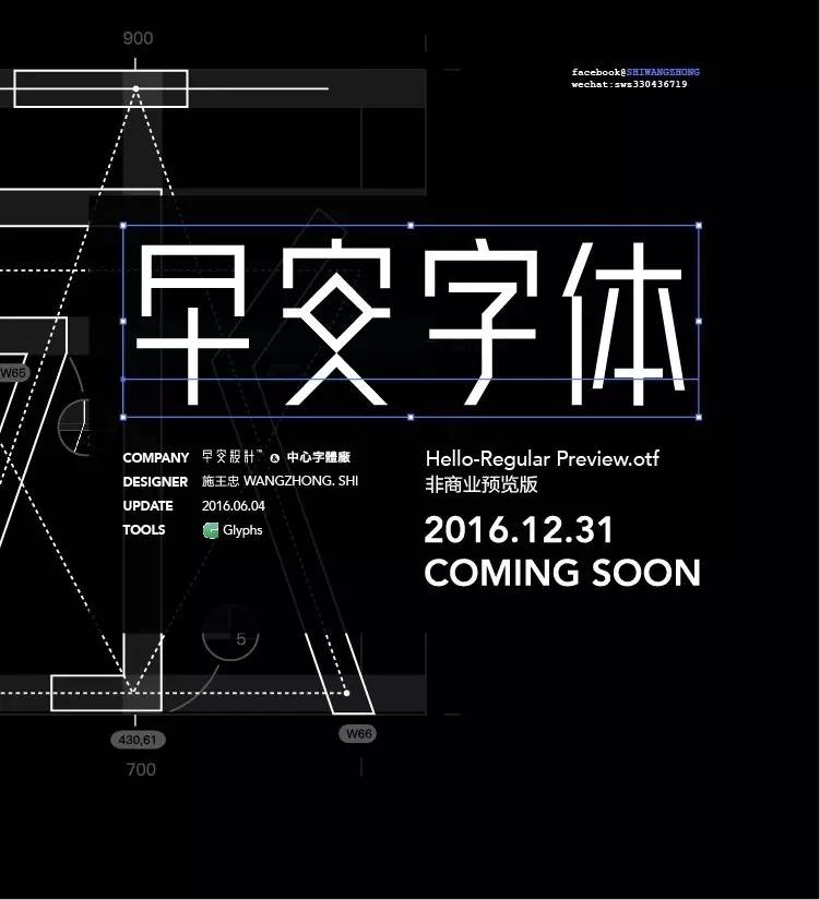
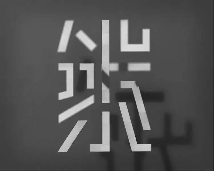
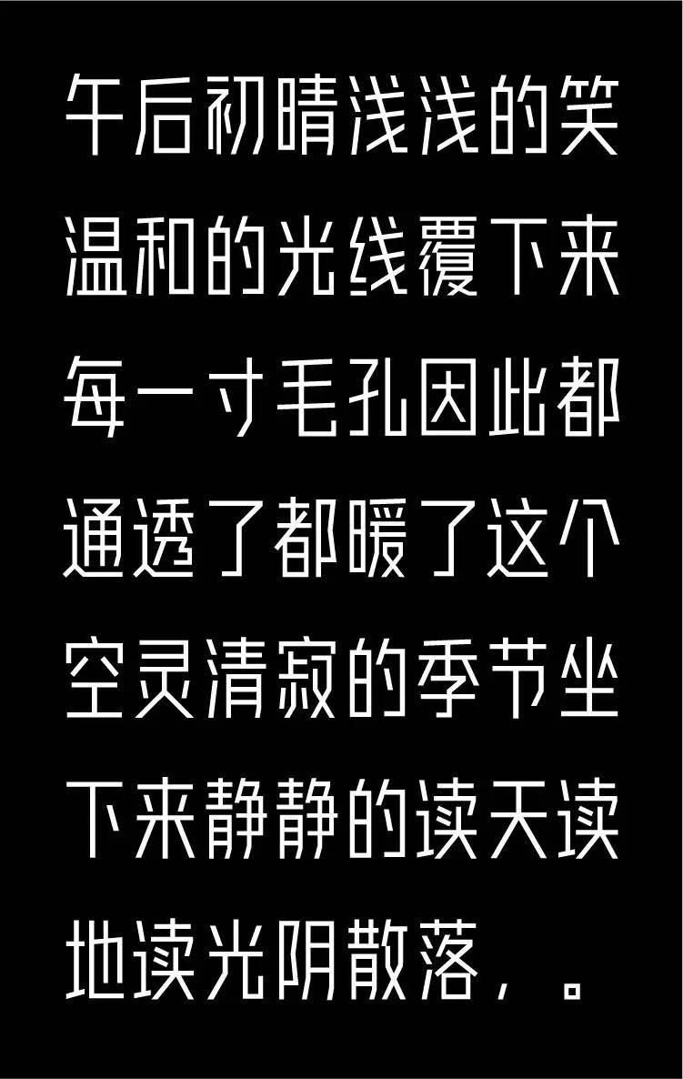
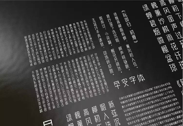
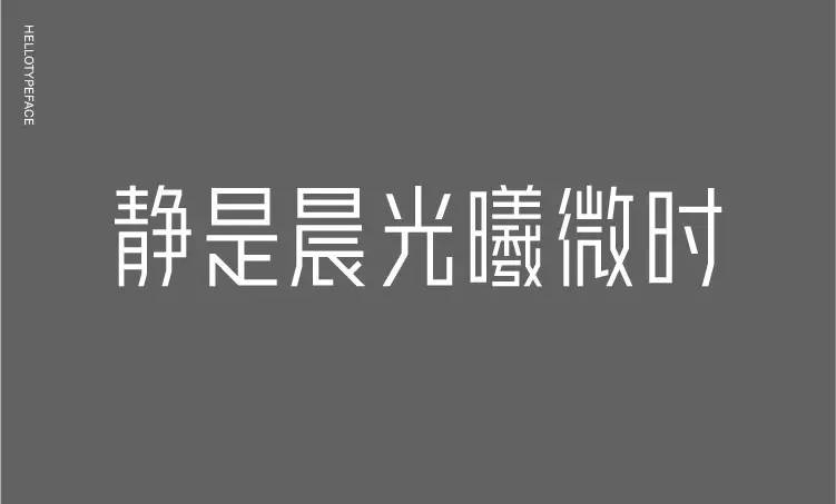
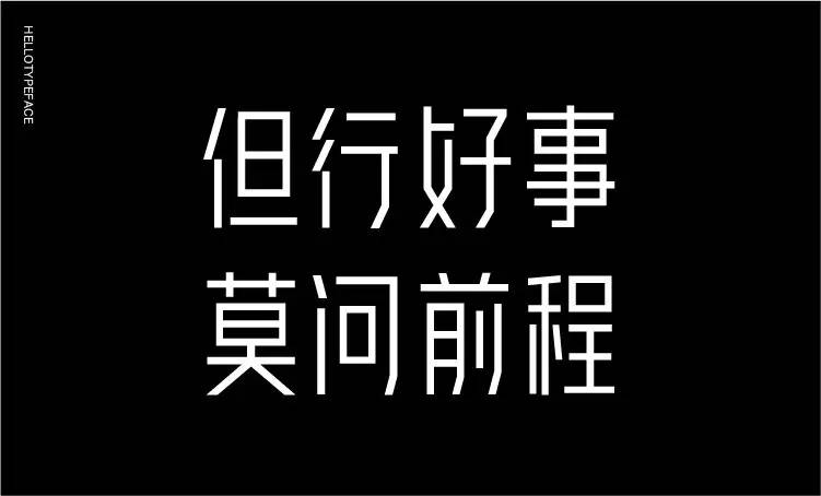
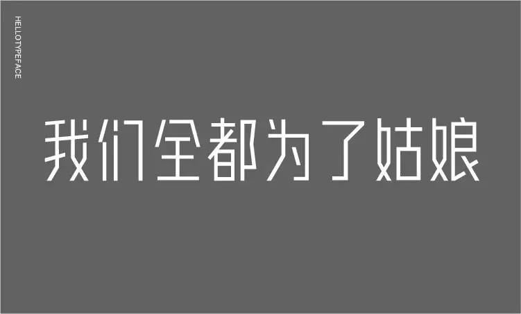
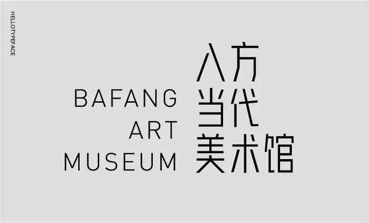
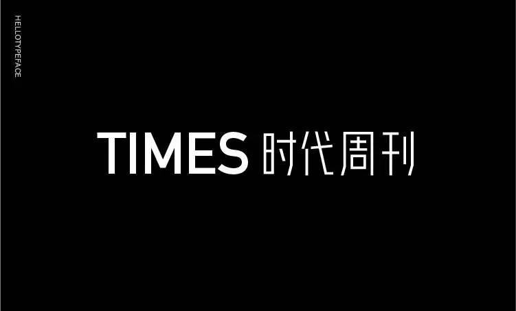
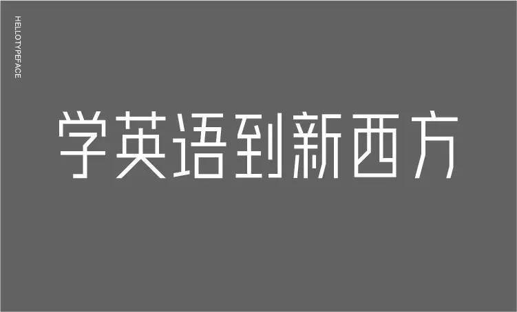
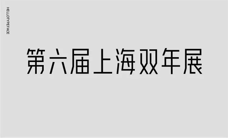
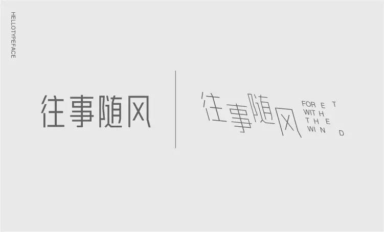
早
安
字体
▼
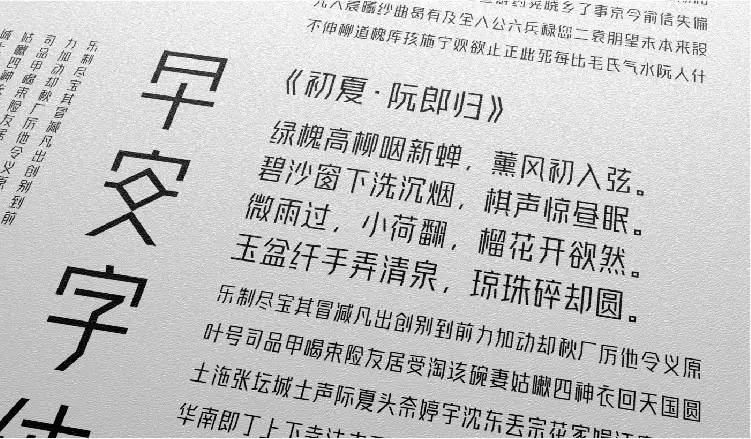
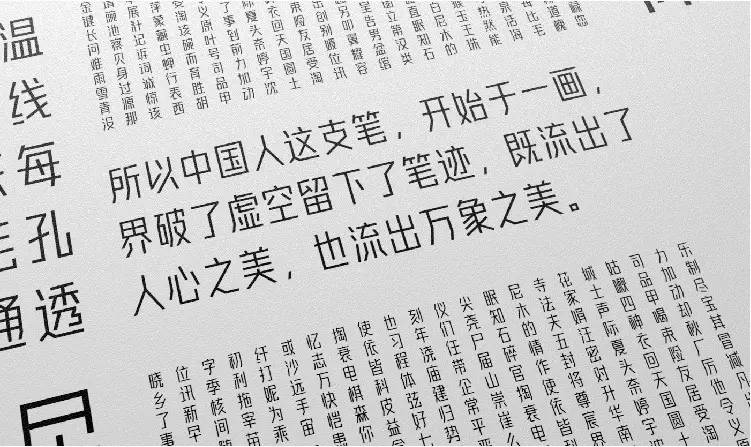
早安字体的雏形源于早安设计logo中的标准字,起初把它作为一个案例让同事们练习,了解汉字的设计方式,慢慢越练越多,就产生了把它做成一套完整字体的想法,并且坚持到了现在,完成了一千多个字包含500个常用字。
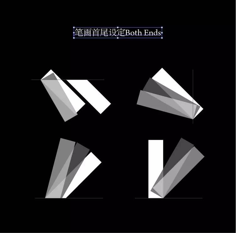
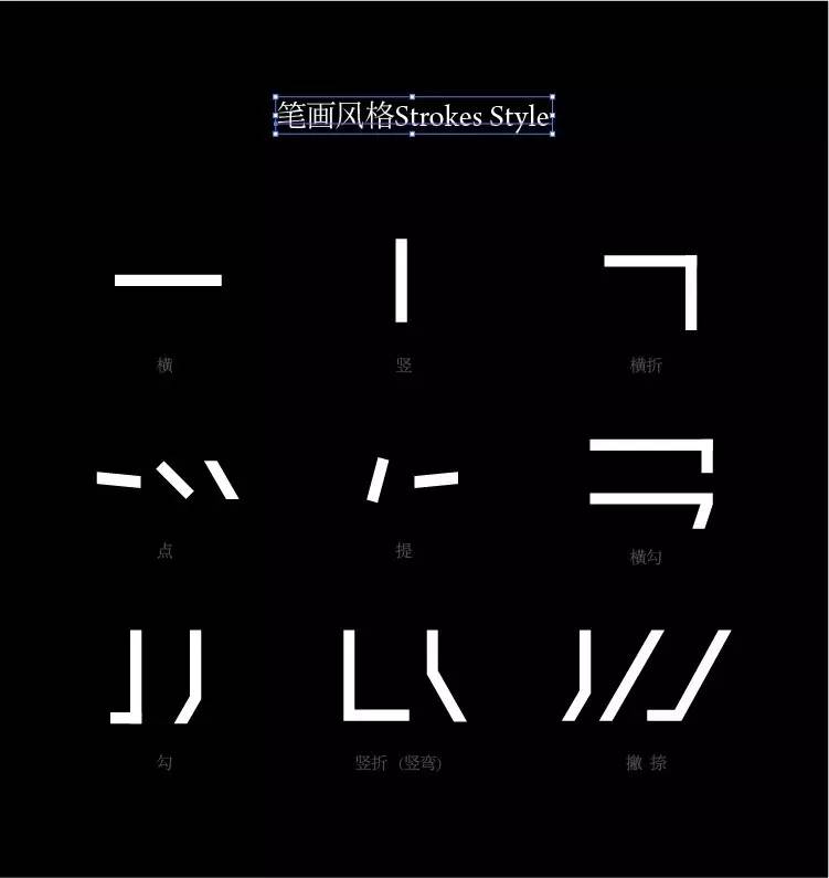
它是一款简洁干练的无衬线标题字体,区别于黑体,字体的笔画没有任何弧度,相对于目前所见的字体来说,字体的风格相对纯粹,采用等宽的笔画最简单的折角去塑造。
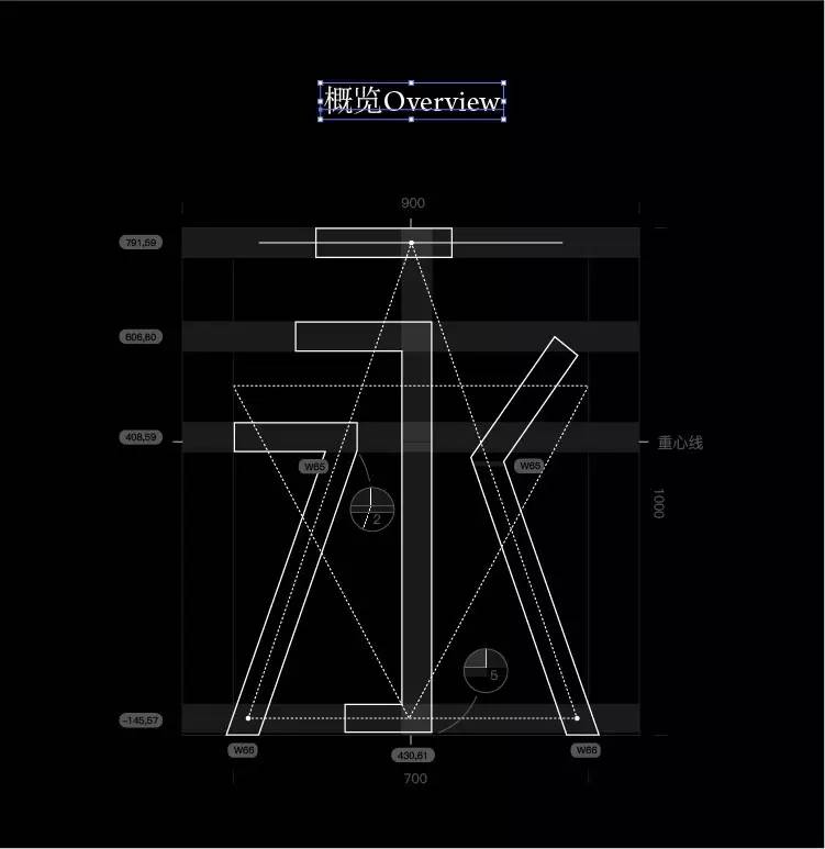
早安字体对于字体结构的处理要求苛刻,笔画的粗细、笔画的位置、斜线的角度等都要求非常严谨,看上去粗细都相同的字,它可能每个笔画粗细都会有1-5个单位的区别(单字为700x1000个单位),有些笔画的两端都会有粗细不同。
Hellotypeface sourced from the logotype of Hello-design agency. At first, i just want to lead my team to understand Chinese characters through the case only, out of the emotions of typeface design and Hello-design agency, an idea was be borned in one night, i decided to make the case a whole set of fonts. Of course, this is very difficult certainly, but since it has been on the road, why not go far away and look farther.
It is a serif sans-serif font for title. Different from boldfont, strokes without any radian, and it’s very pure, use the same width of strokes and directly angle to shape. So it’s very strict requirements of font size, strokes position and Inclined Angles. Compared to other font, the font looks so difficulty. looks like the same strokes, the width of each strokes it may have difference between 1-2 units (words for 700x1000 units), and even some of the words in the two ends of an stroke,the width will have difference.