我是小渔歌,点击右上方“关注”,每天为你分享【前端技术知识】干货。
大家看下这个gif动态图上的拖拽效果,用CSS可以实现吗?

这个时完全可以用CSS实现的,说了大家可能不信,话不多说,下面就带大家一步一步实现这个拖拽功能。
CSS实现原理
在网页开发中,几乎每天都和页面滚动打招呼,在PC端中页面超过盒子高度,即可使用鼠标滚轮进行页面的滚动,而在移动端是通过手指滑动进行页面滚动。 同时开启水平垂直方向的滚动,设置overflow:auto,大家猜猜会发生什么?
当子元素超出父元素才会出现滚动条。
这时,在PC端垂直方向上可以通过鼠标滚轮滚动,水平方向上则是通过shift健加鼠标滚轮,只能同时滚动一个方向。 但是移动端就不一样了,他可以通过手指滑动任意方向滚动(拖动)。
基于这个就能实现上面的拖拽功能,是不是很神奇。
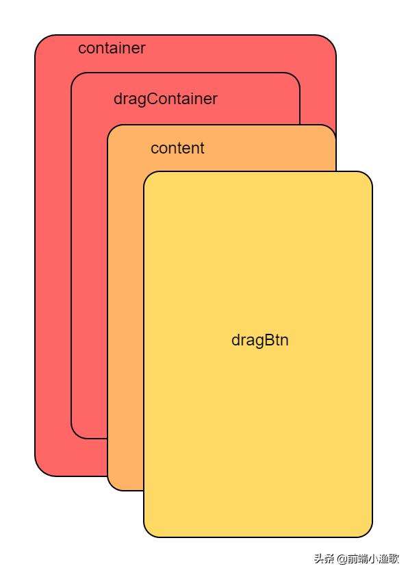
下面来说下实现所需的元素盒子布局: container:外层盒子,设置overflow:auto。 dragContainer:宽高大于外层container的宽高,这样才会出现滚动。 content:网页内容区域。 dragBtn:一个用于拖拽交互的button。
完整结构代码
    <div class="container">
        <div class="dragContainer">
            <div class="LR">
                <div class="L">
                    L
                </div>
                <div class="R">
                    R
                </div>
            </div>
            <div class="content">
            </div>
            <div class="dragBtn">
            </div>
        </div>
    </div>
实现元素层级图
实现拖拽层级图
dragContainer 的宽高是container的2倍,这样dragContainer整个在移动端就可以拖动了。
主要样式代码
.container {
        position: absolute;
        left: 0px;
        top: 0px;
        right: 0px;
        bottom: 0px;
        width: 100%;
        height: 100%;
        overflow: auto;
    }

    .dragContainer {
        width: 200%;
        height: 200%;
    }
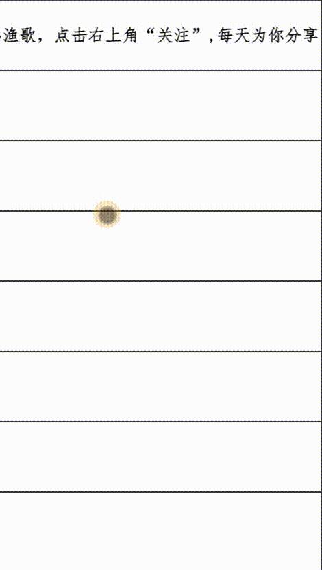
dragContainer拖动效果图
然后在加上dragBtn按钮
注意:此时的dragContainer的宽高要减去dragBtn的宽高,以达到按钮一直在可视区域的效果。
主要样式代码
.container {
        position: absolute;
        left: 0px;
        top: 0px;
        right: 0px;
        bottom: 0px;
        width: 100%;
        height: 100%;
        overflow: auto;
    }
    .dragContainer {
        width: calc(200% - 50px);
        height: calc(200% - 50px);
    }
    .dragBtn {
        width: 50px;
        height: 50px;
        border-radius: 50%;
        background: #FFD966;
        position: absolute;
        right: 0;
        bottom: 0;
    }
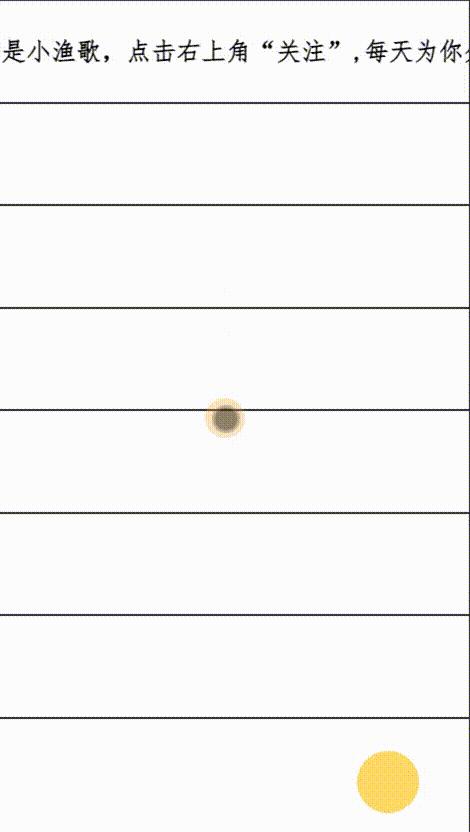
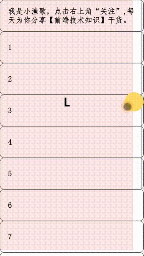
加上dragBtn效果图
哈哈,此时是不是有点那个意思了。
不过此时拖动非按钮区域,按钮也跟着动。现在我们要实现只拖动dragBtn按钮才动
此刻我们把content固定。
注意:content的层级应该在dragBtn与dragContainer之间。
主要样式代码
    .content {
        width: 100vw;
        height: 100vh;
        overflow: auto;
        position: fixed;
        left: 0;
        top: 0;
    }
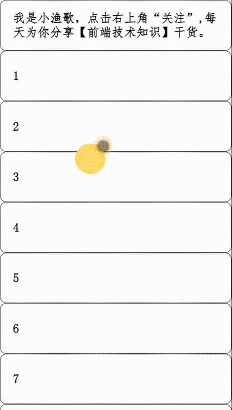
哈哈,是不是很完美[中国赞],不过我们还差一步,按钮的边缘吸附效果,
按钮边缘吸附效果实现
那怎么样实现吸附效果呢?
大家可以思考下,CSS有什么属性可以做到。
主要用到scroll-snap-type: x mandatory与scroll-snap-align: start这两个属性。
我之前有一篇文章提起过这个CSS属性,感兴趣的可以看下,链接在下方
能用CSS实现的效果,就尽量把Javascript踢开吧?
主要样式代码
     .container {
        position: absolute;
        left: 0px;
        top: 0px;
        right: 0px;
        bottom: 0px;
        width: 100%;
        height: 100%;
        overflow: auto;
        scroll-snap-type: x mandatory;
    }
 .LR {
        display: flex;
        width: 100%;
        height: 100%;
    }

    .L {
        background: rgba(255, 0, 0, 0.1);
    }

    .L,
    .R {
        flex-grow: 1;
        scroll-snap-align: start;
        display: flex;
        align-items: center;
        justify-content: center;
        font-size: 30px;
        font-weight: bold;
    }
这里我们给L加了歌背景半透明的颜色,这样看起来更清晰点。
吸附效果图
完整样式代码
  * {
        padding: 0;
    }
    body {
        overflow: hidden;
    }
    .container {
        position: absolute;
        left: 0px;
        top: 0px;
        right: 0px;
        bottom: 0px;
        width: 100%;
        height: 100%;
        overflow: auto;
        scroll-snap-type: x mandatory;
    }
    .dragContainer {
        width: calc(200% - 50px);
        height: calc(200% - 50px);
    }
    .LR {
        display: flex;
        width: 100%;
        height: 100%;
    }

    .L {
        background: rgba(255, 0, 0, 0.1);
    }
    .L,
    .R {
        flex-grow: 1;
        scroll-snap-align: start;
        display: flex;
        align-items: center;
        justify-content: center;
        font-size: 30px;
        font-weight: bold;
    }
    .dragBtn {
        width: 50px;
        height: 50px;
        border-radius: 50%;
        background: #FFD966;
        position: absolute;
        right: 0;
        bottom: 0;
    }
    .container::-webkit-scrollbar {
        width: 0 !important
    }
    .content {
        width: 100vw;
        height: 100vh;
        overflow: auto;
        position: fixed;
        left: 0;
        top: 0;
    }
    .item {
        height: 80px;
        font-size: 20px;
        border: 1px solid #333333;
        border-radius: 10px;
        display: flex;
        align-items: center;
        padding: 0 20px;
        font-weight: bold;
        font-family: "仿宋"
    }
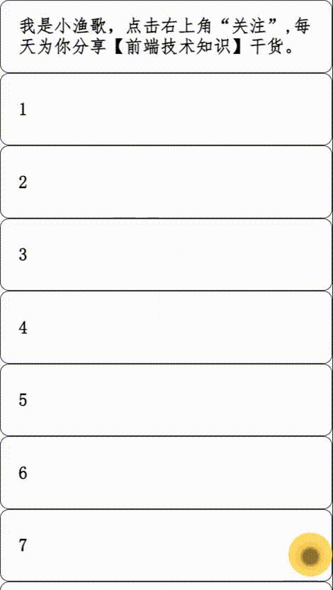
最终实现效果图
完整效果图
总结
主要是利用移动端水平和垂直方向超出区域可以随意拖动的原理,按钮吸附效果是借助CSS3的scroll-snap-type: x mandatory与scroll-snap-align: start这两个属性实现的。
往期精彩内容
能用CSS实现的效果,就尽量把Javascript踢开吧?
在JavaScript中call与apply的实际应用你知道多少?
作者介绍
小渔歌,90后前端研发工程师,热爱生活,一个在劳动中不断学习的人,愿我们共同进步,点关注不迷路[中国赞][作揖]