有时如果我有二级随机数据,想模拟一下某些区间数据的图形如下:
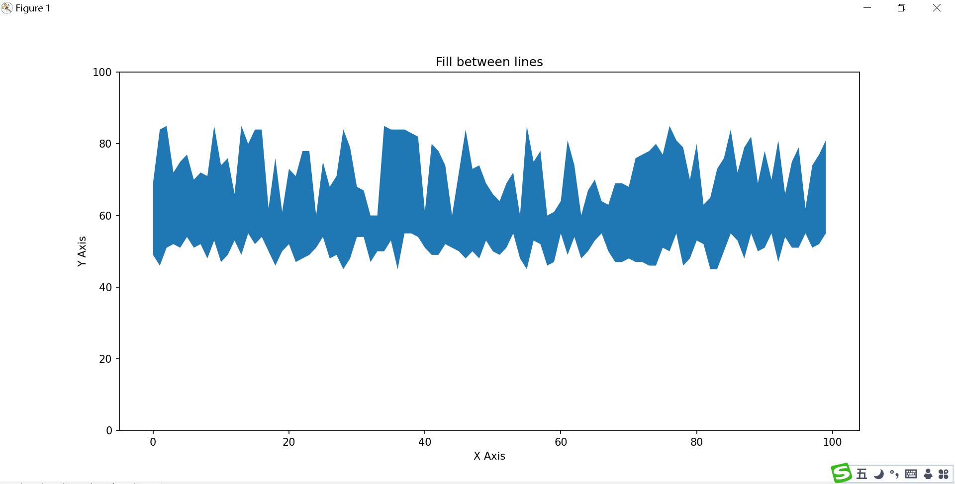
这个图形有点像什么?大家可以自行脑补
如何生成随机数据数据 Y坐标我们使用随机生成 numpy.random.randint 函数
numpy.random.randint(low, high=None, size=None, dtype='l')
函数的作用是,返回一个随机整型数,范围从低(包括)到高(不包括),即[low, high)。
如果没有写参数high的值,则返回[0,low)的值。
参数如下:
- low: int
- 生成的数值最低要大于等于low。
- (hign = None时,生成的数值要在[0, low)区间内)
- high: int (可选)
如果使用这个值,则生成的数值在[low, high)区间。
- size: int or tuple of ints(可选)
输出随机数的尺寸 ,
比如size = (m * n* k)则输出同规模即m * n* k个随机数。默认是None的,仅仅返回满足要求的单一随机数。
dtype: dtype(可选):
想要输出的格式。如int64、int等等
>>> np.random.randint(2, size=10)
array([1, 0, 0, 0, 1, 1, 0, 0, 1, 0])
>>> np.random.randint(1, size=10)
array([0, 0, 0, 0, 0, 0, 0, 0, 0, 0])
我们使用上面 的函数来生成随机数据
y = np.random.randint(45,56,100)
yy = np.random.randint(60,86,100)
x = np.arange(100) # x 坐标使用固定刻度
[ 0 1 2 3 4 5 6 7 8 9 10 11 12 13 14 15 16 17 18 19 20 21 22 23
24 25 26 27 28 29 30 31 32 33 34 35 36 37 38 39 40 41 42 43 44 45 46 47
48 49 50 51 52 53 54 55 56 57 58 59 60 61 62 63 64 65 66 67 68 69 70 71
72 73 74 75 76 77 78 79 80 81 82 83 84 85 86 87 88 89 90 91 92 93 94 95
96 97 98 99]
接着绘制图形
plt.fill_between(x, y, yy)
plt.xlabel('X Axis')
plt.ylabel('Y Axis')
plt.ylim(0,100)
plt.title('Fill between lines')
plt.show()

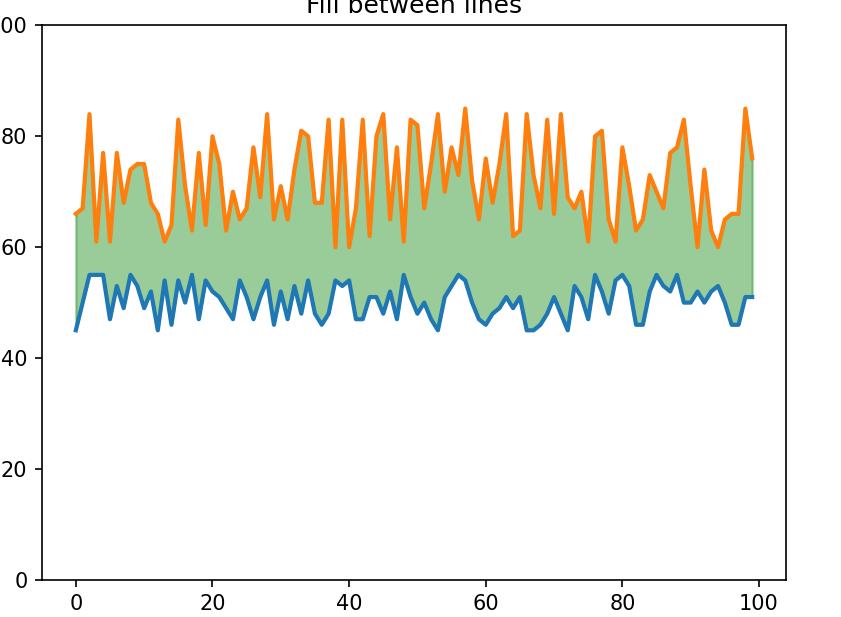
继续对代码稍作 修改
plt.fill_between(x, y, yy, alpha=0.4)

继续修改
plt.plot(x,y, yy, linewidth=2.0)
plt.fill_between(x, y, yy, color='green', alpha=0.4)