废话不多说,先上图:
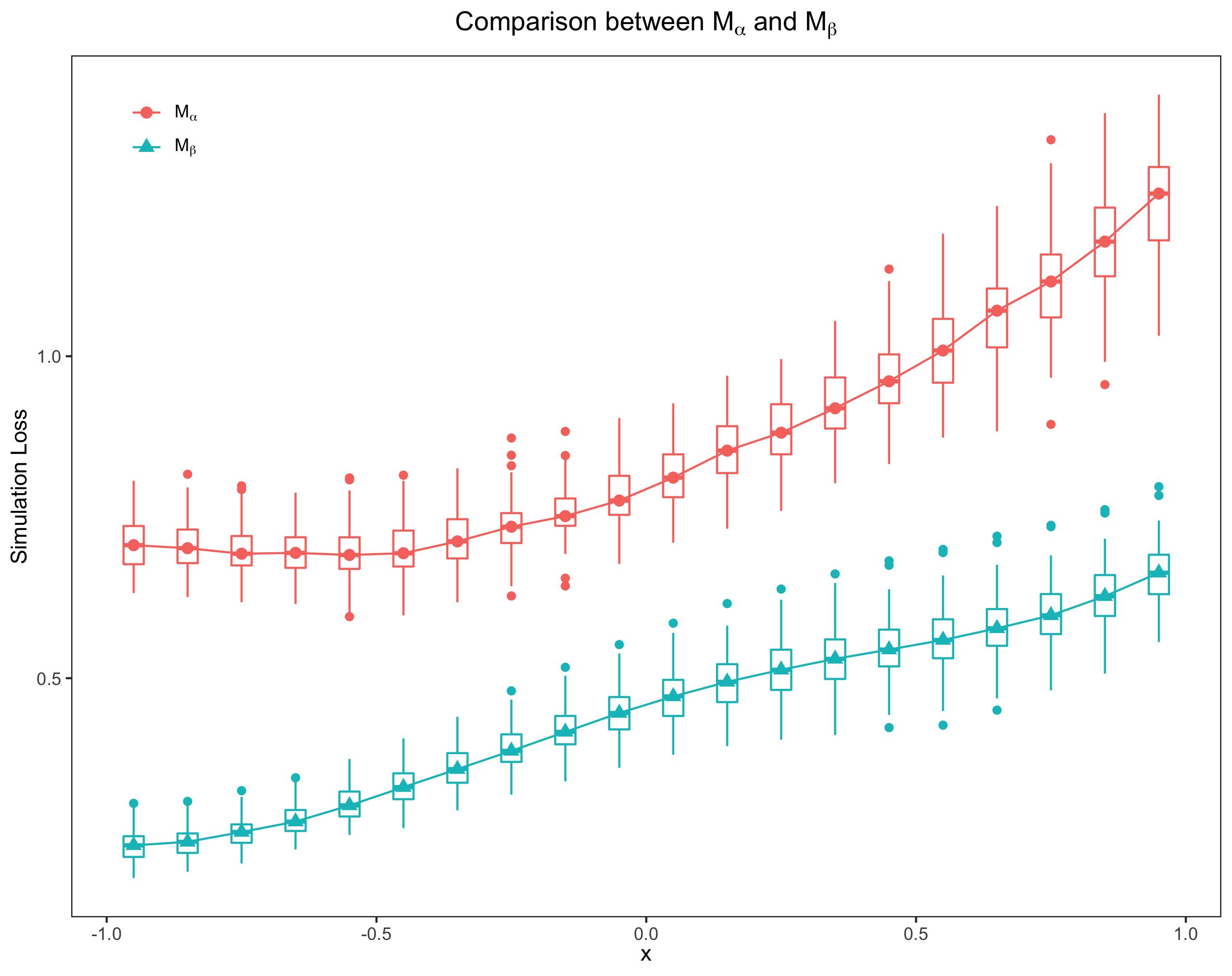
此图⽐普通的均值折线图代表了更多的信息。下⾯我就⼀步⼀步展示怎样得到这样的 boxplot 和中位数折线图。主要⽤到2个 R 包 latex2exp 和 ggplot2. ggplot2是画图的主⻆,latex2exp可以让 legend, title,x-axis label 和 y-axis label 的中的$LaTeX$ 正常显示, 如上图中的$M_{\alpha}$ 和 $M_{\beta}$。下⾯我介绍⼀下数据的类型。
数据说明
在统计实验中,我们会遇到这样类型的数据:$x$ 表示条件,等间隔取值。⽐如在上图中我 给的$x$值是:-0.95:0.1:0.95,间隔 0.1,共 20 个值。在每个指定的 $x_i,i=1,...,20$下,我们⽐较两种统计⽅法:$M_{\alpha}$ 和 $M_{\beta}$,计算他们 各⾃的损失,并且每种⽅法重复$N$次。这样我们分别得到 2 个loss matrix, ⼤⼩是:$20\times N$。
基本逻辑
ggplot2包的精髓就是图层(layer), 通过控制图层,我们⼏乎可以画出任何精美的图表, 也正因为如此,ggplot2 的主要作者Hadley Wickham 2019 年获得了号称"统计学界诺⻉尔 奖"--COPSS Presidents ̓Award。拿⼤神的⼯具来画上⾯的图,当然是⼩菜⼀碟了,就像做 三明治,我们⼀层⼀层的把需要的图层叠加起来就得到了需要的图。
箱型图
在画箱型图之前,我们需要对损失矩阵做⼀下处理,先贴代码:
m_alpha_df <- data.frame(
    loss = matrix(m_alpha, ncol = 1, byrow = T),
    cond = rep(x, times = N)
)
m_beta_df <- data.frame(
    loss = matrix(m_beta, ncol = 1, byrow = T),
    cond = rep(x, times = N)
)
m_median <- data.frame(
    loss = c(apply(m_alpha, 1, median), apply(m_beta, 1, median)),
    cond = rep(u, 2),
    method = factor(rep(c(0, 1), times = 1, each = k), levels = c(0, 1))
)
m_alpha 和 m_beta 分别代表$M_{\alpha}$ 和 $M_{\beta}$⽅法得到的矩阵。m_alpha_df 是数据框(dataframe),⾥⾯有两个变量 loss 和 cond, loss就是损失矩阵按列拉直, cond是$x$ 重复$N$次。m_median 表示中位数的数据框:loss表示取⾏的中位数后,再组合成列向量;cond 是$x$ 重复$2$次;method 是因⼦变量,⽤ 0 表示$M_{\alpha}$,1 表示 $M_{\beta}$。
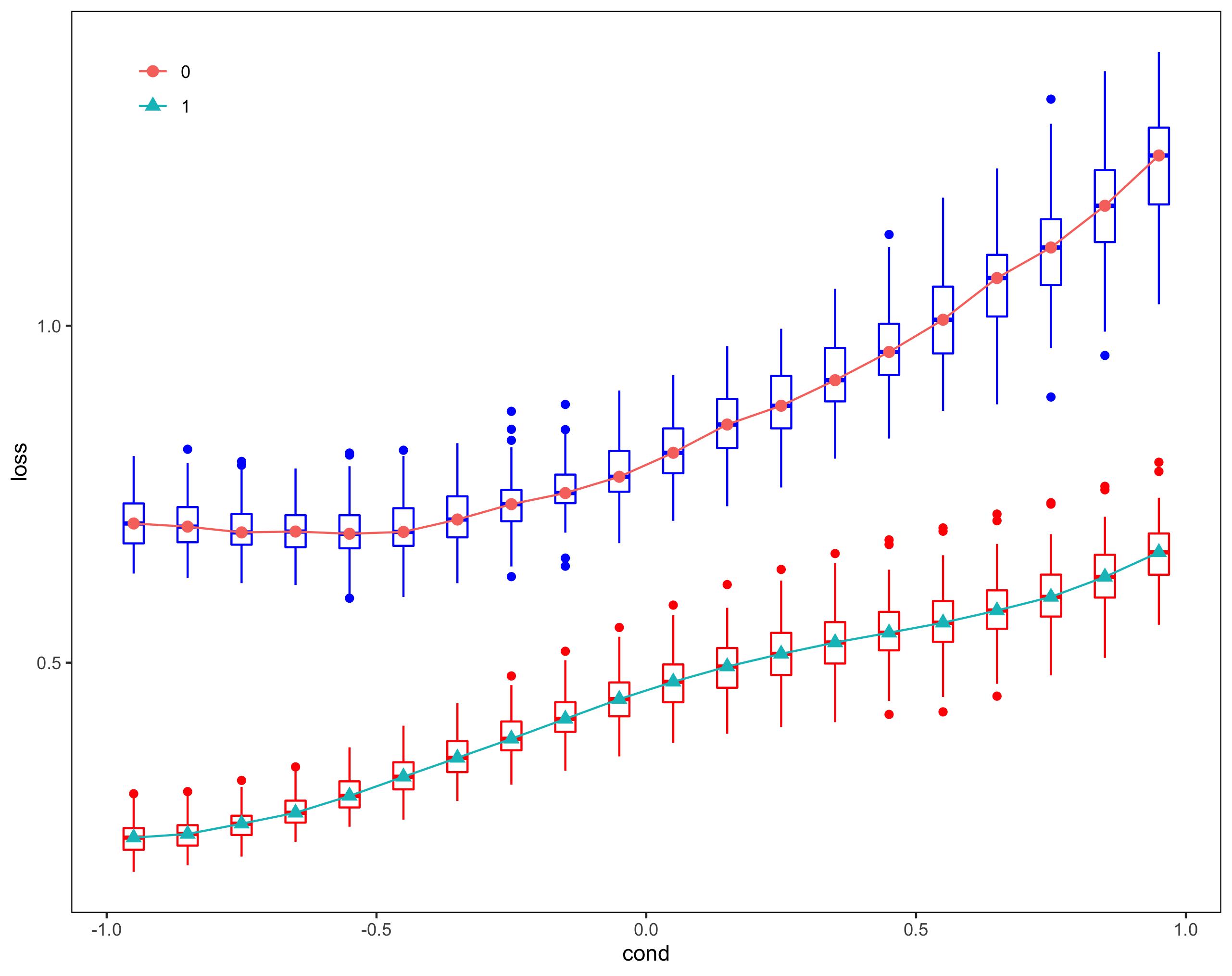
⽤如下的代码就可以得到箱型图
p_compare  <- ggplot(m_median, aes(x = cond, y = loss))
p_compare  <- p_compare  + geom_boxplot(data = m_alpha_df, aes(group = cond),
                                        colour = "blue") +
    geom_boxplot(data = m_beta_df, aes(group = cond), colour = "red")
现在箱型图还很不完美,x 轴和 y 轴的标题不对,背景是灰⾊的,并且带有⽹格,表格没有边界框,等等。
但是不要着急,我们后⾯会慢慢调整过来。

中位数折现线图
实际上,上⾯的箱型图是三个图层的叠加,因此中位数折线图只需要在原来的基础上再多加 两⾏命令即可:
p_compare  <- ggplot(m_median, aes(x = cond, y = loss))
p_compare  <- p_compare  + geom_boxplot(data = m_alpha_df, aes(group = cond),
                                        colour = "blue") +
    geom_boxplot(data = m_beta_df, aes(group = cond), colour = "red") +
    geom_point(aes(shape = method, color = method), size = 2.5) +
    geom_line(aes(color = method))
细⼼的⼩伙伴肯定发现,boxplot 和中位数折线图的颜⾊不⼀致,等会我会告诉⼤家怎样⼿ 动去调节颜⾊。
注意:实际上我们是加了两个图层:⼀个是点图层,⼀个是线图层,实际上每个图层都 带有 legend。为了使两个图层的 legend 统⼀,我令 aes 函数中的 shape,color,都取 值为 method 因⼦变量。⼩伙伴们可以修改⼀下参数,看看会发⽣什么样的结果。对于怎样 把 multiple legend 合并为⼀个,可以参考:https://stackoverflow.com/questions/37140266/how-to-merge-color-line-style-and-shape-legends-in-ggplot。

修饰Legend,背景和配⾊
我们有以下⼏个任务:
- 把 legend 移动到左上的位置
- 把图⽚背景和 legend背景改为⽩⾊
- 去掉⽹格(grid)
- 去掉 legned name, 也就是 method
p_compare  <- ggplot(m_median, aes(x = cond, y = loss))
p_compare  <- p_compare  + geom_boxplot(data = m_alpha_df, aes(group = cond),
                                        colour = "blue") +
    geom_boxplot(data = m_beta_df, aes(group = cond), colour = "red") +
    geom_point(aes(shape = method, color = method), size = 2.5) +
    geom_line(aes(color = method)) +
    theme(legend.position = c(0.08, 0.92)) +
    theme(legend.title = element_blank()) +
    theme(panel.grid.major = element_blank()) +
    theme(panel.grid.minor = element_blank()) +
    theme(plot.title = element_text(hjust = 0.5)) +
    theme(panel.background = element_rect(fill = "white", colour = "black")) +
    theme(legend.background = element_blank()) +
    theme(legend.key = element_rect(fill = "white", colour = "white"))
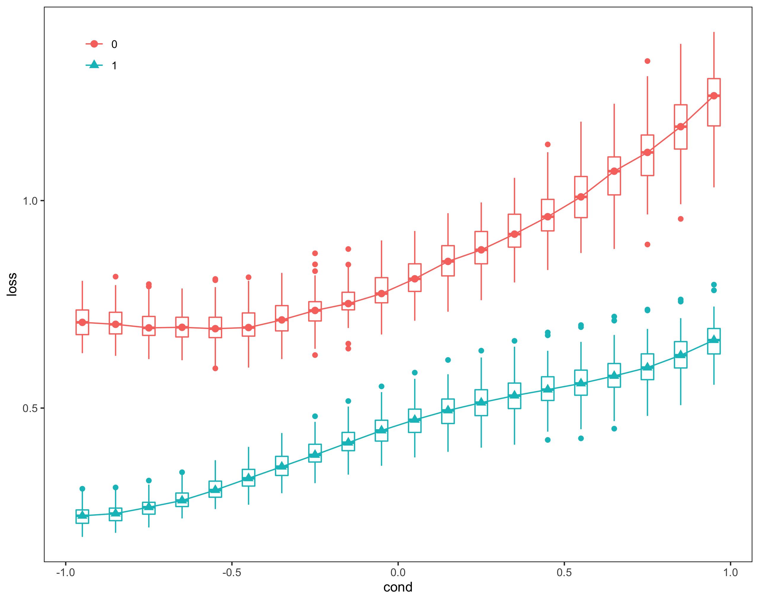
现在还有个很重要的问题:boxplot 和 line 的颜⾊不匹配,为了简单起⻅,我们改动了 boxplot 的颜⾊
p_compare  <- ggplot(m_median, aes(x = cond, y = loss))
p_compare  <- p_compare  + geom_boxplot(data = m_alpha_df, aes(group = cond),
                            colour = "#F8766D") +
    geom_boxplot(data = m_beta_df, aes(group = cond), colour = "#00BFC4")
m_alpha_df 的颜⾊改为"#F8766D",m_beta_df 的颜⾊改为"#00BFC4"。⼩伙伴⼜会问,那 这两个颜⾊我是怎样知道的?
其实很简单,⽤如下命令:
ggplot_build(p_compare)$data
>
   colour     x         y PANEL group flipped_aes size linetype alpha
1  #F8766D -0.95 0.7065639     1     1       FALSE  0.5        1    NA
2  #F8766D -0.85 0.7018750     1     1       FALSE  0.5        1    NA
3  #F8766D -0.75 0.6933298     1     1       FALSE  0.5        1    NA
4  #F8766D -0.65 0.6946119     1     1       FALSE  0.5        1    NA
5  #F8766D -0.55 0.6913419     1     1       FALSE  0.5        1    NA
6  #F8766D -0.45 0.6940689     1     1       FALSE  0.5        1    NA
7  #F8766D -0.35 0.7124416     1     1       FALSE  0.5        1    NA
8  #F8766D -0.25 0.7352228     1     1       FALSE  0.5        1    NA
9  #F8766D -0.15 0.7517063     1     1       FALSE  0.5        1    NA
10 #F8766D -0.05 0.7758747     1     1       FALSE  0.5        1    NA
11 #F8766D  0.05 0.8114694     1     1       FALSE  0.5        1    NA
12 #F8766D  0.15 0.8534218     1     1       FALSE  0.5        1    NA
13 #F8766D  0.25 0.8812675     1     1       FALSE  0.5        1    NA
14 #F8766D  0.35 0.9191502     1     1       FALSE  0.5        1    NA
15 #F8766D  0.45 0.9610939     1     1       FALSE  0.5        1    NA
16 #F8766D  0.55 1.0089209     1     1       FALSE  0.5        1    NA
17 #F8766D  0.65 1.0707904     1     1       FALSE  0.5        1    NA
18 #F8766D  0.75 1.1160649     1     1       FALSE  0.5        1    NA
19 #F8766D  0.85 1.1780385     1     1       FALSE  0.5        1    NA
20 #F8766D  0.95 1.2526302     1     1       FALSE  0.5        1    NA
21 #00BFC4 -0.95 0.2404232     1     2       FALSE  0.5        1    NA
22 #00BFC4 -0.85 0.2458214     1     2       FALSE  0.5        1    NA
23 #00BFC4 -0.75 0.2610919     1     2       FALSE  0.5        1    NA
24 #00BFC4 -0.65 0.2772833     1     2       FALSE  0.5        1    NA
25 #00BFC4 -0.55 0.3023408     1     2       FALSE  0.5        1    NA
26 #00BFC4 -0.45 0.3307433     1     2       FALSE  0.5        1    NA
27 #00BFC4 -0.35 0.3587650     1     2       FALSE  0.5        1    NA
28 #00BFC4 -0.25 0.3871197     1     2       FALSE  0.5        1    NA
29 #00BFC4 -0.15 0.4165976     1     2       FALSE  0.5        1    NA
30 #00BFC4 -0.05 0.4459193     1     2       FALSE  0.5        1    NA
31 #00BFC4  0.05 0.4716478     1     2       FALSE  0.5        1    NA
32 #00BFC4  0.15 0.4942769     1     2       FALSE  0.5        1    NA
33 #00BFC4  0.25 0.5130827     1     2       FALSE  0.5        1    NA
34 #00BFC4  0.35 0.5299724     1     2       FALSE  0.5        1    NA
35 #00BFC4  0.45 0.5444487     1     2       FALSE  0.5        1    NA
36 #00BFC4  0.55 0.5593016     1     2       FALSE  0.5        1    NA
37 #00BFC4  0.65 0.5774040     1     2       FALSE  0.5        1    NA
38 #00BFC4  0.75 0.5975926     1     2       FALSE  0.5        1    NA
39 #00BFC4  0.85 0.6272819     1     2       FALSE  0.5        1    NA
40 #00BFC4  0.95 0.6637228     1     2       FALSE  0.5        1    NA
这样我们就把颜⾊调成统⼀的了。当然也可以更改线和点的颜⾊,有兴趣的可以尝试⼀下。
$LaTeX$ 表达式
最后我们修改横纵轴的标题,给图加 title,把 legend 中的 0 和 1 替换为$M_{\alpha}$ 和 $M_{\beta}$。 这部
分很简单,直接贴全部代码:
library(latex2exp)
library(ggplot2)
m_alpha_df <- data.frame(
    loss = matrix(m_alpha, ncol = 1, byrow = T),
    cond = rep(x, times = N)
)
m_beta_df <- data.frame(
    loss = matrix(m_beta, ncol = 1, byrow = T),
    cond = rep(x, times = N)
)
m_median <- data.frame(
    loss = c(apply(m_alpha, 1, median), apply(m_beta, 1, median)),
    cond = rep(u, 2),
    method = factor(rep(c(0, 1), times = 1, each = k), levels = c(0, 1))
)
lab <- c('M$_{\\alpha}#39;, 'M$_{\\beta}#39;)
lab <- lapply(lab, TeX)
p_compare  <- ggplot(m_median, aes(x = cond, y = loss))
p_compare  <- p_compare  + geom_boxplot(data = m_alpha_df, aes(group = cond),
                            colour = "#F8766D") +
    geom_boxplot(data = m_beta_df, aes(group = cond), colour = "#00BFC4") +
    geom_point(aes(shape = method, color = method), size = 2.5) +
    geom_line(aes(color = method)) +
    scale_colour_discrete(name = "Method",
                        breaks = c("0", "1"),
                        labels = lab) +
    scale_shape_discrete(name = "Method",
                        breaks = c("0", "1"),
                        labels = lab) +
    theme(legend.position = c(0.08, 0.92)) +
    theme(legend.title = element_blank()) +
    theme(panel.grid.major = element_blank()) +
    theme(panel.grid.minor = element_blank()) +
    labs(x = TeX("$x#34;)) +
    labs(y = "Simulation Loss") +
    ggtitle(TeX("Comparison between M$_{\\alpha}$ and M$_{\\beta}#34;)) +
    theme(plot.title = element_text(hjust = 0.5)) +
    theme(panel.background = element_rect(fill = "white", colour = "black")) +
    theme(legend.background = element_blank()) +
    theme(legend.key = element_rect(fill = "white", colour = "white"))
p_compare
注意: scale_colour_discrete 和 scale_shape_discrete中参数 labels 必须是 list 类型。
到此为⽌,我已经把做 boxplot 和中位数折线图⼀步⼀步给⼤家分享了,有兴趣的同学在此基础上可以修改,增删代码,若是引⽤,转载,请⽤超链接引⽤本⽹址,谢谢!