本章主要内容:
1 marquee跑马灯
2 progress进度条
3 rating评分条
4 slider滑动条
5 switch开关选择器
前面的章节已经介绍了全部容器组件和基础组件Text、Button、Input、Picker、Image,本章节将进一步介绍鸿蒙应用程序开发的方舟界面(ArkUI)框架中前面章节中没有介绍到的全部基础组件,了解其基本用法。这样就可以在以后的实际项目开发中做到心中有数。
一 marquee跑马灯
跑马灯组件,用于展示一段单行滚动的文字。
支持设备:手机,平板,智慧屏,智能穿戴
1 属性:跑马灯除支持通用属性外,还有3个属性
|
名称 |
类型 |
默认值 |
必填 |
描述 |
|
scrollamount |
number |
6 |
否 |
跑马灯每次滚动时移动的最大长度。 |
|
loop |
number |
-1 |
否 |
跑马灯滚动的次数。如果未指定,则默认值为-1,当该值小于等于零时表示marquee将连续滚动。 |
|
direction |
string |
left |
否 |
设置跑马灯的文字滚动方向,可选值为left和right。 |
2 样式:除通用样式外,跑马灯还支持如下样式
color:设置跑马灯中文字的文本颜色。
font-size:设置跑马灯中文字的文本尺寸。
allow-scale:设置跑马灯中文字的文本尺寸是否跟随系统设置字体缩放尺寸进行放大缩小。
font-weight:设置跑马灯中文字的字体的粗细。
font-family:设置跑马灯中文字的字体列表,用逗号分隔,每个字体用字体名或者字体族名设置。列表中第一个系统中存在的或者通过自定义字体指定的字体,会被选中作为文本的字体。
3 事件:除支持通用事件外,还支持如下事件
|
名称 |
参数 |
描述 |
|
bounce(Rich) |
- |
当文本滚动到末尾时触发该事件。 |
|
finish(Rich) |
- |
当完成滚动次数时触发该事件。需要在 loop 属性值大于 0 时触发。 |
|
start(Rich) |
- |
当文本滚动开始时触发该事件。 |
4 方法:除支持通用方法外,还支持如下方法
start:开始滚动。
stop:停止滚动。
5 示例
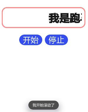
<!-- marqueepage.hml -->
<div class="container">
    <marquee id="marquee" class="marquee" scrollamount="{{ scrollAmount }}"
        loop="{{ loopTimes }}" direction="{{ direction }}" @bounce="marqueeBounce"
            @start="marqueeStart" @finish="marqueeFinish">{{ marqueeData }}</marquee>
    <div class="buttons">
        <button class="control" @click="startMarquee">开始</button>
        <button class="control" @click="stopMarquee">停止</button>
    </div>
</div>
/* marqueepage.css */
.container {
    flex-direction: column;
    justify-content: center;
    align-items: center;
}

.marquee {
    width: 100%;
    height: 80px;
    padding: 10px;
    margin: 20px;
    border: 4px solid #ff8888;
    border-radius: 20px;
    font-size: 40px;
    font-weight: bolder;
    font-family: sans-serif;
}

.buttons {
    flex-direction: row;
    justify-content: center;
}

.control {
    width: 88px;
    height: 40px;
    margin: 5px;
    font-size: 30px;
}
// marqueepage.js
import prompt from '@system.prompt';

export default {
    data: {
        scrollAmount: 10,
        loop: 3,
        direction: 'left',
        marqueeData: '我是跑马灯'
    },
    marqueeBounce() {
        prompt.showToast({
            message: '我滚动到末尾了'
        });
    },
    marqueeStart() {
        prompt.showToast({
            message: '我开始滚动了'
        });
    },
    marqueeFinish() {
        prompt.showToast({
            message: '我完成了滚动次数'
        });
    },
    startMarquee() {
        this.$element('marquee').start();
    },
    stopMarquee() {
        this.$element('marquee').stop();
    }
}
说明:不知道这里为什么bounce和finish两个事件没起到效果。
二 progress进度条
用于显示内容加载或操作处理进度。
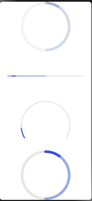
进度条的类型通过属性type定义,有如下取值:
- horizontal:线性进度条;
- circular:loading样式进度条;
- ring:圆环形进度条;
- scale-ring:带刻度圆环形进度条
- arc:弧形进度条。
- eclipse:圆形进度条,展现类似月圆月缺的进度展示效果。
属性percent定义当前进度,secondarypercent属性定义次级进度。
示例
<!-- progresspage.hml -->
<div class="container">
    <progress class="progress" type="scale-ring" percent="10" secondarypercent="50"></progress>
    <progress class="progress" type="horizontal" percent="10" secondarypercent="50"></progress>
    <progress class="progress" type="arc" percent="10"></progress>
    <progress class="progress" type="ring" percent="10" secondarypercent="50"></progress>
</div>
/* progresspage.css */
.container {
    flex-direction: column;
    justify-content: center;
    align-items: center;
    width: 100%;
    height: 100%;
}

.progress {
    width: 300px;
    height: 300px;
}
三 rating评分条
评分条,表示用户使用感受的衡量标准条。通常用于评价目标(音乐、视频、应用等)的等级。
评分条除支持通用属性外,还支持如下属性:
numstars:设置评分条的星级总数,默认值为5;
rating:设置评分条当前评星数,默认值为0;
stepsize:设置评分条的评星步长,默认值为0.5;
indicator:设置评分条是否作为一个指示器,此时用户不可操作,默认值为false;
评分条可以通过change(rating:number)事件监听用户的评分变化。
示例
<!-- ratingpage.hml -->
<div class="container">
    <rating id="rating" numstars="5" rating="5"
            @change="changeRating"></rating>
</div>
/* ratingpage.css */
.container {
    display: flex;
    justify-content: center;
    align-items: center;
}

rating {
    width: 200px;
}
// ratingpage.js
import prompt from '@system.prompt';

export default {
    changeRating(e) {
        prompt.showToast({
            message: e.rating
        });
    },
}

四 slider滑动条
滑动条组件,用来快速调节设置值,如音量、亮度等。
常用属性如下:
min:最小值,默认值为0;
max:最大值,默认值为100;
step:最小滑动步长,默认值为1;
value:初始值,默认值为0;
另外,通过change(changeEvent)事件可以监听用户的滑动数值变化,参数changeEvent有如下属性:
value:当前进度条的进度值;
mode:当前change事件的类型,可选值为:
start:slider的值开始改变。
move:slider的值跟随手指拖动中。
end:slider的值结束改变。
示例
<!-- sliderpage.hml -->
<div class="container">
    <text>进度条的开始值:{{startValue}}</text>
    <text>进度条的当前值:{{currentValue}}</text>
    <text>进度条的结束值:{{endValue}}</text>
    <slider min="0" max="100" value="{{value}}" @change="setValue" ></slider>
</div>
/* sliderpage.css */
.container {
    flex-direction: column;
    justify-content: center;
    align-items: center;
}
export default {
    data: {
        value: 0,
        startValue: 0,
        currentValue: 0,
        endValue: 0
    },
    setValue(e) {
        if (e.mode == 'start') {
            this.value = e.value;
            this.startValue = e.value;
        } else if (e.mode == 'move') {
            this.value = e.value;
            this.currentValue = e.value;
        } else if (e.mode == 'end') {
            this.value = e.value;
            this.endValue = e.value;
        }
    }
}

五 switch开头选择器
通过开关,开启或关闭某个功能。
开关选择器的常用属性如下:
checked:是否选中,默认值为false(不选中);
showtext:是否显示文本,默认值为false(不显示);
texton:选中时显示的文本,默认值为“On”;
textoff:未选中时显示的文本,默认值为"Off";
开关选择器可以通过change(checked:checkedValue)事件监听开关状态的改变。
示例
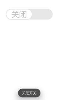
<!-- switchpage.hml -->
<div class="container">
    <switch showtext="true" texton="开启" textoff="关闭"
            checked="true" @change="switchChange"></switch>
</div>
/* switchpage.css */
.container {
    display: flex;
    justify-content: center;
    align-items: center;
}

switch {
    font-size: 30px;
    texton-color: blue;
    textoff-color: silver;
    text-padding: 20px;
}
// switchpage.js
import prompt from '@system.prompt';

export default {
    switchChange(e) {
        if (e.checked) {
            prompt.showToast({
                message: '打开开关'
            });
        } else {
            prompt.showToast({
                message: '关闭开关'
            });
        }
    }
}
好了,本章的内容至此结束,记得多动手。